This post originally appeared in Business Insider.
By Joe Weisenthal
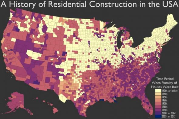
This is a fascinating way to visualize when various regions across the U.S. first got developed. Seth Kadish at the blog Vizual Statistix has put together this map showing when the plurality of homes in any given county were built.
So for example, in the bright, off yellow counties, more homes were built pre-1930s than in any other period. As you can see, in the West and in the Southeast, you actually have many counties where more homes were built post 1990s than in any other period.
It’s also fascinating to see the pockets out west that haven’t been crazily developed recently and where the homes remain very old, such as parts of Oregon and Texas.
See also: This Map Shows the States That Are Falling Behind the World in Math