This article was originally published on MUBI. For the Best Posters of 2015 runners-up, see the original article.
Well Go USA/Studio Canal
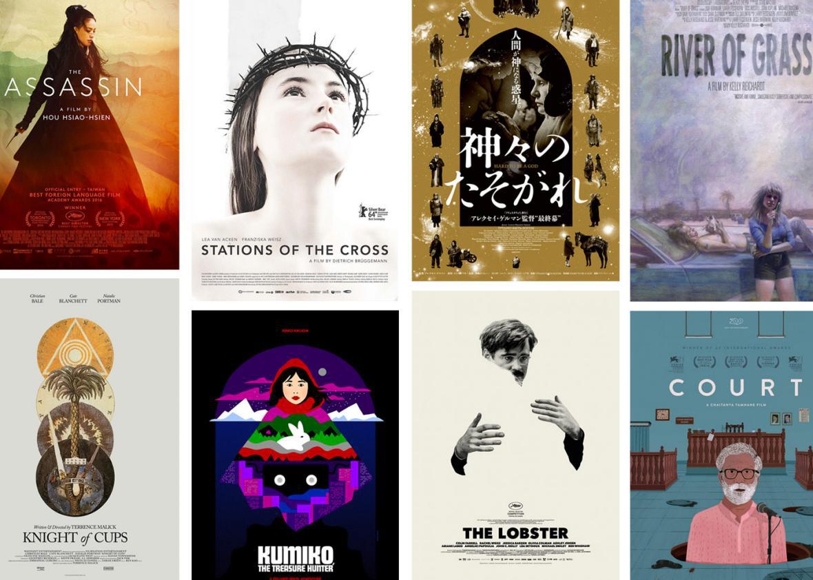
1. The Assassin
Though it doesn’t always follow, the most beautiful film of the year should have the most beautiful poster, and Erik Buckham does Hou Hsiao-hsien right with this gorgeous piece. What looks at first like a combination of photography and illustration is in fact entirely taken from images from the film. Buckham told me “I didn’t want to use any imagery in the poster that did not come from the film itself, so everything you see is taken from screen grabs and some on-set photography.” What I always thought were stylized clouds surrounding Shu Qi are actually elements from an embossed picture of a rooster on a lacquered vase or some similar object. As Buckham confided, “I liked the look of the lines so I cropped in super close and played around with lighting and layer effects to blend it in with the background imagery. It was one of those things where you are just messing around without knowing exactly what you will get and are surprised by something, which to me is usually where the best stuff comes from.” Take a look at a very hi-res version of the poster to really appreciate the fine work in it.
Buckham has designed a number of brilliant posters over the past few years (The Dog, The Art of the Steal and The House of the Devil being among my favorites), and he has topped this list once before, in 2010, with the poster he co-designed with Neil Kellerhouse for I’m Still Here.
Go Digital
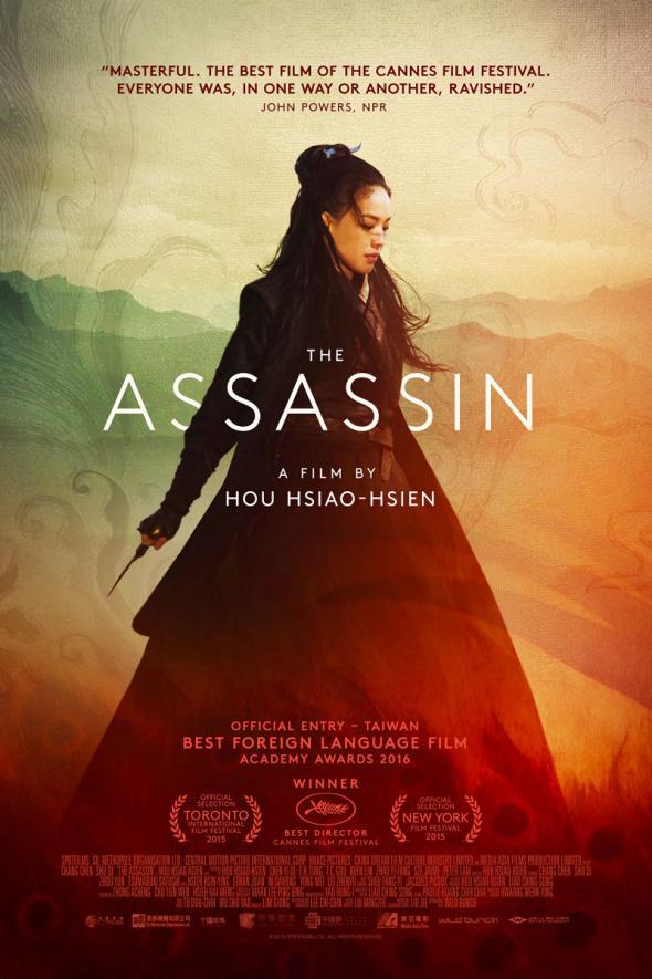
2. Kumiko, the Treasure Hunter
There are remarkable similarities between Buckham’s Assassin and Sam Smith‘s screenprinted teaser poster for Kumiko, none of which I had noticed until I placed them next to each other here: the pronounced triangular structure of the clothing, the mountainous horizon, and of course a beautiful Asian female protagonist. The mock-heroic quality of Kumiko’s quest for the buried loot of Fargo might seem to pastiche a film like Hou Hsiao-hsien’s and thus the poster also, but Smith’s design was created months before The Assassin even premiered at Cannes. Sadly, Amplify didn’t trust the power of this poster, or feared that people would think it was an animated film, and commissioned a more realistic photographic version for the final release.
Alchemy
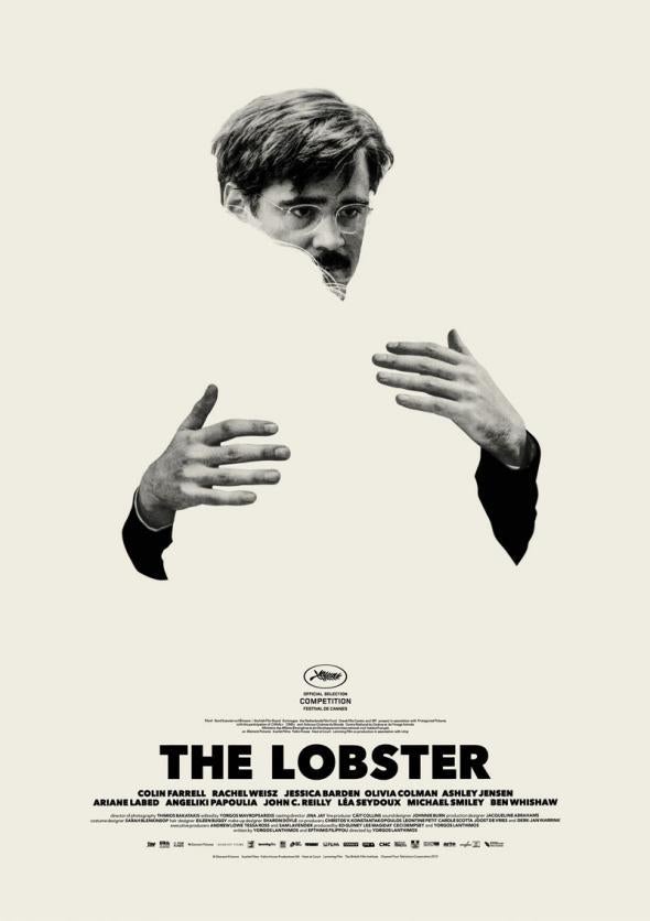
3. The Lobster
Designed by Vasilis Marmatakis, who previously created equally outré designs for Yorgos Lanthimos’ Dogtooth and Alps., this poster is my favorite of the pair that made quite a splash around Cannes-time with their witty use of absence. In an interview on the UK design blog Creative Review, Marmatakis explained that “the main aim on all the posters was to graphically visualise ‘solitude’ in opposition with the need to be ‘with’ someone, and the implications that such notions convey. On the two posters, Colin Farrell and Rachel Weisz embrace someone. The other person might not even be there. During that action of embrace, they might be disappearing, too. I tried to visually imply ‘incompleteness’; the feeling of void and the resulting agony.” That said, I always liked the idea that Colin Farrell might actually be clutching a giant invisible lobster.
Cohen Media Group, Magnolia Pictures.
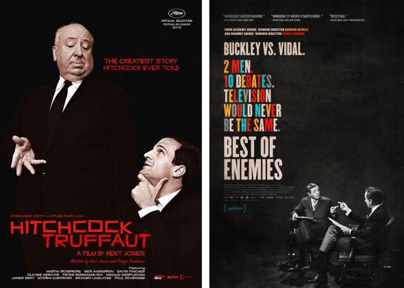
4 & 5. Hitchcock/Truffaut and Best of Enemies
Two remarkably similar posters, both terrific, that use black and white photos, negative space and typography to splendid effect. And not coincidentally both are for documentaries that revive titanic meetings of minds from the 1960s: one about the 1962 week-long discussion between Alfred Hitchcock and François Truffaut which Truffaut turned into his 1966 book Hitchcock (the hardback first edition of which being one of my favorite things), the other about the 1968 televised debates between intellectuals and political antagonists Gore Vidal and William F. Buckley. Notably each poster sports a hyperbolic tagline: “The Greatest Story Hitchcock Ever Told” and “Television Would Never Be the Same.”
Broad Green Pictures
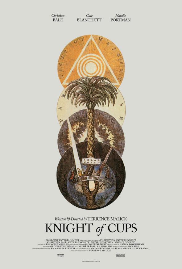
6. Knight of Cups
As if the world of Terrence Malick wasn’t mysterious enough, along came this arcane poster for his latest film when it premiered at the Berlin Film Festival last February. Designed by the artist who goes by the name of Midnight Marauder (as if to add to the mystery), it turns out the image is a 1764 illustration entitled “The Tree Of The Soul” by one Dionysius Andreas Freher, found in a book of the works of the mystic and theologian Jakob Böhme. It was previously used on the cover of an edition of Israel Regardie’s 1932 occult magic text called (wait for it) The Tree of Life. Midnight Marauder came across the image when researching tarot cards and mystical texts (the Knight of Cups is a tarot character). As well as working for Malick, MM creates captivating original alternative art every month for The Film Stage. To bring this page full circle, I particularly like his design for The Assassin, as well as a princely one for the MUBI release of Junun.
Kino Lorber
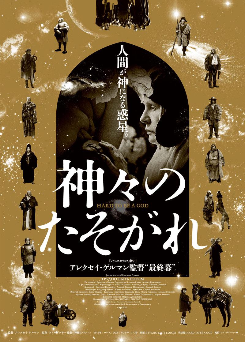
7. Hard to Be a God
The long-awaited posthumous release of Aleksei German’s Hard to Be a God (currently showing on MUBI US) was one of the great cinephile events of 2015. This Japanese poster, designed by Kei Naruse, was the one piece of art for the film that gave it the grandeur it deserved. Look closely at its ragtag cast of characters and you’ll see a film much more deserving of a series of character posters than most of the blockbusters that are routinely saddled with them.
Arrow Film Distributors
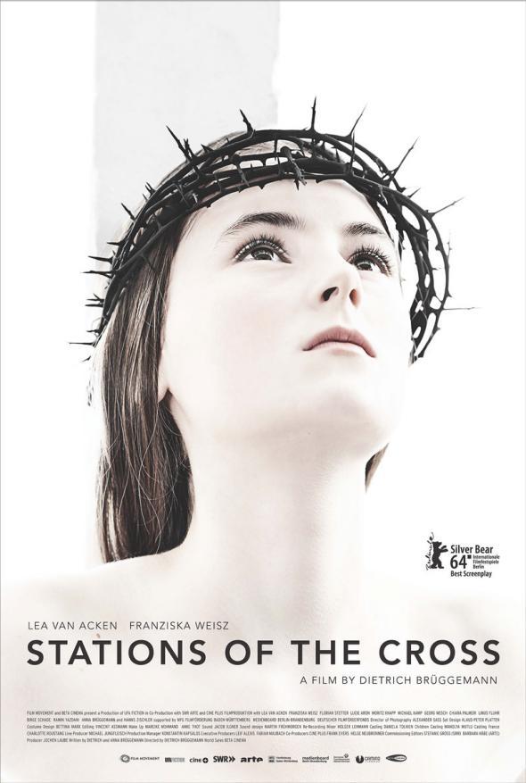
8. Stations of the Cross
With Knight of Cups and Hard to be a God, this feels like a very spiritual top ten, not least with this stunning image for Dietrich Brüggemann’s devastating fable about religious fanaticism. The German version of the poster (art directed by Brüggemann himself, with photography by Nina von Kozierowski) appeared in 2014 when the film premiered in Berlin, but Film Movement released the film this year so I’m counting it. An indelible poster, I love its ethereal, blown-out, high contrast look. And that crown of thorns looks awfully real.
Oscilloscope Pictures
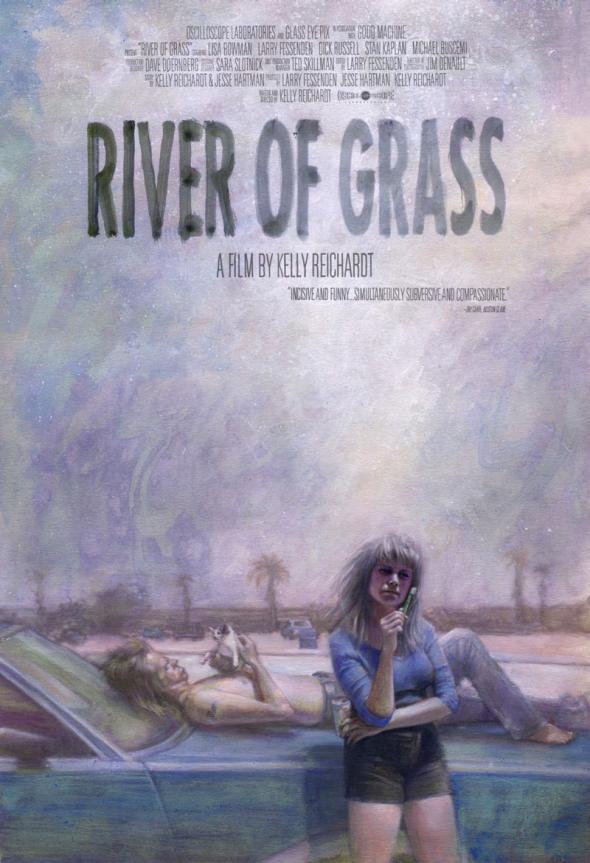
9. River of Grass
For all my love of illustration in movie posters there are only three in my top ten that are entirely illustrated. This painting by Wisconsin-based artist Zachary Baldus for Oscilloscope’s re-release of Kelly Reichardt’s 1994 debut River of Grass is a beauty that seems to sizzle with Florida heat. I especially love its hand-painted title and the fact that all the type, even the billing block, is hand-written.
Zeitgeist Films
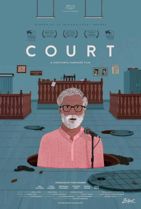
10. Court
Propriety prevents me placing this any higher because I work for the distributor, but since I actually had no hand in the design of this wonderful poster I thought it was fair to include it. Having tried and failed to come up with some designs for the film myself, I know just how hard it was to advertise Chaitanya Tamhane’s brilliant, trenchant film (India’s submission for the Best Foreign Film Oscar) when its isolated still images—as beautiful as the widescreen cinematography of the film is—just couldn’t do it justice. And I know just what a breath of fresh air it was when we first saw this artwork. The illustrator is Nishikant Palande and the piece was art directed by the very hip Mumbai design agency Pigeon & Co.