The much-anticipated fourth and final book in Elena Ferrante’s Neapolitan novels will be released in English on Tuesday. In anticipation of The Story of the Lost Child, I interviewed Sandra Ozzola, co-founder, publisher, and, more importantly for these purposes, co-art director of Europa Editions and Eizinioi E/O, which publishes Ferrante’s novels. (Ozzola and her husband, Sandro Ferri, conceive the idea for the cover art and then work with the graphic designer to create it.) I asked Ozzola via email about the cover design: how they chose the dreamy illustrations, why they intentionally went with something, in Ozzola’s words, “kitsch,” and whether Elena Ferrante, whoever she is, approves of the covers. The interview has been lightly edited for clarity.
You read the first book in the series before it received all the glowing reviews. What was your first impression of the Neapolitan novels?
That we were dealing with a true masterpiece. As gripping as a pop fiction novel but written in an extremely refined language that alternated unadorned, neutral sentences with language that becomes hard, even brutal at times. A book with the power and breadth of a great classic.
With Ferrante’s earlier books—The Days of Abandonment, The Lost Daughter, and Troubling Love—you went in a more abstract direction for the cover design. With the Neapolitan novels you opted for an almost dreamy color scheme, but the images themselves are pretty literal, featuring characters from the book. What was your thought process there?
At our Italian publishing house, Edizioni E/O, we all work together, without significant distinctions between roles. This is especially true when it comes to choosing cover art, which is often done by me and my husband (we’re the publishers) and then developed creatively by our graphic designer. This is an important fact when considering our covers. It’s true, the covers of Ferrante’s earlier books were very different from those of the Neapolitan novels. But the books were different, too. They were more contained; they focused on the experience of a single protagonist; they were more concentrated, I’d say, almost claustrophobic. But with My Brilliant Friend, which corresponds to a different kind of exploration on the part of the author, the atmosphere changes, everything expands, even the protagonist is, I’d say, doubled. We wanted the covers to signal this change.
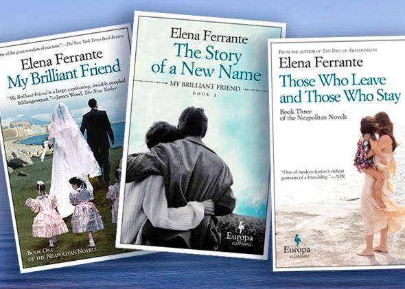
How did you choose the image for the first book, in which you depict one of the final scenes—Lila’s wedding?
From the time of our first conversation with Elena Ferrante about her intention to write this novel, we knew the book’s title and that it would be the story of a long friendship between women—and that it would conclude with a scene of a very vulgar Neapolitan wedding. The wedding and Elena’s impression of it … is an extremely important moment in the book. That’s why I intentionally searched for a photo that was “kitsch.” This design choice continued in the subsequent books, because vulgarity is an important aspect of the books, of all that Elena wants to distance herself from.
What about the other three covers, which feature scenes that don’t stand out to me as parts of the plot quite as clearly?
In the first two books we wanted to highlight the stories of first loves, in the other two, maternity; then, in the last book, the actual existence of the girls gathers weight.
A lot of discussion around the book has been about the friendship between Lila and Elena. Did you ever think of portraying them together?
It took us a long time to find suitable images, and we wanted the two protagonists to be unrecognizable, like the author herself. You can’t see the face of the woman at the center of the story in any of the covers of Ferrante’s books.
Have you communicated with “Elena Ferrante” about the covers? Do you know if she likes them?
Yes, we showed her the covers and she approved them. She trusts us and has faith in our work and she doesn’t intervene much in these kinds of choices, though she does share her impressions. She agreed with our choice to purposefully use “low-class” images. And she was surprised by the doubts expressed by some readers. We also had the feeling that many people didn’t understand the game we were playing, that of, let’s say, dressing an extremely refined story with a touch of vulgarity.
In the U.S., there has been a lot of discussion about the aesthetic differences between covers of books written by men versus covers of books written by women. It’s hard to imagine these four covers on a book written about a man. Is that intentional? And more generally, do you ever worry that book cover art is too gendered?
Perhaps in the case of some covers we reach out to a female readership more explicitly. … But it’s not that important—the choice can also be entirely random. For us it’s sufficient that a cover is done well and that it properly represents the book.