If you’ve gone to the movies or watched a new trailer online in the last month, you might have noticed that the trailer tag—the green screen full of text before the trailer proper starts—looks a little off lately. “Why does this look so weird?” you might have thought. What have they done with our comforting “The following preview has been approved for all audiences”?

The old trailer tag.
Screengrab from YouTube
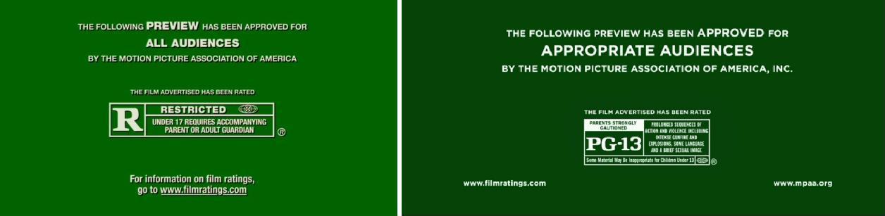
The new trailer tag.
Screengrab from YouTube
A few of us in the office got to wondering what was up with these changes, and so we carried out our duty as journalists: We contacted the Motion Picture Association of America. The MPAA informed us that the design change was part of their new “Check the Box” campaign, which emphasizes the rectangle on the bottom half of the trailer tag, which contains not just the rating but a brief description of any objectionable content. The box lets you know if the movie has things like “language,” “sexy dancing,” or “intense depiction of very bad weather.” The MPAA also removed the drop shadow behind the text, and made some font-size adjustments to emphasize that the preview has been “approved,” rather than the fact that it’s a “preview.” (Most people probably know that a preview is coming, so this last change makes some sense.)
But mostly what caught our eye was the font. It looked more—as one colleague put it—“Wes Anderson-y.” A typeface enthusiast in the art department pointed out that the type was not Anderson’s signature Futura, but appeared to be Gotham, another sans-serif typeface popular in recent years and closely associated with, among other things, Barack Obama’s 2008 presidential campaign.
When we asked the MPAA about the typeface, they said that it was “Myriad Pro, which is a slight alteration from the previous version” and explained that they believe “the change presents the information on screen more clearly.” When we asked them if they were sure about the typeface, because it really looked like Gotham, they told us that we were right, it was Gotham. (Actually, they first told us that we were right, it was “gothic,” but later confirmed that that was just a typo.)
So is the new design any good? It may take some getting used to, but it does seem like an improvement over the old design, which was maybe starting to look a little dated. At the very least all those who edit fake trailers now know what font they should begin to use: Gotham. Definitely Gotham.