The announcement of Apple’s new executive of software development, Jonathan Ive, has sparked speculation that the company will soon overhaul its approach to product design. For years, CEO Steve Jobs and Scott Forstall, whom Ive replaced, created Apple products that, for all their innovations, still included little nods to our technological past: the wooden bookshelf displayed in the iBooks app, the linen-textured background that accompanies the iPhone’s drop-down notifications feature, and so on. According to the Times, Ive has made it clear to those within the company that he is not fond of such outdated touches, and many industry folks eagerly anticipate that Apple might finally take a “fresh” approach to their software design.
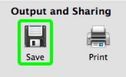
Skeuomoprhs, as these anachronistic features are called, are used to “make the new look comfortably old and familiar.” And they are remarkably durable—and ubiquitous: A delightful Reddit thread earlier this year came up with dozens of icons and gestures that represent technologies now obsolete. Consider the hand-motion/sound combo of the old cash register, which people still use to signify making money (“ka-ching!”); the roll-down-the-windows gesture; and the traditional telephone ring as a cell phone ringtone. Another one of more recent vintage is the “save” icon that looks like a floppy disk. And then there’s my favorite: the scratching sound that occurs when a record is violently stopped, and which now signifies an abrupt stop to something. If you’re my age, chances are you’ve only ever heard that sound in movie trailers.
In the world of high-tech design, such anachronistic quirks are often frowned upon. In the Times piece, Axel Roesler of the University of Washington says that such old-school touches are “like putting horses in front of a car.” Ive and company will most likely do away with Apple’s old features in favor of sleeker, more modern designs that techies will love, and which will no doubt be pleasing to the eye.
Yet for most consumers, these features are helpful and pleasant, not offensive. I prefer the quickened pace at which I can take notes through one of Apple’s notebook apps over actual paper and pen. Still, I use the notebook app precisely for the replication of said lined paper and dividers, because the design pleasantly reminds me of taking notes in class and helps me to better organize my thoughts. Jay David Bolter and Richard Grusin have argued that a new medium cannot be formed without the existence of an older medium from which to draw inspiration. Sure, no one under a certain age owns a home answering machine that uses a cassette tape, if they own such a machine at all. But the iPhone’s voicemail icon indicates a continuity with earlier technologies that people have already mastered. Things change so fast now, it can be hard to keep up. Skeuomorphs are one of the more pleasant little tricks we use to help make make sense of something new.