In early September, it’s hard for New Yorkers to avoid one big reminder of the World Trade Center: the Tribute in Light, an eerie photic imitation of the Twin Towers visible to pretty much anyone within a few miles of downtown. The rest of the year, you can go miles and weeks without spotting any trace of the towers—except, on rare and jolting occasions, on business signs.
The iconic New York City skyline has long been a popular choice for area businesses in search of a logo, and a few businesses have continued to use the skyline not of today, but of 1973 to 2001. After spying a silhouette of the towers on a scaffolding sign in Brooklyn a few months ago, I wondered why. Why maintain a likeness of the towers nearly 11 years after they’d disappeared? Was it an expression of patriotism? Of authenticity? Just a small memorial?
Logos that include the Twin Towers aren’t as common these days as they were even a few years ago. In 2009, artist Ji Lee began collecting photographs of logos that still featured the towers in his World Trade Center Logo Preservation Project. “These logos will not last forever as many of the small business will either update their logos at some point or close their doors,” he wrote. As the Wall Street Journal noted last year, he was right. The Alliance for Downtown New York has changed the L’s in its logo from identical rectangular skyscrapers to incongruent pointed ones. The Mexican chain BurritoVille, whose sign used to feature a couple of sombrero-wearing cowboys riding horses in front of the towers, went bankrupt; New York Video, whose red awning bore a black silhouette of pre-2001 Manhattan, now exists online only.
But a few companies have kept them in. Manhattan Mini Storage, the storage company whose ads are ubiquitous in subway cars, has not changed its wordmark, in which the M resembles the Citigroup Center, the H the Empire State Building, and the T’s the Twin Towers. Why are they holding on to the towers? “We’ve kept the Twin Towers in our logo because they are an important part of Manhattan’s history,” Stacy Stuart, the company’s vice president of marketing, wrote to me in an email. Stuart says the logo hasn’t changed for over 20 years and there are currently no plans to change it. Manhattan, Stuart stressed, is “home for us,” adding, “Customers have told us that our logo is an icon that means something to them.”
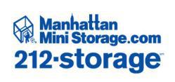
Courtesy Manhattan Mini Storage.
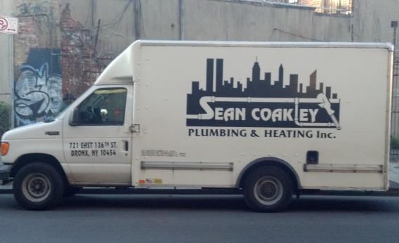
Sean Coakley, the founder and owner of Sean Coakley Plumbing and Heating in the Bronx, says he’s also had some people tell him they like seeing the Twin Towers in the logo plastered on his business cards and on his fleet of 12 vans—but also that some people have asked him why he hasn’t changed the logo. “Out of respect, I would not remove that, no matter what,” says Coakley. “As far as I’m concerned, that’s the New York skyline.” Coakley, who’s originally from Ireland but has lived in New York for 26 years, describes his motivation to keep the logo after 2001 as a combination of respect for the people who died on September 11 and a desire not to forget what New York was like before that day. “The New York lifestyle and everything that goes along with it was much different when we did have the Twin Towers,” he told me, citing increased airport security as just one of many ways Americans’ lives have changed since then. Coakley wants people to remember what life was like before the Twin Towers fell.
Gene King and his partner bought Midtown West pet supply store Metropets in 2007 and changed the name to Pets NYC—but they kept the green awning, which features stylized dogs and cats frolicking in front of the silhouette of the old lower Manhattan. King and his partner moved to New York in August 2001, and King recalls seeing the burning towers from a train window the morning of September 11. Having had this experience strengthened his attachment to the logo. “We just felt like it was important to keep it … It was kind of like an homage,” he told me. King has considered revamping the awning, but he and his partner are intent on keeping the towers there even if they update the design.
Those two identical rectangles are unique in their ability to elicit strong emotions, but the exact emotions vary enormously from person to person. Lee describes experiencing “a strange mix of sadness and joy” whenever he sees a logo with the Twin Towers. For me it’s more like sadness and shock. For King, the Metropets logo inspires something very different. “For me it’s just a remembrance thing,” he says. “For me it’s a positive feeling when I look at it.”