Starting in her early 20s, Louise Fili spent years wandering the streets of Paris, photographing the beautiful old signs she saw along the way. She was beginning to discover graphic design at the time, and her documentation of the vernacular signs was for for her own reference and enjoyment.
“This is a city that has possessed exquisite taste and style, for a long, long time,” she said via email.
Over the years, however, Fili noticed that many of the signs she loved were starting to disappear and that digitally rendered, clumsily crafted letterforms were taking their places. That’s when she started thinking about cataloguing her favorites in a more permanent way to preserve their memory for future generations. That led to her book, Graphique de la Rue: The Signs of Paris, which Princeton Architectural Press will publish in October.
Louise Fili
Louise Fili

Louise Fili
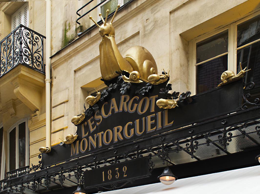
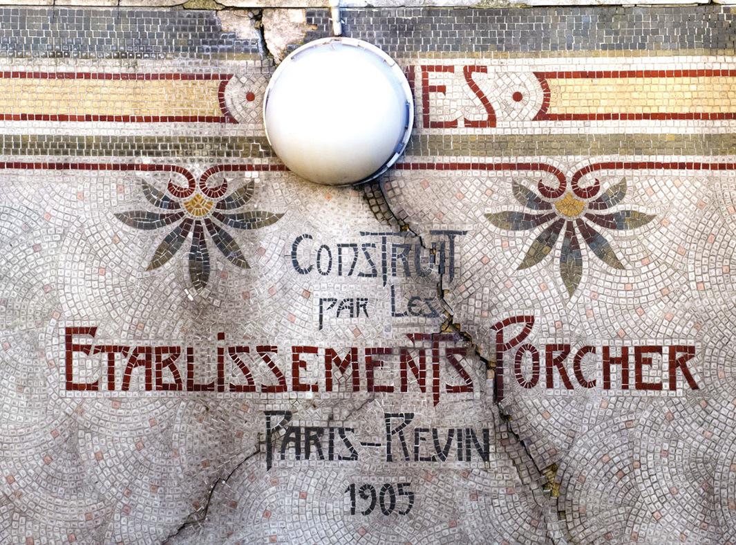
Since she started photographing, Fili notes that signage in the City of Light changed more rapidly than she’d ever expected. Neon signs, which are much more fragile than their wood and metal counterparts, tend to be replaced every decade or so, and “never for the better.” Mosaics, however, have more staying power, and she discovered many beautiful examples for her book.
“It’s hard for me to accept the demise of some of the more iconic signs. One in particular, a neon script for a tabac in the Marais, saddens me every time I walk by its former location. I have it in the book in the ‘Avant et Après’ section. The replacement sign, an especially mediocre typographic display, makes me wince,” she said.
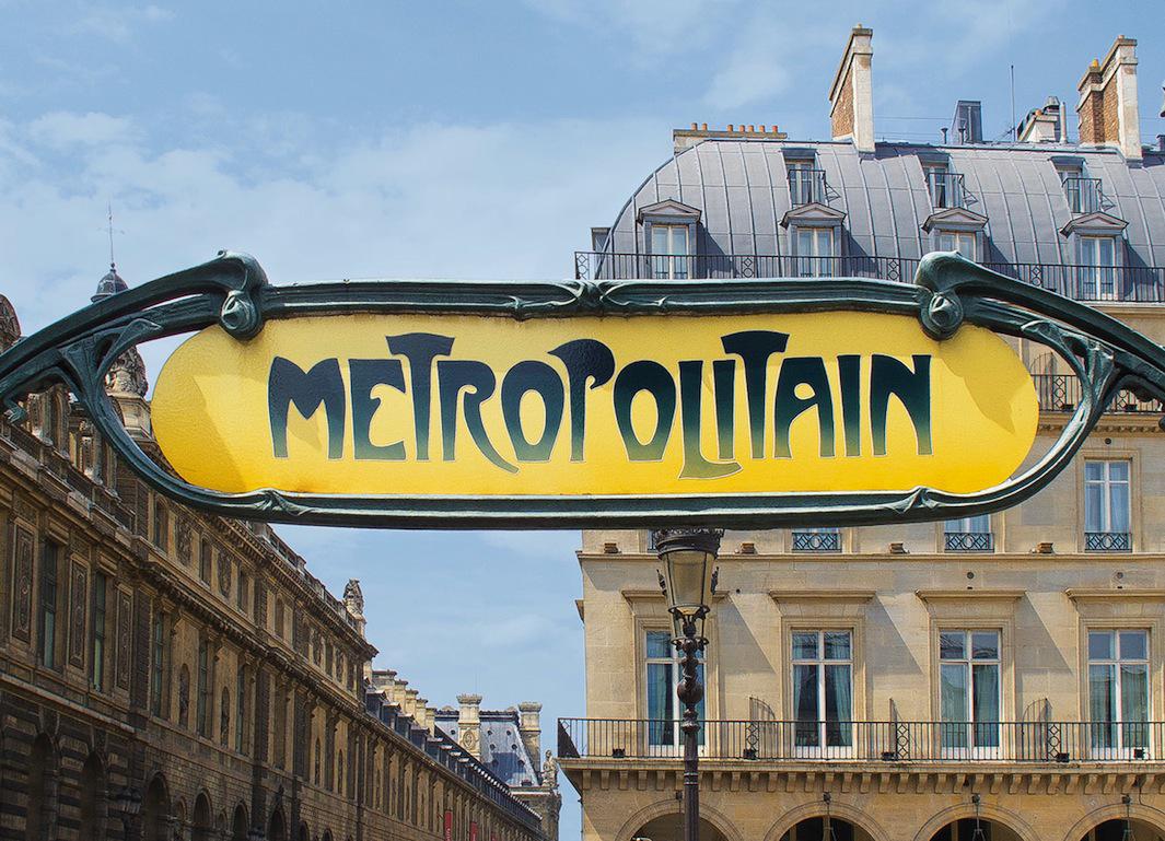
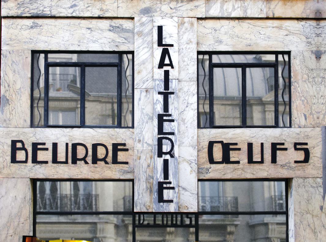
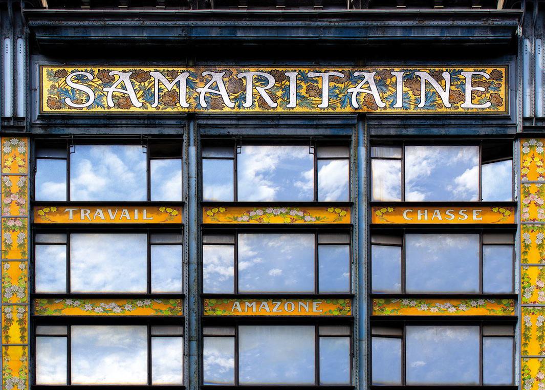
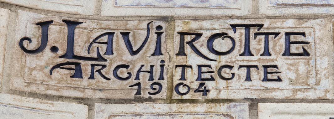
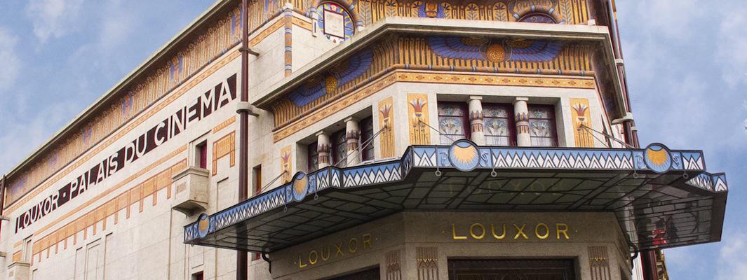
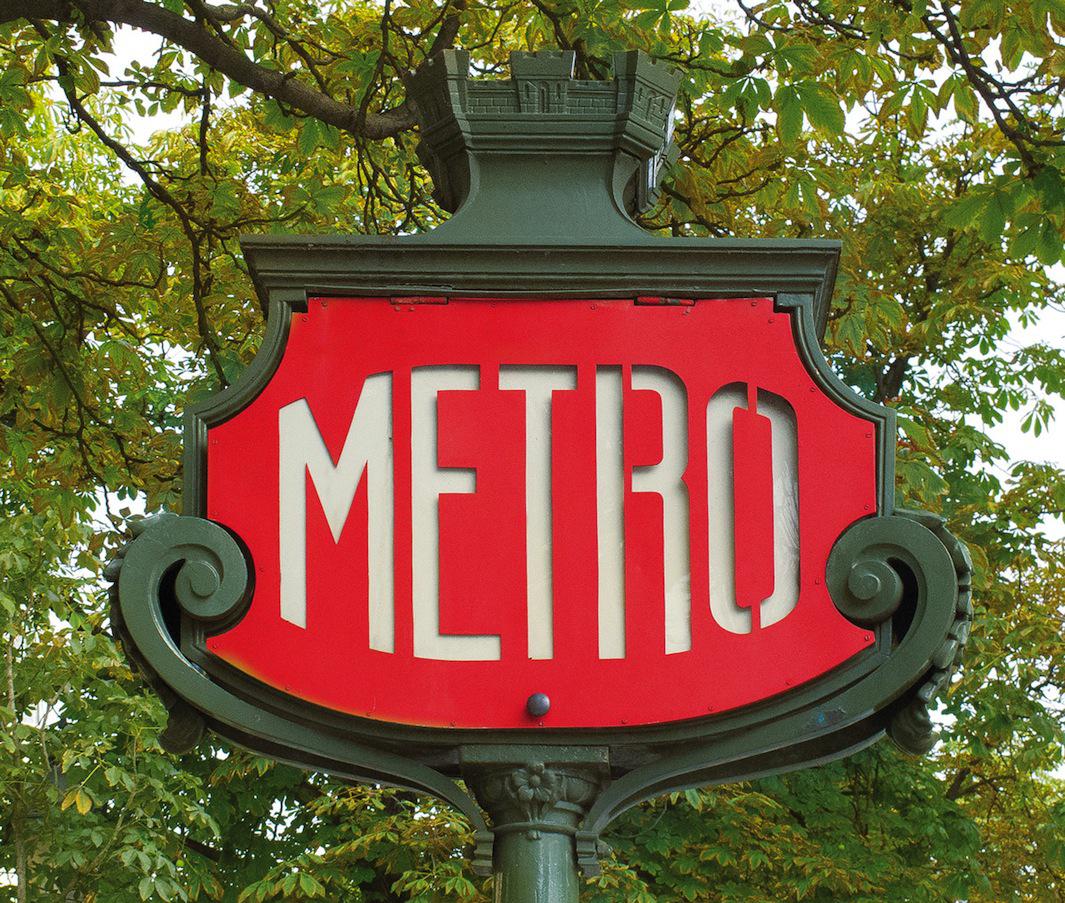
When Fili started working on her book, she was determined to find as many undiscovered signs as possible, so between trips to Paris, she roamed the streets virtually from her desk in New York using Google Street View. Among the signs in the book are Hector Guimard’s iconic entrances to Paris Metro stations as well as those featuring Art Deco, Futurist, and Art Nouveau architectural lettering.
Louise Fili
Louise Fili
Fili has also spent lots of time in Italy, and she documented the signs she came across there in her book Grafica della Strada. In the Italy book, she said, eclectic signs—those which “shake up the typographic status quo”—comprise the biggest chapter; in the Paris book they make up the smallest. Further, ghost signs, which are hand painted on buildings, “seem to be part of Italy’s DNA,” while in Paris they are essentially nonexistent. “Paris typography is definitely a proper grande dame, while Italy is the winsome artiste with an ever-changing repertoire.”
Fili will be signing copies of her book at the Designers & Books Fair at the Fashion Institute of Technology in New York City on Oct. 3 at 3 p.m.
Louise Fili
Louise Fili
Louise Fili