Even after all this time—13.8 billion years, give or take—hydrogen still dominates the Universe. It’s the simplest element, and the most abundant. It fuels the stars, which convert it into heavier elements like helium, iron, calcium, and more. It’s strewn between the stars and even between the galaxies themselves.
To know hydrogen is to know the Universe.
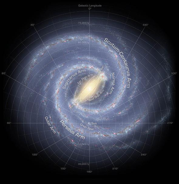
This is no exaggeration. Hydrogen in deep space hums in the radio region of the electromagnetic spectrum, and that can be detected by radio telescopes. This is incredibly useful: For example, we discovered our own Milky Way galaxy was a spiral by tracing the hydrogen gas, which outlines the majestic, sweeping arms (for more, go watch my Crash Course Astronomy episode on the Milky Way).
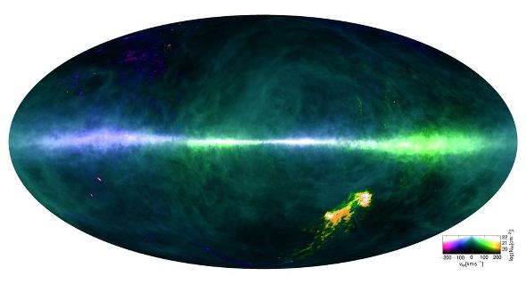
The image at the top of this article is a new map of the entire sky made by tracing the radio emission of hydrogen. Two huge telescopes—a 100 meter Effelsberg telescope in Germany and the 64-meter Parkes telescope in Australia—covered both hemispheres in great detail. In this map the spherical shape of the sky is, in a sense, unpeeled and shown as an ellipse, which is a convenient way to show the whole sky in a 2-D way.
When done this way, the Milky Way stretches directly across the middle of the map. The galaxy is flat, and we’re in it, so we see it as a line across the sky. In this “galactic coordinates” map, the center of the galaxy is in the map center. You can see the hydrogen gas of our two companion satellite galaxies to the lower right, and the tiny smears to the lower left of the Andromeda and Triangulum galaxies, two nearby spiral galaxies not too dissimilar to our own.
Now I need to show you something, because this is utterly, utterly cool.
Hydrogen emits light at a very specific wavelength: 21.106114 centimeters. This far longer than the wavelength of the kind of light we see—a half-million times longer! That’s why we need special telescopes to see it.
Effelsberg and Parkes are both very sensitive telescopes, and they can also detect minute changes in the wavelength of the light. If a hydrogen atom is moving toward us, the wavelength shortens a bit, and if it moves away it lengthens. This is related to the famous Doppler effect (see Crash Course Astronomy: Light for all about that).
The map above uses colors to represent that. The colors aren’t real; they just represent the velocity of the gas. Hydrogen colored blue is headed toward us; green is where it’s moving away. When I first saw this map, I saw the broad green line on the right and the blue one on the left, and realized that what it shows is the Sun’s motion as it orbits the center of the galaxy. We’re moving at about 200 km/sec around the galaxy, so we’re approaching gas on one side of the galaxy, and moving away from the gas on the other side. Neat!
But then I saw the gas closer to the center. The colors are reversed! On the right side of the map, the gas is blue until a third of the way out then switches to green outside of that. What the what?
NASA/JPL-Caltech/R. Hurt (SSC/Caltech)
Then I laughed when I figured it out. We’re not the only object in the galaxy in motion! All that galactic gas is orbiting the galactic center as well. Stuff near the center is orbiting faster than we are, and stuff farther out slower. The blue gas on the right is inside our orbit, moving faster than we are, so it’s catching up to us, approaching us. But the gas colored green is outside us, moving more slowly, so we’re leaving it behind.
I know this can be hard to picture in your head, but the beauty of it is that once you do, this map sings. You can instantly see what’s what: the motion of the gas, where it’s more dense than other locations, how it’s distributed. It also shows our location in the galaxy! All those changing velocities depend on the Sun’s velocity, the velocity of the gas, but also the direction of the Sun’s motion and its position in the Milky Way’s disk. That’s a stunning amount of information.
Maps like this allow astronomers to puzzle out the structure of our galaxy, and the dynamics of the gas inside and out, and even what other galaxies are doing as well.
I really wasn’t overstating the case: To know hydrogen is to know the Universe. Sometimes it’s the simplest stuff that leads to the most profound understanding.