
I know it’s funny to read this when the East Coast of the U.S. is shoveling out from under a blizzard, but that doesn’t make it any less true: 2015 was the hottest year on record for the planet. And not only the hottest, but blasting through the previous record, held by … the year before. 2014.
No matter how you slice it, how you analyze it, last year was by far the hottest year on record. Here’s a graph showing combined land and ocean surface temperatures:
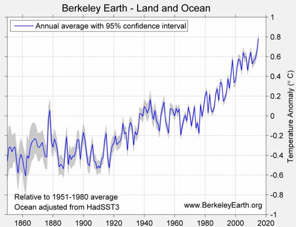
Graph by Berkeley Earth
That shows the temperature anomaly—the variation from an average (in this case, from 1951–1980)—of the Earth going back to 1850. As you can clearly see, 2015 spikes up at the end, showing a huge jump in temperature even from just last year (which, I remind you, was a record-breaker itself).
Of course, single records aren’t as important as trends. In this case, the trend is incredibly obvious: up.
This graph was put together by the notoriously conservative Berkeley Earth project (which was originally created questioning the global warming consensus among scientists, I’ll note). But even they were unequivocal about 2015 setting the record.
And it’s not just them.
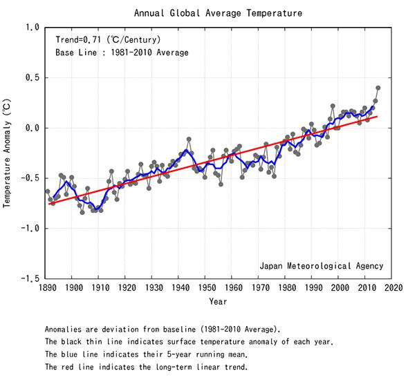
Graph by JMA
That graph is by the Japanese Meteorological Agency, and also shows the temperature anomaly (using the average from 1981–2010, which is hotter than the average from 1951–1980 due to global warming), and again shows 2015 poking its head up above the crowd.
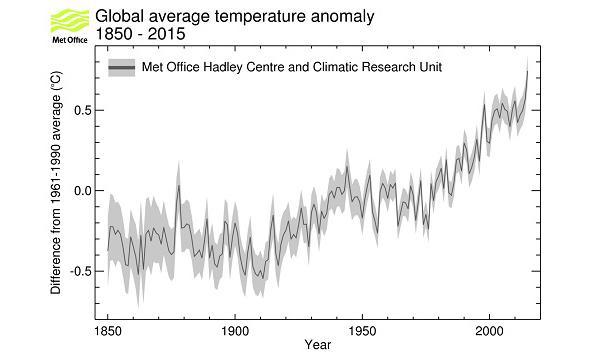
Graph by the U.K. Met Office
The graph above is by the U.K. Met Office (this uses an average from 1961–1990). Look familiar?
Here’s NASA’s version, using the GISS temperatures:
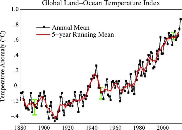
Graph by NASA
Huh.
If you prefer your data in animated form, here’s a video put together by NASA showing the change in average temperatures from 1880–2015:
NOAA reports that the margin by which 2015 broke the hottest annual record is also the largest on record—it’s not just the temperature that broke the record, it was the spike itself that was the largest in historical documentation. They also report that the 16 hottest years since 1880 have all occurred in the past 17 years. Only 2000 didn’t make the list.
In other words: It’s getting hotter, and 2015 blew us away.
As it happens, we’re in the midst of a pretty strong El Niño, which tends to raise temperatures. How big an effect did that have? Climate scientist Gavin Schmidt looked into that, calculating the impact of El Niño on temperatures, correcting for it. He created this graph:
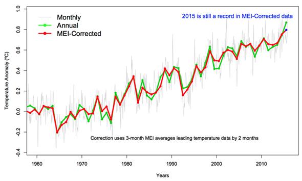
Graph by Gavin Schmidt/NASA/GISS
As you can see, the corrected (red) temperature anomaly is still a record breaker. Even without El Niño, 2015 would have been the hottest year on record. While there’s an effect, of course—El Niño only accounts for about 0.07°C of extra temperature—it’s not the primary reason 2015 was the hottest year on record.
The primary reason is global warming.
NASA posted a graph showing this as well:
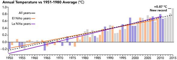
Graph by NASA
Note the red line: That’s a fit to the average temperatures using just years where there were El Niños. Note the trend! It goes up. If this current heat were just due to El Niño, that line would be horizontal. Instead, we see even those years getting hotter with time. That’s because the planet is getting hotter.
So there you go. The facts are in. Really, they have been for a long, long time. The globe is warming. We are pumping CO2 into the air to the tune of 40 billion tons per year, and that stuff stays up there. It lets light through from the Sun that heats the ground, but then won’t let the thermal infrared radiation escape into space. The Earth can’t cool down, so it gets hotter.
The oceans are absorbing that heat. They’re expanding, with sea levels rising. They’re acidifying as they try to absorb the extra CO2. The warmer water and air is melting ice at a devastating pace at both poles. We’re seeing weirder, wilder, more extreme weather (and yes, the East Coast blizzard has its roots in warming as well; warmer water means more moister evaporates into the air, and when that meets cold arctic air you get even more snow).
So look again at those graphs. They are far more than just squiggly lines; they are our future. That’s us in those graphs, and the new, hotter world we are creating in which we must live.