A series of new Hubble Space Telescope images of Jupiter were recently released, and holy jumping jovian gas giants they’re cool.
The images are part of a new campaign to take yearly snapshots of the outer giant planets (including Saturn, Uranus, and Neptune) as a way to look for changes in their atmospheres over time. All four have tremendously thick atmospheres, so we only see the tops of their dense, opaque clouds. They change all the time, but sometimes there are persistent features that nonetheless can be seen to slowly morph over the years.
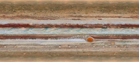
The shots were taken of Jupiter using different color filters in such a way that the entire “surface” of Jupiter could be seen over time. These were combined to create a global map that is simply stunning. Here’s an animation created using those images, mapped onto a sphere*:
A couple of features are highlighted in the animation that are worth exploring a little more.
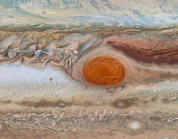
Photo by NASA, ESA, A. Simon (GSFC), M. Wong (UC Berkeley), and G. Orton (JPL-Caltech)
For example, obvious in the animation is the Great Red Spot on Jupiter, a gigantic hurricane far larger than our entire planet (only on the ridiculously huge Jupiter could something that big be called a “spot”—well, and the Sun, I suppose). I’ll note that this photo is only a tiny section of the full-size images, which I heartily recommend you download.
We’ve known for some time that the spot is shrinking. It shrank quite a bit from 2012 to 2014, but from these new photos we can see that in the ensuing year the shrinkage has dropped. It’s still getting smaller, just not as rapidly.
A new feature has also appeared in the spot: a long wisp that you can see coming in from the right hand side of the spot. It appears to feed into the center, which is interesting; the “core” of the spot has been seen to be fading in certain colors. The coloring of the spot is due to the chemicals in it, but the details aren’t well understood.
Another feature seen in the images took me a second to figure out, but it’s worth it. Here’s a “non-natural” color image of the region of interest:
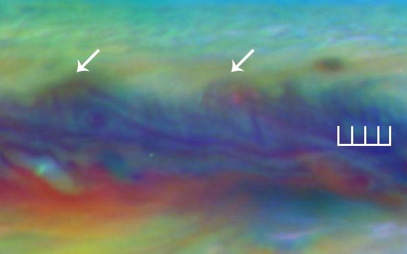
Photo by NASA, ESA, A. Simon (GSFC), M. Wong (UC Berkeley), and G. Orton (JPL-Caltech)
The arrows point to cyclonic storms, circulating patterns several thousand kilometers across (a large terrestrial hurricane would be about the size of the arrowhead in this image, just to destroy your sense of scale). Going across the middle of the photo are faint vertical streaks, shown by the comblike indicator. Dozens of these regular dark lines run across the cloud tops of Jupiter, stretching in a row for tens of thousands of kilometers.
These are actually waves! It’s some sort of stream of gas that is bobbing up and down, like waves on the ocean. It may originate in the layer just under the clouds, and we see the crests as they move up into the cloud deck. It was first seen in images taken by the Voyager 2 probe in 1979 but hasn’t been seen since. It may be similar to what’s called a baroclinic wave in Earth’s atmosphere, which is a wave that occurs when you have a rapidly rotating, stratified (layered) fluid—just like Earth’s atmosphere (which rotates with the Earth). Baroclinic waves are important in the creation of cyclonic systems, and we do see those forming just north of this wave feature on Jupiter!
Amazing. Jupiter seems like it’s as different a planet from Earth as any two planets can be, yet there are many similarities. Physics doesn’t discriminate; the same equations govern rotating fluids whether they’re on Jupiter or worlds smaller and warmer. It’s just the input parameters that change.
I’m excited about the prospect of getting annual checkups on the outer planets. They tend to surprise us—giant storms pop up on Saturn and Uranus, while Jupiter sometimes loses an entire belt—so keeping an eye on them sounds like a good idea.
And, I’ll add, once the JUNO mission arrives at Jupiter in 2016, NASA will not have a single spacecraft mission planned to visit the outer planets. Not one. Given that it takes many years to design, build, and launch such a mission (not to mention the travel time of years or even decades), it’ll be a long, long time before we get a close-up look at these worlds. We should take whatever chance we can get to spy on them.
*The animation bugged me for a sec until I realized they mapped the images onto a sphere. Jupiter is an oblate spheroid, noticeably flatted due to its rapid rotation and low density. It’s actually about 9,000 km wider across the equator than through its poles, a difference of more than 6 percent.
Correction, Oct. 16, 2015: Just above, I originally misstated that Jupiter is 5,000 kilometers wider along its equator, but it’s slightly more than 9,000.