A weird animated graphic depicting a distorted, lumpy Earth has gone viral over the ‘Net in the past few days, claiming that this is what the Earth looks like “without water.”
There’s only one problem with it: nope. Nopity nope nope nope.
That’s not at all what it shows. What it actually depicts is the Earth’s geoid: a way of describing Earth’s gravitational field. The original graphic is a product of the MATLAB package described by Ales Bezdek (credits at that link). Here it is in all its knobby goodness:
Earth’s gravity isn’t smooth at the surface but is stronger in some places than others. That’s because the Earth isn’t a perfectly homogeneous sphere (that is, the exact same density throughout its interior) but has some places where it’s more dense and places where it’s less dense. That affects the surface gravity.
When you stand on the surface of the Earth, it feels like gravity is pulling you down to the center. But if you stand next to a denser region, its gravity pulls you a little bit to the side, away from the center. The geoid in the viral graphic shows this; in that map gravity always pulls you perpendicular to the surface depicted.
I know that sounds weird, but basically it’s saying that if you’re on the side of a “hill” shown in the geoid graphic, a plumb bob (a heavy weight tied to a string) will not point toward the center of the Earth, but perpendicular to the surface where you’re standing. The actual graphic is hugely exaggerated on purpose, making it easier to see the Earth’s lumpy gravity field.
I have to laugh (if somewhat ruefully). One thing I find whenever some wrong science factoid goes viral is that it’s usually exactly wrong; it states the opposite of what’s actually going on. That’s true here! How?
Another way to describe the geoid is that it’s the shape of an object if it’s perfectly fluid; if the surface is allowed to flow freely.
For a perfectly homogeneous object (say a big nonrotating drop of water in space) the geoid would be a sphere. For the Earth, well, it’s what’s shown in the graphic. In other words, that graphic doesn’t show the Earth without water, it shows what the shape of the Earth’s surface would look like if the surface were entirely covered in water.
See? Exactly wrong.
It’s easy, given the caption, to think that this is what the Earth’s solid surface under the oceans looks like. But look at the scale bar in the graphic; it goes from about +80 meters to -80 meters. That’s a teeny tiny fraction of Earth’s size. In physical reality, even if the Earth were covered in water it wouldn’t be anywhere near as lumpy as depicted. Again, it’s exaggerated for clarity.
Think about this, too: The deepest part of the Earth’s ocean (the Mariana Trench) is about 10 kilometers deep. The Earth is nearly 13,000 kilometers across! Take away all the water from the Earth’s surface and you’d hardly notice; the elevation difference between the highest mountain and lowest point in the ocean is less than 20 kilometers, about a tenth of a percent of the Earth’s diameter.
Here’s what the Earth would really look like without water.
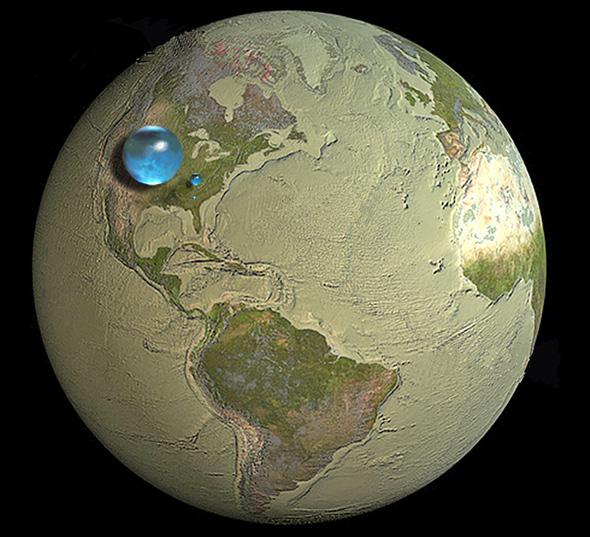
Graphic by Howard Perlman, USGS; globe illustration by Jack Cook, Woods Hole Oceanographic Institution; Adam Nieman.
And yes, that drop is the size of the sphere you’d get if you extracted all the Earth’s ocean water (as well as atmospheric water vapor, lakes, ice caps, and so on). It’s not much compared with the whole planet, is it?
The lesson here? Beware of factoids without evidence to back them up. Also beware of science factoids presented by nonscience sites. Heck, beware of them even from science sites; we make mistakes sometimes.
But be super-duper skeptical of stuff on the ‘Net given without attribution, too. That usually means it’s been through at least one layer added by someone who doesn’t necessarily understand what they’re writing. It could even be something just made up out of thin air.
And that usually means … it doesn’t hold water.
Note: I think this was originally posted to Twitter by 9GAGGifs, a site where people can upload images without any attribution, practically guaranteeing stuff that abuses science can go viral with virtually no fact-checking. (I’ll note I don’t have anything against such sites in theory, but in practice a lot of stuff is posted without attribution, which, not to put too fine a point on it, sucks.) It was then picked up by DesignTimes, a Twitter feed that, upon my inspection, also appears to commonly post stuff without attribution (or, in this case, fact-checking).