Sometimes, it’s the little things.
I got an email the other day from someone who works with Google, telling me some cool news: They’ve updated their search results about health conditions. They now provide information that’s curated and vetted by doctors, including the Mayo Clinic!
That’s fantastic. So, for example, when you Google “measles,” the first couple of results are (as usual) news items, then links to the Centers for Disease Control and Prevention, the Mayo Clinic, and Wikipedia. I’ll note that when I dug down a few pages in the results list, there still wasn’t a single anti-vax site to be seen. Nice.
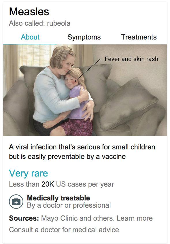
Photo from Google
Another good part is that off to the right there’s added information from a database called a “Knowledge Graph” by Google (I took a screengrab, shown above). You can get more about symptoms and treatments, and under a drawing of someone with measles is this wonderful line:
A viral infection that’s serious for small children but is easily preventable by a vaccine.
Emphasis mine. That’s great. Little tidbits like that used casually—especially by Google—can go a long way toward marginalizing views that damn well ought to be marginalized. On the Google blog (linked above), they say that 1 in 20 searches are for health issues, so this update by them is hopefully going to have a very long reach.
I’ll note that Google contacted me because they saw my article about Kristen Bell advocating for vaccination. That too makes me happy. As you can imagine, the comments I get whenever I post about vaccines (in the blog comments as well as on Twitter and Facebook) are not always reality-based. It’s really great to know that Google is on the side of science. That’s not a surprise, but it’s still nice to see them doing their part. They obviously have a vast amount of leverage, and they’re using their powers here for good.
Update, March 4, 2015, at 17:00 UTC: I should note that these results are only for the U.S., and are optimized for mobile. I checked using an iPad, and they do format quite well.
Update 2, March 4, 2015, at 20:30 UTC: To be clear, the graphic on the right is not the “Knowledge Graph”; the database is called that. I changed the phrasing in that sentence for clarity. Also, the mobile app allows you to use voice search, which is pretty cool; as I was told, it’s pretty helpful if your hands are full holding a small child or you’re not sure how to spell something. :)