Just the other day I wrote about the good folks who create video at NASA’s Goddard Space Flight Center. And now I get to do it again: They just released their Dial-a-Moon page for 2015, which lets you display the hour-by-hour appearance of the moon for the entire year.
They also put out a video compiling all the images for the year into a single animation. You might expect it to look like the Moon is just sitting there, with the phase changing as the terminator (the day/night line) sweeps across its face. But that’s not what you get at all. Watch:
Trippy!
The Moon orbits the Earth in the same amount of time it takes to spin once. This means it always shows us the same face … except not really. The Moon’s rotation is constant, but the velocity it travels in its orbit around the Earth changes because that path is an ellipse. When it’s closer to Earth it moves faster, and slower when it’s farther away. This mismatch lets us peek a bit “around the side” of the Moon. The Moon’s spin axis is also tipped a bit with respect to its orbit, and that allows us to see over the northern and southern poles, too.
When added together, you get that mesmerizing nodding and weaving motion, which is called libration.
The video has some nifty extras too. At the top left it shows the Moon’s position in its orbit around the Earth, as well as the phases of both the Earth and Moon.
Behind the big Moon in the center is a line representing the Moon’s orbit seen edge-on. On the left is the Earth, and on the right it shows how far away the Moon is, in units of the Earth’s diameter (12,740 kilometers or 7,900 miles).
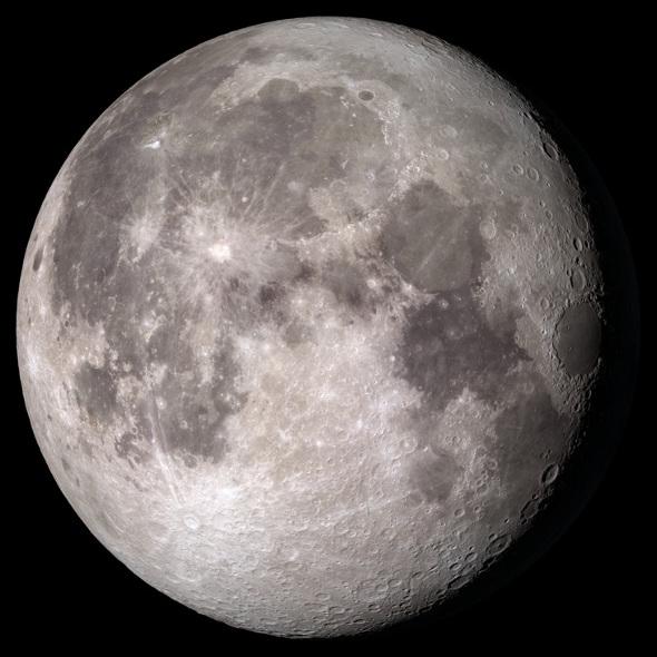
On the bottom left is a diagram of the Moon, with a blue and yellow dot; the blue is the sub-Earth point and the yellow is the sub-solar point. In other words, if you were standing on the Moon at the position of the blue dot the Earth would be exactly overhead, and if you were at the yellow dot the Sun would be directly overhead. Note that when the Moon is full to us on Earth, the yellow dot is smack dab in the center near the blue dot: The Sun is shining straight down on the half of the Moon we see. When the Moon is new (completely dark), the yellow dot is on the far side of the Moon; the Sun lights up the half we can’t see, and the half facing us is dark.
Finally, on the lower right are lots of fun numbers: date/time, the phase (percentage of the Moon illuminated as seen from Earth), how big it appears, how far it is, and so on.
If you’re planning any detailed lunar observations, the GSFC page is pretty useful. I know I’ll use it to plan our future Science Getaways trips; we try to schedule them around new Moon so we can see the stars when I take my telescope out.
And even if you don’t need that kind of detail, this is just a way cool thing to have around. There’s also a video that shows just the Moon without any of the annotation, and a view as seen from the Earth’s Southern Hemisphere as well, with the Moon upside-down. Wacky Southern Hemisphereans.
And don’t forget this is a simulation, based on images taken by the Lunar Reconnaissance Orbiter. The real thing is even better, so go outside and look! You may get inspired. A couple of friends of mine were.