Literally just the other day I was wondering how much global warming has occurred in my hometown of Boulder, Colo. Those data are available, but not in a very user-friendly form, so I tabled the idea.
And then just yesterday comes the news (via Climate Consensus) that a very friendly form is available: Google Earth! This is software that maps the Earth with pretty high detail, and allows the user to poke and prod the planet, zooming in and out, looking at maps, satellite imagery, and more. You can use it in your browser, or download it to your computer and open it as an app.
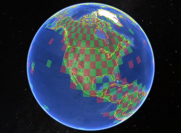
Image from Google Earth
Google Earth also has what are essentially expansion packs, added layers that can show different information. These are called KML files, and once you download them you just open them with Google Earth, and voilà: Tons more info is at your fingertips.
The University of East Anglia Climatic Research Unit has just released a fantastic new layer that maps out local temperature changes over the past few decades for areas all over the planet (right-click and use “Save As” on that second link; you’ll need Google Earth to open the file). It breaks the world up into a grid of latitude and longitude boxes 5° on a side (marked in alternating red and green). Click in the box, and a pop-up appears with information in it; you can look at temperatures for that grid location averaged annually or season by season. You can even get that data in table format.
The temperatures are plotted as an “anomaly,” that is, a deviation from average. They take the data, find the average value over the years 1961–1990 (called the baseline), then plot the temperatures with that average subtracted. That makes it far easier to see changes in temperature. If a year has an average temperature of, say 20 C, and the baseline is 19 C, then that year has an anomaly of 1 degree.
Now, guess where this is going?
Yup. I started poking around the data, and over and again, what I saw was what I expected: Decades ago, in general, there are fluctuations around the mean up and down, but in the past few years there’s a pretty big upward jump in temperatures. That’s not true everywhere—statistically, you expect different values over time and location—but the overwhelming conclusion is that the past decade or so is hotter than the ones before it … exactly as we already knew. Nine of the 10 hottest years on record have been in the 21st century.
Here’s the temperature graph for Boulder:
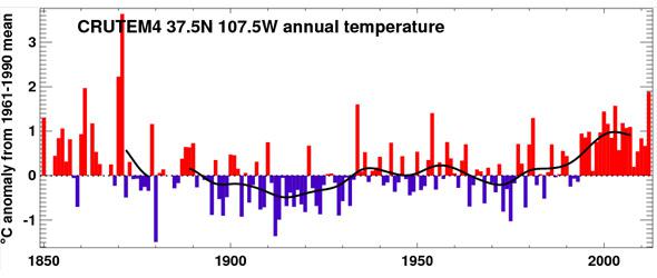
Image from Google Earth/EAUCRU
There are plenty of spikes, but those go up and down year to year. You can clearly see the recent trend of heat in the past 15 or so years, for a 1 C or so rise.
I also knew that the Arctic regions are more sensitive to global warming than lower latitudes, and that’s obvious too in the map. Temperature measurement coverage is sparser in the far north (more on this in a second), but still, nearly everywhere I clicked in the Arctic the temperature jump in the past 10 years or so is larger and more obvious. Here’s one I grabbed more or less at random, for a grid in north Alaska:
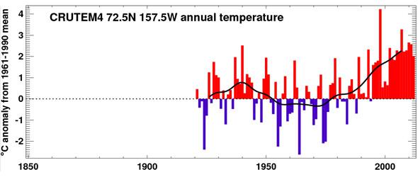
Image by Google Earth
Other grids farther north show an even greater rise in temperature over time.
I expect deniers will decry this new bit of accessible information, claiming the data have been manipulated, or calibrated improperly, or whatever they can say to cast doubt. But the fact remains that the data have been tested over and again, analyzed every which way by scientists from all over the world, and when honestly evaluated the conclusion is always the same: The data are robust, and the Earth is getting warmer.
I expect too to hear more about the so-called global warming pause, but as has also been shown, this is more fantasy than fact. First, you expect some ups and downs in temperature over time; you have to look at the overall trend, which is clearly toward higher temperatures. Also, the low coverage in the Arctic as I mentioned earlier affects the results; the Arctic is warming faster than the Earth overall, and when you account for that, it weakens the “pause” and shows the warming more clearly. Finally, we also know that the lion’s share of the heat from warming is getting stored in the deep oceans, not the Earth’s air, so measuring surface temperatures is not the best way to look at warming. You have to look at the whole planet, not cherry-pick one part of it, or from one small slice of time.
The facts are in, and the science is clear: The planet is getting hotter. The Google Earth app will help make that even more obvious. I urge folks to get it and play with it. Facts don’t speak for themselves, but this app helps give them a voice.