
Last week, I posted about ten failed climate change denial arguments. It was a video made by Hank Green and does a great job slapping down some of the ridiculous claims you still see polluting newspaper editorial pages and denial blogs (for examples, see here and here and here).
One argument Hank brings up (at the 1:44 mark), and one I’ve hammered on a few times as well, is this idea that we’re in some sort of global warming pause. This is a claim that gets some traction, because when you look at land surface temperatures over the past few years, they haven’t gone up as quickly as they have in the past.
However, using this measurement to claim that global warming has stopped, or even just paused, is wrong. The good folks at NASA Goddard recently posted a video interview with climate scientist Josh Willis to put this claim to rest:
I like it; it’s quick, breezy, and hits the high notes. But I’d like to add my own $0.02 to it here.
The bottom line is: No, we are not seeing a pause in global warming. Here’s the graph that’s causing so much grief:
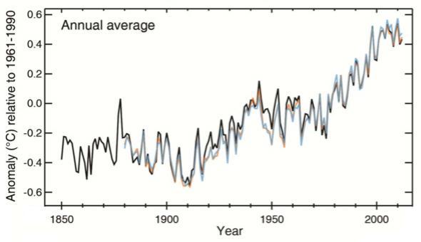
Graph from the IPCC AR5 report
This plot shows the land and sea surface temperature “anomalies”, that is, deviations from an average (in this case, the temperatures averaged from 1961 – 1990). When you look at just the past few years — way up there to the upper right — you see the ocean and land surface temperatures fluctuating, but more-or-less staying flat. However, when you look at the whole schmeer, it’s obvious that the much larger and far more obvious trend is an increase. There have been many such “pauses” before — mostly due to short-term effects like La Niña — but over time the temperatures go up, up, up.
A far better way to look at that plot is to average it over decade timescales. When you do, you get this:
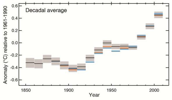
Graph from the IPCC report
And that makes things a lot more clear.
And even then, surface temperatures (land and/or ocean) are not the best way to measure global warming! Surface temperatures are one small part of a much larger system that includes the atmosphere and deep oceans. And, it turns out, the oceans play a major role, the key role here: They are where the extra heat from global warming is going. About 90 percent of it, in fact.
This is not a guess, an excuse, or an attempt to obfuscate. It’s the simple truth. Temperature measurements of the ocean show it getting warmer. The sea level is rising steadily, and has been for decades — this is due to loss of ice in Antarctica and Greenland, as you might expect, but it’s also due to thermal expansion; literally, warm water expands.
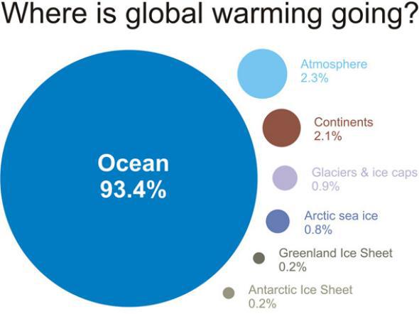
Illustration from Skeptical Science
The process is relatively simple: The oceans are absorbing much of the energy from global warming, that warmth is causing the water to expand, and the sea levels are going up. This is how we know the oceans are absorbing that extra heat; we can measure it directly via temperature increase, and it’s causing gross physical changes in the level of the water.
Not only that, but we see the effect on marine life. As the oceans absorb more carbon dioxide, the water acidifies. We see mass coral bleaching due to this acidification, and effects on phytoplankton, the base of the ocean’s food chain and creators of much of the oxygen in the atmosphere. On land and in the water, climate change affects all ecosystems.
So don’t be fooled by the smoke and mirrors from the denial noise machine. Distraction is all they have. But when you look behind the curtain, you see the reality of what’s happening to our planet. It’s warming up, it hasn’t stopped, and it’s changing everything.