Los Angeles is a fun town—as long as you’re not a) driving around in it, or 2) trying to see any stars except for the TV and movie kind.
It’s a big city, and a lot of the light used to illuminate it goes into the sky. We call this “light pollution”, because it’s wasted, and also because it can ruin the view of the sky. LA is particularly bad because it’s spread out over a huge area, and to see anything at all in the sky you have to get really, really far out of town.
So I will admit to being pretty skeptical when I first saw the picture below: it purports to show the Milky Way—the faint fuzzy band of light strewn across the sky from our galaxy itself—seen over LA!
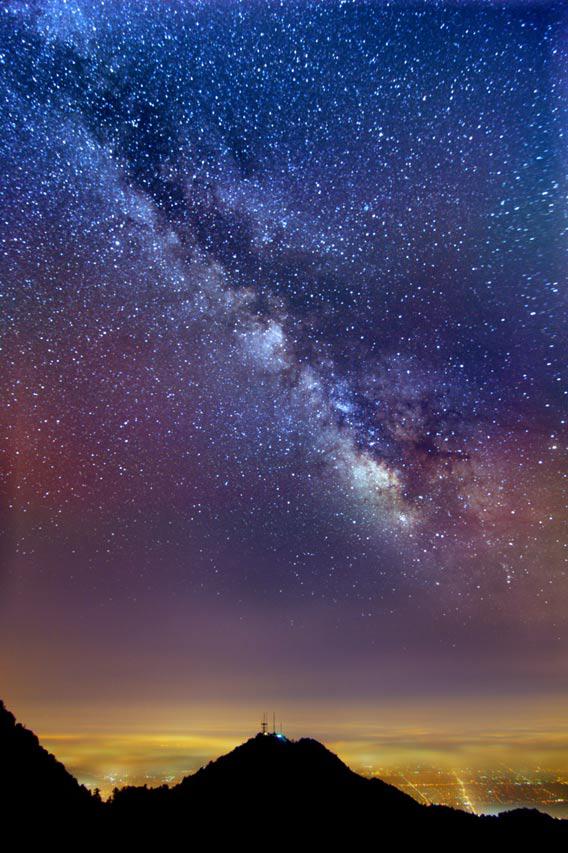
Photo by Aaron Kiely/Getty Images
Seriously, right? That’s nuts.
But it’s also real. It was taken by Aaron Kiely, who works on spacecraft data at NASA’s JPL, and who’s familiar with techniques to squeeze extra information out of them. That lends him more credence right away. He also has a more detailed explanation of how he put the image together on his Flickr page, and after reading it I was satisfied it’s legit; the techniques he used were very similar to ones I used myself back when I worked on Hubble images!
The idea is that even when you have a very bright foreground (like LA), the fainter background (like the Milky Way) is still there, it’s just that the photons from it are vastly outnumbered. But if you take lots and lots of pictures, those photons build up. Then you can add the pictures together to create one where you can see fainter objects.
The problem is the Earth spins, so the Milky Way and the stars in the sky move. Normally you could just shift all the pictures to line them up, but in this case, though, Kiely used a wide-angle 11mm lens, so the pictures are distorted. That makes a simple shift much harder to do. So instead, he used some math to make a model of how the stars moved across the frame of the picture over time. This created a series of curved lines, all different depending on where they were in the frame:
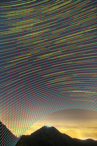
Photo by Aaron Kiely.
That is essentially a map, a grid, showing where a star would be given its position and the time the picture was taken. He then used that model to warp each image, placing them all on a common frame, and added them together:
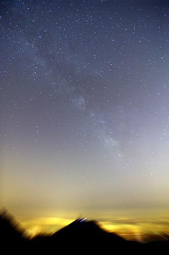
Photo by Aaron Kiely.
Cool. The Milky Way can now be seen, but it’s still faint; the bright sky is still swamping the Milky Way light. He needed to subtract it, reduce its influence. So Kiely turned to math once again.
Imagine the sky were the same brightness everywhere. All you’d need to do is find out what that value is (using Photoshop or any number of other image manipulation packages) and subtract it. But the sky brightness changes from spot to spot. Kiely wrote some software that examined the sky brightness all over the image and made a smooth two-dimensional map of it—like how throwing a blanket over a bunch of boxes on the floor smooths out their bumpiness. For those math nerds out there, he fit a polynomial to the background excluding stars and the landscape at the bottom, fed the coefficients into a least squares fit routine, and boom. 2D map made.
Subtracting that from his co-added picture, and voilà! You get the Milky Way hanging eerily over Lalaland.
Well, almost. Shifting and adding all the images together blurred out the hills and city at the bottom, so he took the nice, sharper shot of that from one of the single pictures and replaced the blurred portions.
Some people might think this is “cheating”, since so much manipulation is involved. I can understand that, but I’m not so upset. First of all, this is art, not science. Well, it is science; science used to make art. And it’s beautiful.
But moreover, let me ask you this: What isn’t cheating? A camera by its very nature shows us things our eyes cannot see. It collects light for far longer than our eyes do, it responds to color differently than our eyes do, it converts light to digital data, and it even performs a lot of mathematical manipulation of the picture before we even see it.
For some, “cheating” is when you’re showing something in the picture that wasn’t there in the first place… but even then it may not be so bad; astronomers combine images from different telescopes all the time. I only get upset by that when it’s presented as an actual photo; the person doesn’t let you know it’s been manipulated. Honesty is the best policy.
So to me, what Kiely did is not only legit, but also useful. He was able to tease out information that was in his pictures but far too faint to see in any one shot. And the result is amazing.
Tip o’ the lens cap to FakeAstroPix on Twitter.