I’m always comparing astronomy to art, and sometimes that’s literally true, like when artist David Fuhrer creates amazing near-3D images of the planets:
That’s very cool, and even niftier, they’re to scale! The colors aren’t real – the image of Venus (next to Earth) he used is from radar mapping of the planet from the Magellan spacecraft, and Mercury (second from left) is actually a relatively uniform grey – but this really gives you a sense of the innermost terrestrial planets (and one bonus Moon – ours, all the way on the left in that image).
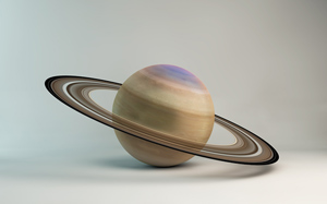
 I also really like his depiction of Saturn. It makes me wish this were a real objet d’art; I’d love one for my living room.
You should also check out this family portrait of all the planets together – man, Jupiter and Saturn are way bigger even than Uranus and Neptune!
These images were created for a TV documentary, and I’ve filed David’s name away if I ever need it for something like this. He has other cool images, too. Digital imagery is really amazing, and I wonder how many people have been introduced to art – both the creation and appreciation of it – due to its advent?
Images used by permission of David Fuhrer. Tip o’ the electron to srahhh on Twitter.