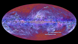
The European Space Agency just released the first all-sky survey taken by their Planck orbiting observatory, and it’s a beauty!
[Click to entelescopinate.]
Planck observes the sky from the far infrared all the way out to near radio frequencies, detecting cold gas and dust, star forming regions, and even the subtle and cooling glow of the background fire from the Big Bang itself. In this image, infrared is blue, and the longer wavelengths (out toward the radio part of the spectrum) are progressively more red. It shows the whole sky, which is why the image is an oval; that keeps the map from getting too distorted (like how maps of the Earth are distorted near the edges).
The line running horizontally across the image is the Milky Way galaxy itself. The galaxy is a flat disk, and we’re inside it, so it looks like a line. Think of it this way: imagine you are inside a vast fog-filled room, five hundred meters on a side, but only five meters high. When you look across the room you see lots of fog, but when you look up you only see a little bit – the amount of fog depends on how far into the room you look. The Milky Way is the same way; we’re halfway to the edge of a huge, flat disk filled with dust. When we look into the disk we see it edge-on, and we can see all that dust. Look up or down (toward the top and bottom of the image) and we don’t see as much.
 This map is in galactic coordinates, meaning the center of the Milky Way is the center of the map. That makes it a little confusing for people used to using coordinates based on the Earth (celestial latitude and longitude), but much easier for astronomers mapping the galaxy and the objects beyond it. That’s what this map was made for, and that’s why it uses a galactic reference.
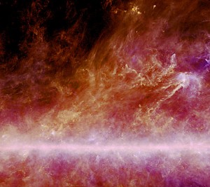
The wispy material in the image is dust blown up out of the disk by the fierce combined winds of thousands of young massive stars when they are born, and also when they die and explode (a close up from an earlier Planck image can be seen on the left). The reddish glow you can see near the poles of the picture is from the Cosmic Microwave Background, the fading glow of the Big Bang. You can find out more about that in a post I wrote about it a little while back. To many astronomers, that glow is the most important thing in this image, but to get at it they’ll have to digitally remove all the foreground glow of the Milky Way; it’s like looking out a bedroom window at night at a faint object when your light is on. You have too much local glow swamping your view. Removing that foreground light from the Milky Way is extremely difficult and will take astronomers long time, possibly years. But when they do, they’ll have the best ever view of it, and will learn a huge amount about how the Universe itself formed.
 The ESA put up a helpful map indicating where some more familiar objects are. For example, Orion is almost all the way to the right, and the big puffy pink circle halfway to the left is the star-forming region in Cygnus, the Swan.
If you want to explore this image more, I suggest heading over to Chromoscope, an interactive map that lets you switch between different wavelengths of light, from radio up to gamma rays. It’s a nifty tool to show you how the sky changes when you observe it in different light.
The Planck data is truly amazing, and I’m very glad to see it released. I know a lot of astronomers who will be hunkering down and spending the next several years of their lives poring over it. They’ll tease out subtle hints about the Universe: how it formed, how it has evolved, and how, eventually, it may die. This is what we are now able to do, we big-brained apes. I have to disagree with Alexander Pope: the proper study of mankind is the Universe, and everything in it.
Credits: ESA/ LFI & HFI Consortia
Related posts:
- The Milky Way erupts with cold dust
- Herschel and Planck slide across the sky
- Herschel and Planck on their way!