Adapted from Dataclysm: Who We Are When We Think No One’s Looking by Christian Rudder. Out now from Crown Publishers.
One of the beautiful things about digital data, besides its sheer volume, is that it has both physical and social dimensions. A piece of paper has two axes, space-time has four. String theory predicts that our physical existence requires somewhere between 10 and 26 dimensions. Our emotional universe surely has that many and more. And in combining these spaces—our interior landscape with our external world—we can portray existence with a new depth.
Websites and smartphones are gathering ample location data. Tweets are geotagged with latitude and longitude; Facebook asks for your hometown, your college town, your current home; many apps know the very building you’re standing in. We can layer identity, emotion, behavior, and belief over our physical spaces and see what new understandings emerge. We can look at how location shapes a person, and how people have laid new borders over our old Earth.
The boundaries of many communities were created by fiat or accident—or both. The United States and the USSR split Korea on the 38th parallel because that line stood out on a map in an officer’s National Geographic. Earlier that same month, Germany was divided into zones of occupation that reflected, more than anything else, whose troops were standing where at the time. Many of our own American states were created by royal charter or act of Congress, their borders drawn by people who would never see the land in person.
For websites, political and natural borders are just another set of data points to consider. When information—fluid, unbounded, abstract—is your currency, the physical world with its many arbitrary limits is most often a nuisance. At OkCupid, rivers are an endless irritant to the distance-matching algorithms. Queens is both half a mile and a world away from Manhattan. Try explaining that to a computer. The problem is that when a person is online, he or she is both of the world and removed from it. But that duality also means we can remix our physical spaces along new lines, ones perhaps more meaningful than those drawn by plate tectonics or the dictates of some piece of parchment.
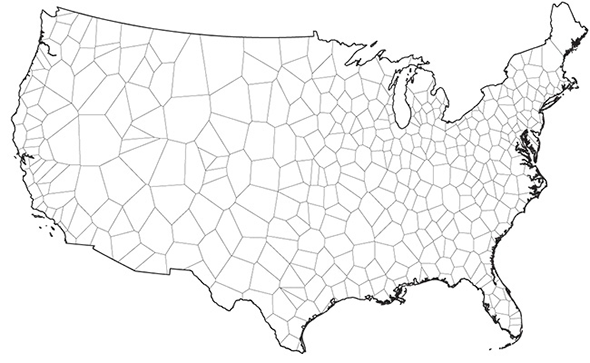
Here you see a plot of how Craigslist carves up the country—each region in the map is the territory served by a separate classified list. One mapmaker called it the “United States of Craigslist” but “united” feels to me like the wrong word—this is a partition, and, within the whole, each little zone is its own petty kingdom. It’s a Holy Roman Empire of old furniture.
Courtesy of Dataclysm: Who We Are When We Think No One’s Looking
Once we begin to graft content to the spaces, the map becomes more interesting. Below is Craigslist’s empire again, but overlaid with the most popular locations listed on the site’s many “Missed Connections” board.
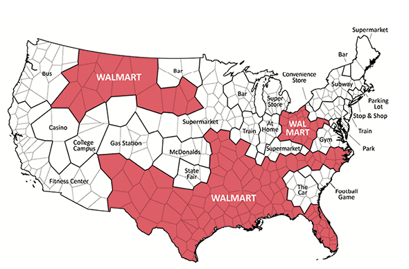
This map uses data from Dorothy Gambrell’s Missed Connections map, published in Psychology Today. Courtesy of Dataclysm: Who We Are When We Think No One’s Looking.
Portlandia most often makes eyes on the bus. California flirts by the elliptical machines. But for much of the rest of the country, the venue of longing is Walmart.
Now we’re getting to a place that a traditional cartographer can’t take us, that no satellite can pick up. The above is a simple and goofy page from a new kind of atlas: behavioral and physical terrain as one.
In the above examples, Craigslist defined its borders a priori, by picking the markets they wanted to serve. Most websites collect location data rather than project it, and from these we can create a truly alternate map of the world, actually move the borders and contours to fit the human landscape.
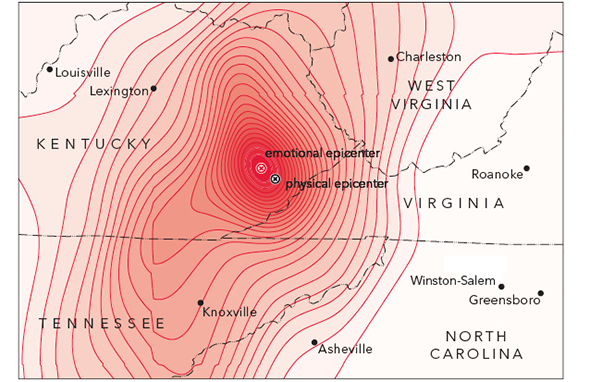
Smartphones, each one with a tiny GPS pinging, have revolutionized cartography. Matthew Zook, a geographer at the University of Kentucky, has partnered with data scientists there to create what they call the DOLLY Project (Digital OnLine Life and You)—it’s a searchable repository of every geotagged tweet since December 2011, meaning Zook and his team have compiled billions of interrelated sentiments, each with a latitude and longitude attached. DOLLY is an incredibly versatile resource, the output of which is only now being explored. For Zook, it’s already had a few highly personal applications. In February 2012, his office in Lexington was shaken by an earthquake, and he turned to the database to see the psychological aftershocks. The map below shows the density of reaction on Twitter, plotted over the physical epicenter of the fault. Here we see contours of surprise laid over the shifting Earth:
Courtesy of Dataclysm: Who We Are When We Think No One’s Looking
Zook discovered that the quake’s emotional epicenter was just northwest of the seismic one, in Hazard, Kentucky.
But Zook’s map shows people’s instantaneous reaction to an event that lasted a split second. Surveying Kentuckians later, even with infinite effort, he couldn’t have generated a true report—not only do emotions change in the remembering, but media coverage and talk about the quake would’ve hopelessly polluted the data. People with smartphones don’t make seismographs obsolete but Zook’s plot reflects the “impact” of the earthquake in a much more direct way than the old Richter scale. Knowing nothing else about a quake, if it were your job to distribute aid to victims, the contours of the Twitter reaction would be a far better guide than the traditional shockwaves around an epicenter model.
Even though each one is transitory, tweets collected together can capture more than ephemera. A demonstration of DOLLY’s power on YouTube shows it tracking the Dutch holiday of Sint Maarten, a sort of Germanic Halloween where children go door-to-door singing for candy. In the data, you see people celebrating not only in the major population centers of the northern Netherlands, as you’d expect, but also in Western Belgium—the tweets reconnect old Holland to Flanders, its cultural cousin. Thus we watch an animated visualization of GPSenabled data points, and see shadows of the Habsburgs.
Given the power of what we can already see through software like DOLLY, the lack of longitudinal data is especially painful. On today’s research corpus, time often feels like a phantom limb. Twitter currently gives us so much of that multidimensional promise: We have every emotion, we have every spot on the globe, but we still have only a few years to work with. In Europe, where the combination of geography, culture, and language has been so volatile over the centuries, imagine being able to track the Alsace-Lorraine as it changed hands—German, French, German, French—each government imposing its culture on the people, as if the region were a house taking on coats of paint. Or imagine the Caribbean basin in the late fifteenth century and being able to watch first the soldiers, then their religion, then their language overwhelm the land, Arawak to Aztec. To see the ebb and fracture of a culture over decades is what DOLLY was built for. All it needs now is the decades themselves.
Geocultural insights can be found in other sources, too, and though in most of them you lose the immediacy of Twitter, you get a different kind of depth in its place. When websites pose questions directly to their users, we have a chance not only to refine borders but to show they don’t really exist as normally conceived.
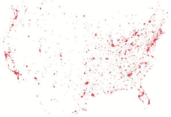
Below are 1 million answers to “Should burning the flag be illegal?” collected by OkCupid. Here my mapping software drew no political or natural boundaries, it just organized belief according to latitude and longitude. This is truly a nation defined by its principles, or, as you can see, two nations: Urban and Rural. You can even see where one encroaches on the other: the rural communities up the Hudson River and in Northern California’s wine country, built up with Big City money, have Big City opinions as well.
Courtesy of Dataclysm: Who We Are When We Think No One’s Looking
Similarly, and in support of the earlier Google Trends finding that homosexuality is universal, we see that same-sex searches have no borders, no state, no country. Below is a plot of gay porn downloads, by IP address, taken from the largest torrent network, Pirate Bay. This map, too, is without any predrawn guides, and as opposed to the OkCupid plot above, its theme is solidarity: from Edmonton and Calgary down to Monterrey and Chihuahua, this is just where people live.
Courtesy of Dataclysm: Who We Are When We Think No One’s Looking
There are as many ways to draw maps as there are sources of data. We’ve been slowly working our way up off the page, building a psychological dimension—how we feel about the flag, porn—on top of our maps. But it’s possible to go the other way: Data can tie abstractions back down to Earth. Take cleanliness, again via OkCupid. This is how often people say they shower:
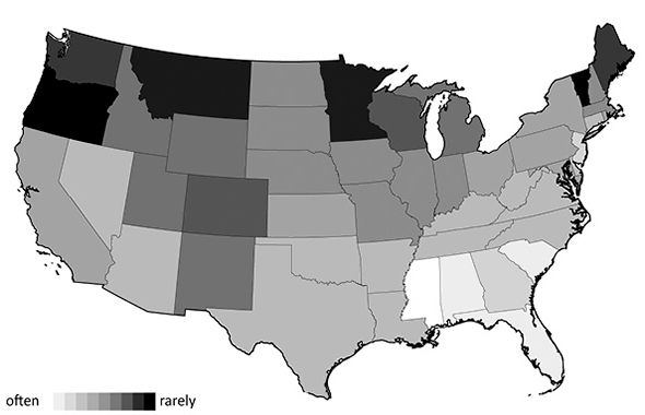
Courtesy of Dataclysm: Who We Are When We Think No One’s Looking
On the one hand, the broad trend merely reflects the weather: Where it’s hot, people shower more. But down in the details there are a pair of good stories. In Jersey’s lightness, you can read the gym/tan/laundry grooming obsession of Pauly D and the Situation—Jersey is much more fastidious than the surrounding states. And in Vermont you find the opposite philosophy: The crunchiness is more than just a stereotype. Vermont’s the most unwashed state overall, and truly an outlier compared to its immediate neighbors. According to Google the state animal is the Morgan Horse. It should be a white guy with dreads.
Politics, weather, Walmart, and certainly earthquakes all have a strong connection to the physical world, but in some of our data we can begin to see an exclusively inner geography. Take lust, which in theory, should have no state. But here we see it does, and a surprising one:
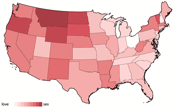
Courtesy of Dataclysm: Who We Are When We Think No One’s Looking
This pattern comes up again and again on OkCupid—the north central and west of the country is more sexually open, more sexually adventurous, and more sexually aggressive. Up the Pacific Coast you’d perhaps expect such unconventional attitudes, but for many of these red-meat states, it goes against type. Politically, OkCupid’s users in, say, the Dakotas are as conservative as their reputation. Their profile text isn’t much different from anyone else’s. For all other indicators, the states should not be dark, but in the data we see a mysterious sexual intensification. This unexpected pattern reveals a further power in Internet data; we can now discover communities that transcend geography, rather than reflect it.
This data above does not prove that the Mountain Time Zone is one big high-plains makeout party. In fact, the explanation is rather banal: If you are looking for people to have sex with in a place like Pierre, South Dakota, your local options are limited. So you try a dating site to find what you want. It’s simple selection bias in our data, but there’s meaning there: Where people can’t find satisfaction in person, they create alternative digital communities. On a dating site, that means communities with similar sexual interests. On other sites with more diverse aims, where the users aren’t just there to flirt in groups of two (and occasionally three), you get something richer.
Reddit is the fulfillment of that earliest ambition of the Internet—to bring far-flung people together to talk, debate, share, spread news, and laugh. To collapse space and create personal closeness Here, I’ve plotted the 200 most popular topics, and this is something you could properly call “the United States of Reddit.” It’s a geography like the Craigslist division we saw before—made, in fact, by a similar algorithm—but instead of physical geography, it plots a geography of interests, of the collective Reddit psyche. And it shows distinct yet connected communities. The size of each state corresponds to the popularity of the topic, and the software put “like with like,” according to cross-commenting between subreddits.
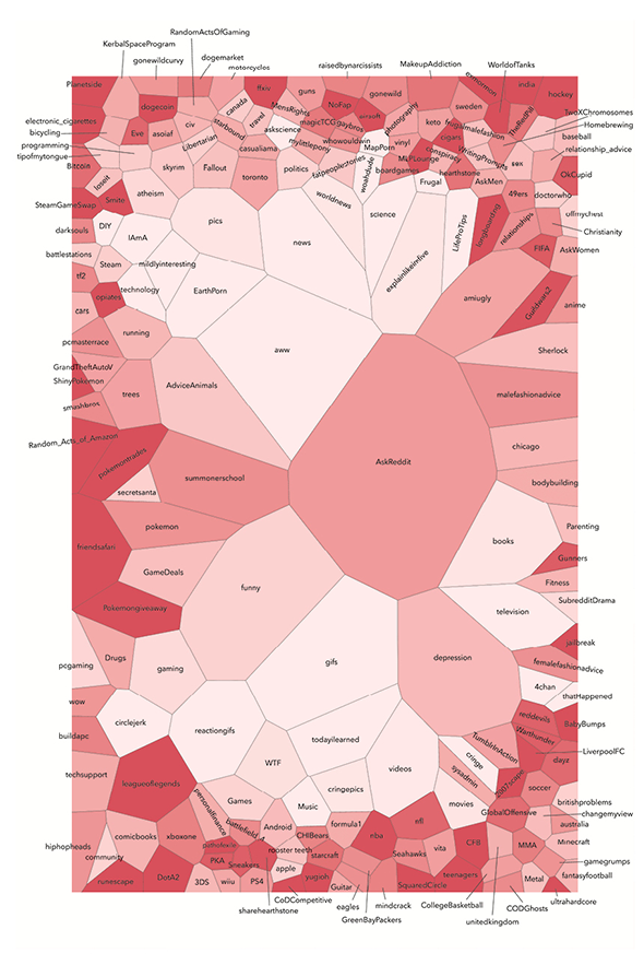
Courtesy of Dataclysm: Who We Are When We Think No One’s Looking
My favorite game, Magic: The Gathering (magicTCG), is correctly surrounded by its unfortunate natural friends MensRights, whowouldwin, and mylittlepony. Similarly, many sports (nfl, nba, formula1, and so on) are grouped at the bottom. Everything pokemon is clustered over to the left. Britishproblems, along the right edge, is next to australia and soccer. It also makes sense that the most popular subreddits are in the center—that is, not too far from anything. The red tint corresponds to how tight-knit each subreddit is. It shows the degree to which the people posting post only there. The darker the red, the more isolated the thread. This whole thing is an abstraction, but it shows how people can locate themselves by what they find interesting or funny or important rather than where they happen to sleep at night. It’s a map of one particular collective consciousness.
Adapted from Dataclysm: Who We Are When We Think No One’s Looking Copyright 2014 by Christian Rudder. Published by Crown Publishers, an imprint of Random House LLC.
Correction, Oct. 24, 2014: Due to a production error, this piece was missing a map and therefore misrepresented a map showing where Americans believe that burning the flag should be illegal as a map showing gay porn downloads across the country. The missing map has been added.