When I heard that Politico won its first Pulitzer Prize this week, I assumed that the site had been recognized for the way it tirelessly handicaps the state of play in Washington. But rather than honor one of Politico’s scoop-hungry stars, the Pulitzer committee recognized a guy I’d never heard of: Matt Wuerker, its editorial cartoonist.
I rarely look at political cartoons, so it was quite possible that I was missing out on a groundbreaking genius of the form. Not so. Judging by his hits, Wuerker isn’t a bad cartoonist, but he’s hardly an innovative one. His work is typical of every old-timey Thomas Nast spot you remember from your high-school history textbook. In Wuerker’s drawings, the government is an ailing Uncle Sam or a sinking ship (helpfully labeled “USA”), Washington is a circus, and there are lots of elephants and donkeys.
Wuerker is neither subversive nor an extremist. He seems to target Republicans more often than he does Democrats, but he mainly favors a clichéd, pox-on-both-your-houses approach. This excruciatingly punny panel, published during last summer’s budget crisis, illustrates Wuerker’s overriding argument: Washington is broken! (Who knew?)
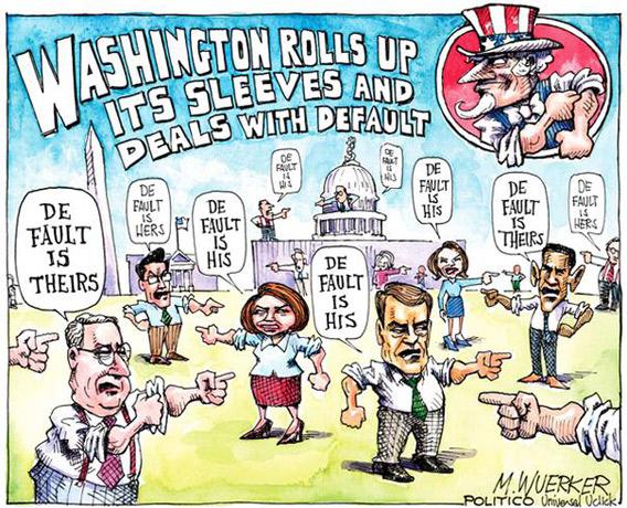
Matt Wuerker/Politico.
I don’t mean to single out Wuerker—my problem is more with his medium than with his work. If you study all of the recent Pulitzer winners in the cartooning category, you’ll see that single-panel editorial cartoons are an increasingly timeworn form. Even the best ones traffic in blunt, one-dimensional jokes, rarely exhibiting nuance, irony, or subtext.
The backwardness of political cartoons is especially evident when you compare them to the bounty of new forms of graphical political commentary on the Web. My Facebook and Twitter feeds brim with a wide variety of political art—biting infographics, hilarious image macros, irresistible Tumblrs (e.g., Kim Jong-il Looking at Things), clever Web comics, and even poignant listicles. I don’t think I’ve ever seen a traditional political cartoon appear on my various social-media channels. Aside from the Danish Mohammed cartoon controversy, it’s hard to remember the last time a single-panel cartoon entered the political zeitgeist.
This isn’t surprising. Editorial cartoons were born in the era of newspapers, and while they now regularly appear on the Web—including in Slate—they remain stuck in the static, space-constrained, caricaturist mind-set of newsprint. The Pulitzers began awarding a prize for cartoons in 1922, and other than a few notable exceptions—Garry Trudeau’s Doonesbury in 1975, Berkeley Breathed’s Bloom County in 1987, and Mark Fiore’s animated cartoons in 2010—the overwhelming majority of its awards have gone to traditional, single-panel cartoonists. It’s time for the Pulitzers to look past this old-fashioned medium and include graphics that are better attuned to this century.
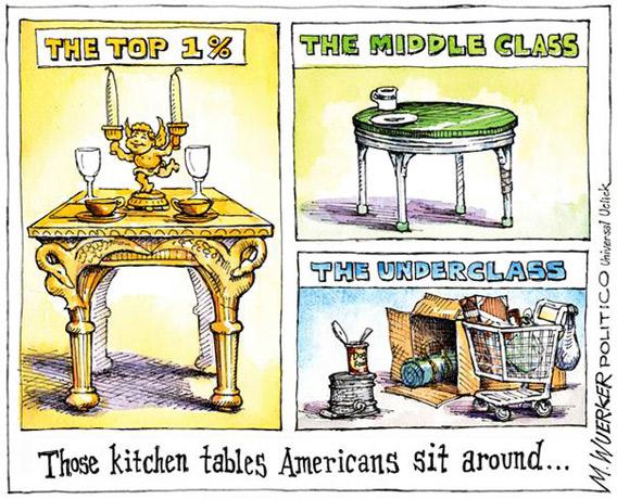
My first suggestion would be for the committee to recognize infographics and interactive visualizations. Like most political cartoons, infographics are rarely funny. Unlike most political cartoons, the best infographics tend to pack a wallop. To see what I mean, look at this Matt Wuerker cartoon about inequality.
Now look at this chart, posted by Mother Jones as part of an excellent piece called “Eleven charts that explain what’s wrong with America.”
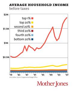
Mother Jones.
Both graphics set out to make a similar point: The top 1 percent is doing a lot better than everyone else. But Wuerker’s cartoon, which shies away from specificity—all it tells us is that rich people have awesome furniture—barely merits a second look. Mother Jones’ graphic, though, demands to be shared widely. That’s because infographics derive their power from real, often surprising data that’s presented, ideally, in a simple, understandable way. The difference between a great editorial cartoon and a great infographic is like the difference between a great painting and a great photograph. Both have their place, but the latter is clearly more influential as a form of journalism. As far as I can tell, Wuerker’s cartoon on inequality didn’t go viral. Mother Jones’ infographics, meanwhile, have acquired more than 242,000 Facebook Likes, and some of its charts were spotted on Occupy Wall Street protest signs.
Editorial cartoons are solo efforts in an era when political art has become a collaborative, crowdsourced affair. Many of today’s most powerful political images were put together by anonymous people on Reddit, where Photoshoppers find them and create ever-more-inspired versions. This collaboration is critical—while a single cartoon might get lost in the media din, an ongoing game of image-based one-upmanship is impossible to miss. Consider, for instance, the Casually Pepper Spray Everything Cop meme. This image—which started it all—makes a profound point about police brutality by itself:
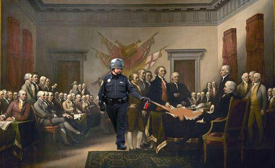
But its lasting power was in the hundreds of hilarious follow-ups it spawned. (The “Single Ladies” pepper spray cop is particularly inspired.) Without those inspired riffs, you might have never seen the original image. With them, the pepper-spray story dominated the news for days.
True, it would be difficult to award a Pulitzer Prize for a crowdsourced meme. I’m mainly arguing that prize committees cast a wider net and get more flexible in how they recognize graphical journalism, which is undergoing rapid changes thanks to new technology.
The most compelling political art I’ve seen recently was a Buzzfeed listicle called “25 Photos of Mitt Romney Looking Perfectly Normal.” The list is exactly what it claims to be: pictures of Mitt Romney looking like a human being, a side of him that most of us had never seen before. The list is subversive—subtly making the point that Mitt Romney isn’t instantly likable—but also informative and moving.
If you were a prize committee, how would you categorize Buzzfeed’s list? The story doesn’t deserve a photography prize—Buzzfeed didn’t take these photos (the site acquired them from a blog maintained by Romney’s daughter-in-law), and none of the photos are arresting by themselves. What’s novel is the combination of a snarky headline and a series of images. In that sense, Buzzfeed’s listicle is a kind of cartoon—except in this case it achieves the opposite of caricature, humanizing its target rather than puffing him up.
It’s laudable that the Pulitzers are now recognizing publications like Politico for their work. Politico is one of the most novel, dynamic news organizations to appear in the last two decades, a site that, for better or worse, has altered how the media covers politics. But you know what nobody thinks about when they consider Politico? The way it shook up the world of cartoons. So let’s not congratulate the committee for its sudden open-mindedness. When the Pulitzers make room for a list of photos of Romney looking like a regular guy—that will be the day for celebration.