The Web is filled with horrible photos. Pixelated, excessively processed, offensively clichéd, they sneak their way onto news sites, blogs, Tumblrs, Instagram feeds. They get shared and reshared as memes or as art accompanying otherwise good articles. The Web’s terrible photographs mock the profession of photography every single day. And no one seems to notice, much less complain.
Until now, that is. Evidently, this is where the digital public draws the line:
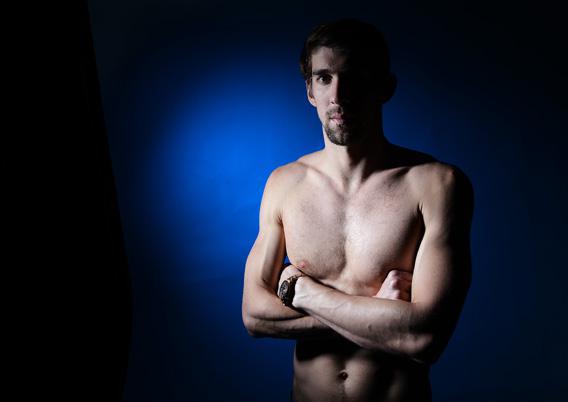
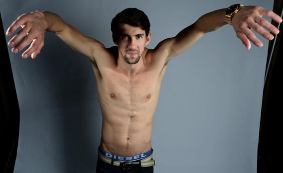
Joe Klamar/AFP/Getty Images.
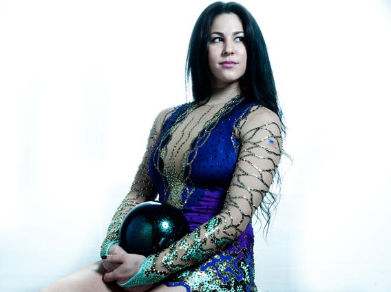
When this crudely lit photograph of the Olympic swimmer Michael Phelps was posted in a slide show on CBSnews.com as part of a gallery of similarly awkward portraits of athletes vying for spots on the U.S. Olympic team, the Internet went nuts.
The photographs were taken by Joe Klamar, and they are not good. Klamar was evidently on assignment for AFP, one wire service, and the photos were then distributed by Getty Images, another wire service. Virtually every major news site in America subscribes to Getty’s database of photos, which means the images could be published nearly anywhere. It appears that CBS was the only site that thought a gallery was a smart idea. Klamar’s portfolio makes our athletes look silly and desperate—the wrinkled guts of a makeshift studio serves only to steal their spotlight.
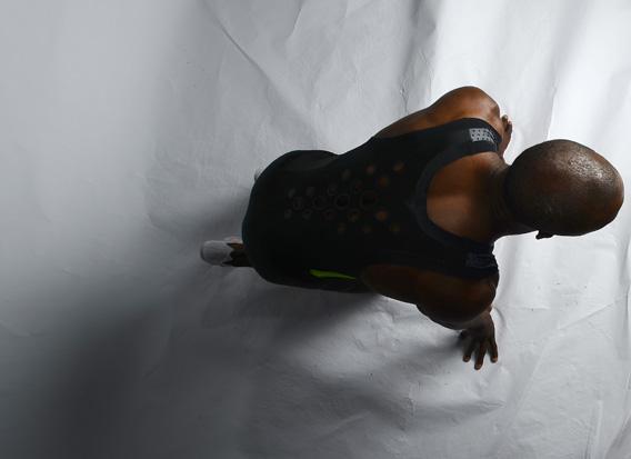
In this shot, an incredible gymnast’s muscles are overshadowed by rips in the paper beneath him.
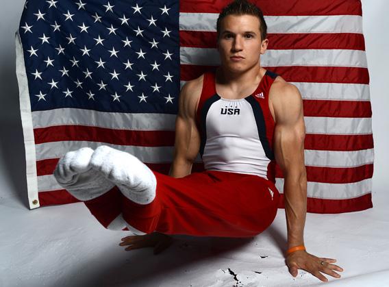
Joe Klamar/AFP/Getty Images.
Here, another gymnast’s laboriously trained leg is cut off by the frame; the edge of the backdrop revealed by the wrong choice of lens.
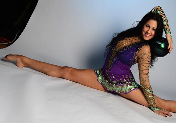
Joe Klamar/AFP/Getty Images.
Taken in aggregate, the sloppy images set off a firestorm of rage that was unprecedented (except in photo editors’ nightmares).
Initially, the images were passed around on Reddit, where they were ruthlessly mocked. Then the photography community caught wind of them. ”Horrible,” cried one Facebook commenter, when Sportsphotographer.net creator Cy Cyr linked to the images in his feed. “Amateurs don’t even make these mistakes!” another noted. “This is an embarrassment to our country and my profession,” wrote another commenter on a blog post about the affair. On Facebook you could even find that classic line of Internet criticism: “My kid could do better.”
The photos were so awful that some commentators even refused to believe they had been an accident, one blogger going so far as to suggest that they were an intentional subversive act.
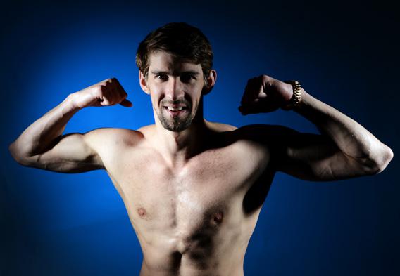
Joe Klamar/AFP/Getty Images.
As a photo editor, my initial reaction was relief. I never thought the day would come when people would cry out en masse not because a photo is too sexy or controversial (more common complaints), but because the lighting and composition were bad. In a world where photo budgets are being slashed, and great photo stories are replaced with snapshots by writers and crowdsourced iPhone images, it is comforting to know that the same people who share blurry cat photos on Reddit also get enraged when an official portrait is not up to par.
And it’s sweet that in an era with few shared national heroes, even cynical bloggers care deeply about how our Olympians are portrayed. But poor Joe Klamar does not deserve to be treated like a bumbling visual terrorist.
After all, Klamar is an award-winning Czech photographer. So it’s worth trying to understand how he came to turn in such amateurish work. And let’s debunk some of the now-widespread Internet myths about his atrocious photos.
Myth No. 1: You Could Have Done Better.
Unless you are a professional photographer, please hold the keyboard. Just because you once took a studio photography class and emerged with a beautifully lit nude of your pregnant wife does not mean you have the skills to take great photographs on Olympic media day.
What is Olympic media day? I contacted Klamar for comment and never heard back. I did, however, communicate with three other photographers who also worked the media day in May, and they offered some insight on its madness.
Nick Laham/Getty Images.
“It’s like a cattle call. You get a run sheet at the beginning of the morning,” explains Nick Laham, who photographed the Dallas event for Getty. Each photo agency got a photo station in the Hilton ballroom. Over three days more than 100 Olympic athletes passed through each one. “They come through and you have them for from 30 seconds to a couple of minutes,” Laham says.
The athletes vary dramatically in height and skin tone. Some come with gear or are wearing their uniforms. Others are wearing distracting jewelry that they need to be coaxed into removing. Some are friendly and at ease in front of the camera; others are exhausted and uncomfortable.
The experience for most photographers was “pretty intense mostly because of the sheer number of athletes that came through,” says Toni L. Sandys, who photographed dozens of participating athletes for the Washington Post. “You want to be a little creative with them, but you can’t be changing the lighting setup with every athlete.”
Ronald Martinez/Getty Images.
On top of that there’s extreme personal pressure, she says, because you’re surrounded by other photographers shooting the same people. You see them drape the athlete with a flag or apply some fancy lighting scenario and you can’t help but ask yourself whose photos are going to come out better.
Any photographer working in these conditions would expect to have a few failed sessions among the dozens. Although no one else whose photos I’ve reviewed produced work quite as consistently bad as Klamar’s, most of the photographers produced a wide range in quality. (The work of this Dallas Morning News photographer has sparked commenter attacks as well.)* Some photographers may have done worse, but worked for publications that opted not to publish the results.
Myth No. 2: Klamar Is a Horrible Photographer
Just because you are good at writing movie criticism does not mean you are good at reporting on Supreme Court cases. The same goes for photography. The other Klamar photos on the wire suggest that he’s more accustomed to working the red carpet, shooting dolled-up celebrities in an environment that’s similar in its frenetic pace to a media day, but otherwise quite different. According to Sandys, Klamar told her the media day was his first time covering this sort of Olympic event.
Toni L. Sandys/Washington Post via Getty Images.
Newbie error is not an airtight excuse. Sandys, who had never covered an Olympic photo day before either, was far more successful.
Joe Klamar/AFP/Getty Images.
One difference, though: Sandys was well-prepared because she knew about the assignment more than a month in advance. She said Klamar told her he’d just learned about it the day before. He arrived without the proper lighting gear and was forced to make do, using gear he was not familiar with.
Myth No. 3: The Editors Should Have Photoshopped the Images Into Something Better
How on earth did AFP and Getty let a photo with ripped backdrop slide through? (Sandys explained why it was ripped, by the way: The soccer players, who came through before the gymnasts, were wearing cleats.) The editors do bear some responsibility here. Klamar should not have turned in such horrible photos to his editors. But neither should his editors have let his horrible photos be published on the wire, going out to hundreds of clients across the world, potentially ruining his career. (I reached out to Getty for comment on this process, but never heard back from their spokesperson.)
Joe Klamar/AFP/Getty Images.
That said, the idea that the photo editors who worked for AFP or Getty should have used the powers of Photoshop to buff out those ugly wrinkles and rips reveals a misunderstanding. Unlike the editorial photographs commissioned by magazines—like, say, a photo you might see on the cover of ESPN the Magazine—photographs released on newswires are not supposed to be dramatically altered.
So how did these photos get published? Perhaps a desire to feed the Web beast was involved. It’s likely that pressure to provide options quickly was a priority, that Getty’s editors perhaps never imagined that in a Web full of bad photos, people would care about wrinkles in a backdrop and awkwardly placed light. As it turns out, this assumption was wrong. Thank goodness for that.
Correction, July 6, 2012: This article misidentified a Dallas Morning News photographer as a Dallas Times photographer. (Return to the corrected sentence.)