In 1996, it was obvious to everyone what a magazine should look like, but it was less obvious what a website should look like. (Now everyone knows what a website should look like, but the whole idea of a magazine is up for grabs.)
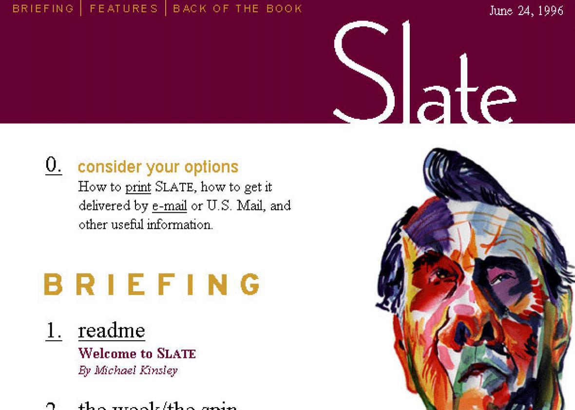
At the time, Slate saw itself less as a web magazine and more as a magazine that could be found on the web. Look no further than the home page of June 24, 1996—literally a table of contents for that week’s “issue.” It was broken into three sections—Briefing, Features, and Back of the Book, not unlike the New Republic or the Economist. Articles were listed (with “page” numbers!) in the order you would encounter them in a print product, beginning with the editor’s note and other appetizers before progressing into the meat of the issue: four original, clever, and varied magazine pieces. Last were the regular departments like Books, Television, and other pieces of criticism. This home page would have remained at slate.com for a full week.
Slate
To a web denizen of 2016, this is laughably backward. There was no strategy for drawing eyeballs to the day’s ripest, juiciest material by putting it at the top of the page, in bombastic type, accompanied by a piece of striking artwork. Today we know that a home page has to grab and hold the reader’s attention every day—ideally several times a day. Slate figured that out during the long evolution from its sleepy dial-up–era incarnation to a bustling multimedia website.
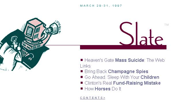
The first microstep was a home page redesign in 1997 that tucked the magazine’s table of contents onto a secondary page and replaced it on the home page with “the front porch,” a jewel box of four or five headlines, paired with an illustration and updated daily, to promote the best and newest content.
Slate
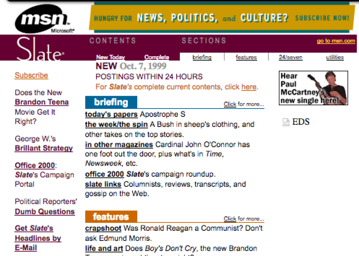
The front porch became a lot less welcoming in March 1998, when a sturdy lock was affixed to the front door, and readers would need to use a $19.95-per-year subscription-shaped key to open it. Fortunately for readers, by 1999 Slate abandoned most of its paywall and erected its most functional home page to date, which featured a top story promotion as well as lists of recently published items and drop-down navigation menus. The table of contents was dissolving: The magazine was still divided into Briefing and Columns & Features, but they were joined by 24/Seven, short items that writers could post, unedited, at will—i.e., blogs.
Slate
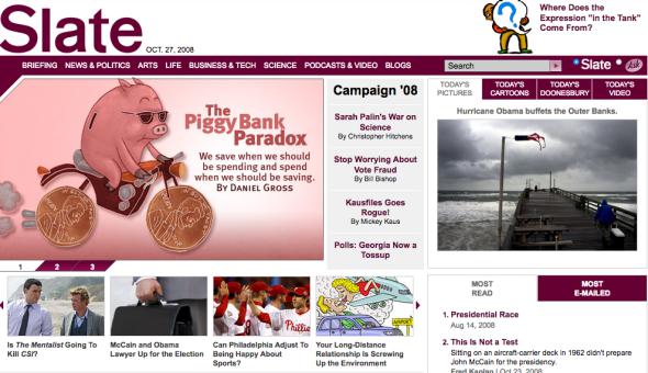
Slate’s home page really found its swagger in early 2002, when it embraced its identity as a magazine that lived on the web. Slate adopted the web equivalent of a magazine cover: a photograph or illustration upon which headline type was carefully styled and laid out to highlight the most worthwhile treats the site had to offer that day. It’s a strategy we still use today.

Slate
At the time, very few sites were investing in such a design-heavy treatment—and almost none do it today. Our bespoke home page art signals to readers: We value these articles. Strong cover design gives print magazines much of their brand value—why sacrifice that advantage when the glossy front is in pixels instead pulp?
Slate
Slate

Slate
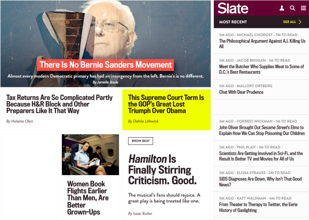
Slate became so enamored of this idea that once the site was brimming with an abundance of daily content, one daily cover was not enough. The 2008 redesign provided for an array of covers (usually three), which were displayed at random, though the lead cover would appear more often than the others.
Slate
Our current home page design, unveiled in September 2013, is our webbiest yet. It was built to be updated quickly and frequently. We still use a highly designed cover to showcase our top offering of the day (or hour, given the pace at which Slate now publishes). But many other spaces feature a single punchy headline, sometimes punctuated with a picture or a secondary “deck” headline. Below are modules featuring standing features such as Dear Prudence, the podcast directory, our huge video player, or the Behold photo viewer.
Slate
We’re proud of our design, but it’s not our sole focus. We’re going for a particular voice in our home page headlines. We try to address readers the way you’d have a conversation—or an argument—during a lively cocktail party. For a long time, web magazines aimed to display the same flair for headline wordplay as their print counterparts, and Slate had some strong entries. Today’s headlines still aim to amuse and convey a playful voice, but you will find fewer puns on the home page in favor of headlines that are direct and clear but, we hope, no less compelling.
What makes Slate’s home page unusual among its peers—and, some would say, out of date—is that it is still edited by a small and consistent team of humans who carefully choose and build each promotion based on news judgment and the magazine’s sensibility. Most of our competitors have forgone human curation of the home page in favor of algorithms that put the newest or most popular content into a ranked list, dressed up in a predictable way. For those sites, the home page is in decline; their users enter through links from social media or search. Slate gets (and cultivates) traffic from social and search, of course, but it retains a substantial core of readers who arrive every day by landing on its home page. Some are the same readers who bookmarked the Slate home page on Netscape in 1996 or 1997 and have come back daily or weekly since then, looking for something to read.