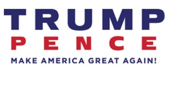
Last week, the Trump campaign was reamed for a logo released after the selection of Mike Pence as vice presidential candidate. The design featured Trump’s “T” plunging into the ready orifice of Pence’s “P.” Mocked endlessly on social media, the logo was speedily replaced with a simpler, less suggestive logo that merely shows the candidates on top of each other. Slate emailed Jesse Reed, who along with Michael Bierut co-designed Hillary Clinton’s campaign logo, for his thoughts on the logo and its walk of shame. The conversation has been lightly edited.
What was your immediate reaction to the initial logo?
Before saying anything, I should state that the sight, thought, and sound of Donald Trump makes me physically ill. But I like talking about logos, so here we go.
The [original] identity resembles a student project. The word America is in the slogan, so stripes were a go-to move. The combination of letterforms is awkward and, without stating the obvious, signals some sort of penetration. Maybe that’s my favorite part. Formally, the mark is poorly drawn—the “T” has a different thickness than the stripes, and the bottom stripe tries but fails to identify the letterforms as the stars on a flag. It follows the tradition of clichés that we’ve seen in many campaign design languages, but they went the extra mile and hired a sophomore in design school who recently learned Adobe Illustrator.
What do you think about the contrast between the penetration logo and Trump’s pre-VP logo, which was much simpler? I used to think the first logo looked cheap, but there was almost something refreshing and unpretentious about that. But the penetration logo’s symbol was more involved than anything I can remember seeing since the Obama “O” rising sun.
I imagine there was a conversation, or demand, to introduce something “iconic” into the brand. Someone said the name alone wasn’t enough or lacked power, and the addition of a running mate provided this opportunity. There are benefits to a symbol that a wordmark lacks, such as a reduction in size. But the complexity of this mark would complicate such uses.
People said the penetration logo was reminiscent of clothing logos. Do you agree? It almost made sense for Trump, given his interest in status symbols.
If I’m being honest, I thought the same thing. American clothing labels have been using a flag motif on polo shirts since I can remember, which started when my mom would drag me to T.J. Maxx in fifth grade. An American flag reference, plus the addition of two initials—reminiscent of T.H., R.L., etc.—conjures an association that’s difficult to deny.
Additionally, the entire configuration is very static; there’s nothing else it can do. It quite literally would be perfect to embroider on a polo, but as a mode of larger visual language, it’s limiting.
And as many clients will often do, Trump could have very well said, “Yeah, make it like the Tommy Hilfiger logo; that’s a solid brand.” Nothing against Tommy—I love those clothes!
If you were designing a logo for Trump and Pence, would you have tried to intertwine them in the way that they initially tried to do? People have been cracking jokes about the penetration, but it really is weirdly suggestive of a kind of closeness that we know isn’t there substantively or personally, as well as maybe an equal partnership moving forward. We know that’s not happening.
Again, I’m more opposed to Trump than I am to touching subway poles during flu season, but there was a huge missed opportunity in their solution. They were given the graphic designer’s gift of having the same amount of letters in both names. I would have kept the size and spacing the same and simply shifted the weight.
Typographically speaking, there could have been a very sophisticated treatment of the two names that is stronger than some weird monogram having intercourse. Again, it’s kind of my favorite part.
What kind of considerations should be made in general when adding a VP’s name to signage?
I think they should be on a level of general equality, but there are other ways to establish dominance: color, weight, style—serif, slabs, italics, bold, thin, and so on. Shit, I hope Trump doesn’t read this and get any ideas!
What do you think about adding the tagline at the bottom?
I think it’s weak. It’s also bullshit.
How do you think they handled the switch to the new intercourse-free logo?
This is classic. They got scared of all the negative attention and in a state of panic reverted back to a standalone wordmark. If you’re going to do something, first believe in it, then deploy with some goddamn confidence.
In this case, I don’t really care, but under other circumstances, the best thing you can do when introducing a new visual language is doing so with conviction—people will have opinions for about 24 hours then move on with their lives.
That said, a logo won’t win or lose a campaign—the candidate will. Trump is a horrible human being, and the best logo in the world—no, universe—couldn’t change that.