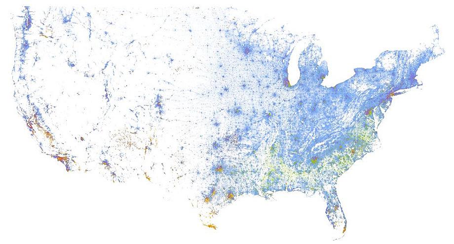
How diverse is your neighborhood really? This map by Dustin Cable at the University of Virginia’s Weldon Cooper Center for Public Service displays the population distribution of every person in America (as of the 2010 census) along racial and ethnic lines. The map features 308,745,538 dots, each smaller than a single pixel and each representing one person: Caucasians are blue, blacks are green, Hispanics are orange, Asians are red, and other races are brown.
The vast swaths of purple appear to show the racial diversity of some of America’s biggest cities. But if you zoom into the map and break these cities down at the neighborhood level, patterns of segregation become much clearer.
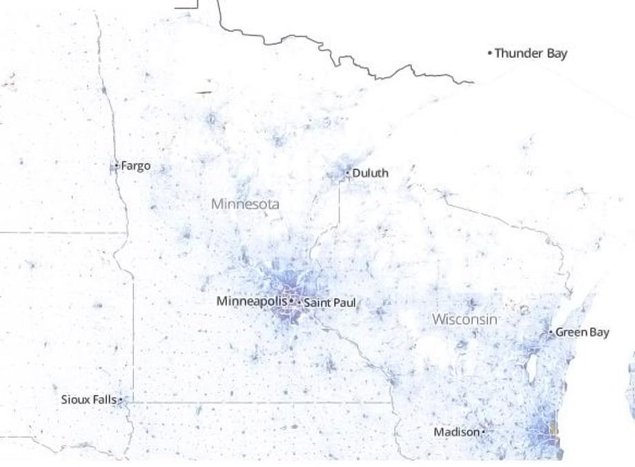
Cable uses the example of Minneapolis–St. Paul to illustrate a city where racial integration in the city as a whole appears far greater than it does in individual blocks of streets. The wide view of Minneapolis–St. Paul is as purple as Adrian Peterson’s uniform, which indicates a large degree of racial diversity:
Courtesy of Dustin Cable/Weldon Cooper Center for Public Service/University of Virginia
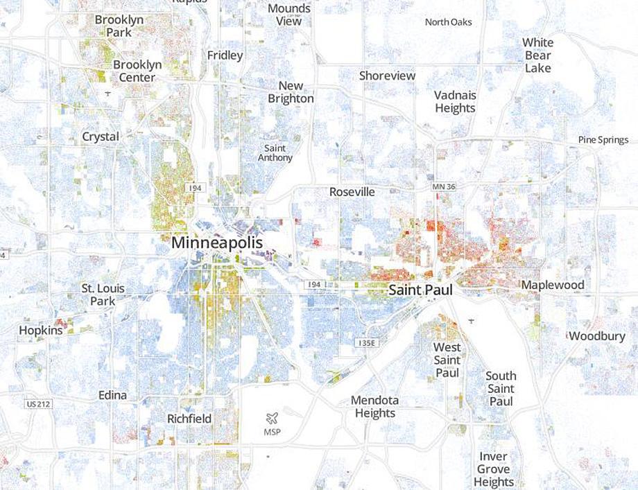
But, as Cable notes, zooming in illustrates clear delineations between predominantly Asian, white, and black neighborhoods.
Courtesy of Dustin Cable/Weldon Cooper Center for Public Service/University of Virginia
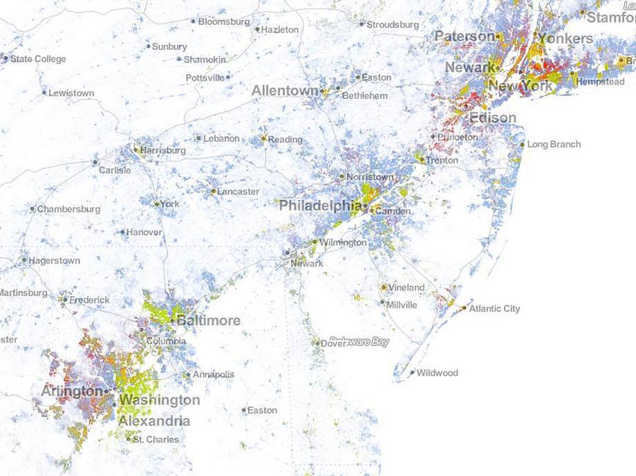
According to research by professors John Logan of Brown University and Brian Stults of Florida State University, Minneapolis is only the 40th most segregated city in the country. Logan and Stults also analyzed the 2010 census data to determine which cities had the largest amounts of segregation in America. Six of the 20 most segregated cities in the U.S. are in the Amtrak corridor that connects the northeastern Atlantic region. Those cities are New York City; Nassau-Suffolk, N.Y., Newark, N.J.; Philadelphia; Baltimore; and Washington, D.C.
Courtesy of Dustin Cable/Weldon Cooper Center for Public Service/University of Virginia
Washington and Baltimore’s low levels of integration are actually visible from a great distance:
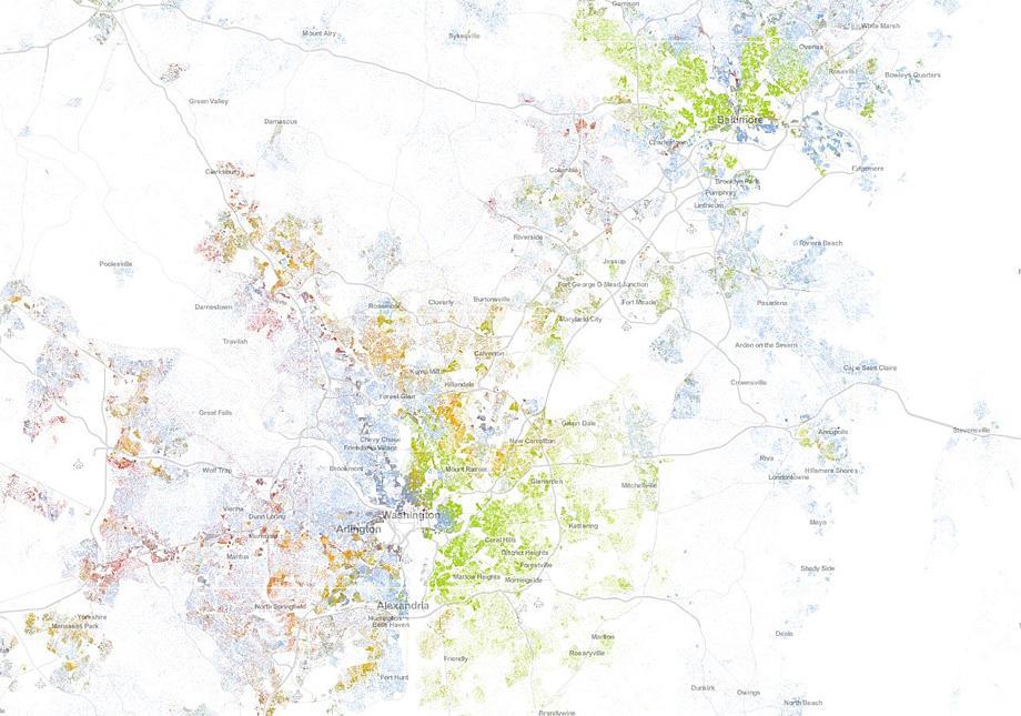
Courtesy of Dustin Cable/Weldon Cooper Center for Public Service/University of Virginia
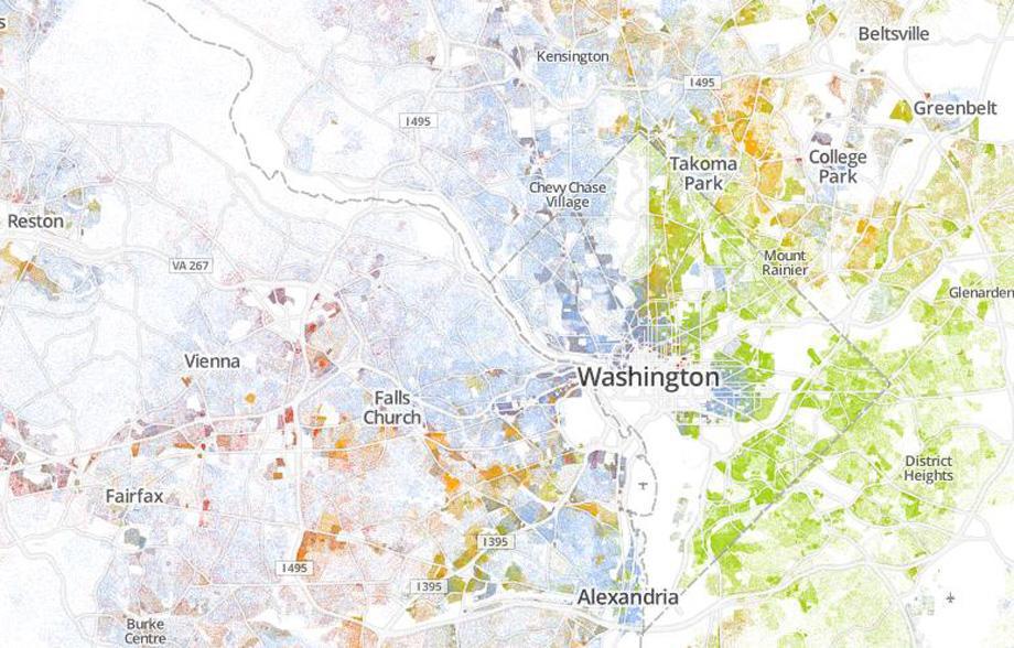
When you zoom in even closer, you can see the extent to which green dominates the entirety of northeast, southeast, and southwest Washington, save for a small patch of blue around Capitol Hill and another smaller patch near Catholic University. You also see seas of blue consuming much of northwest Washington and the outer suburbs, though it’s interesting to see islands of red and orange in Fairfax, Va.
Courtesy of Dustin Cable/Weldon Cooper Center for Public Service/University of Virginia
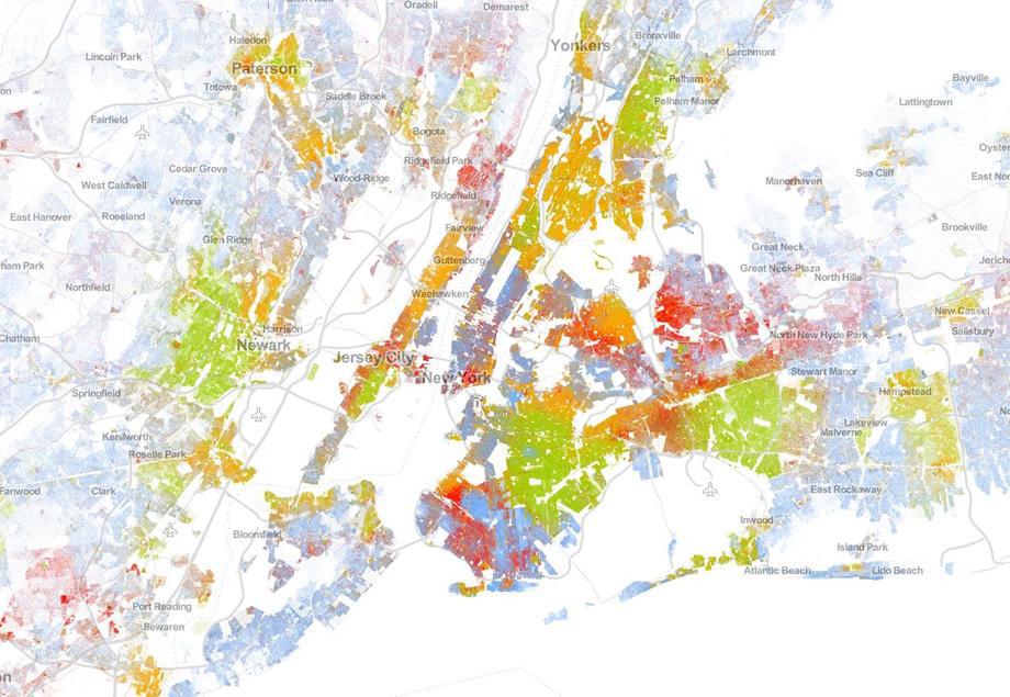
Washington and Baltimore are only the 16th and 17th most segregated cities, respectively. The most segregated cities in the Northeastern corridor, and the third and fourth most segregated in the country, are New York City and Newark.
Courtesy of Dustin Cable/Weldon Cooper Center for Public Service/University of Virginia
The New York portion of the map features a big patch of red in Manhattan’s Chinatown, a swatch of green directly above Central Park in Harlem, vast swaths of orange in the Bronx, and a blue square just to the west of Prospect Park. To explore these maps on your own, visit the Cooper Center’s website.