Last Friday, a friend doing research at the U.S. Centers for Disease Control and Prevention in Atlanta sent me a photo of a display at the CDC’s in-house museum. She thought I’d be interested because it had to do with the cholera epidemic in Haiti, which I lived through at its beginning and have been reporting on ever since.
She was right. It blew my mind:
Farren Yero
To understand what’s so insane about it, you need to know a little about two of the maps in that image and the CDC’s history with the epidemic.
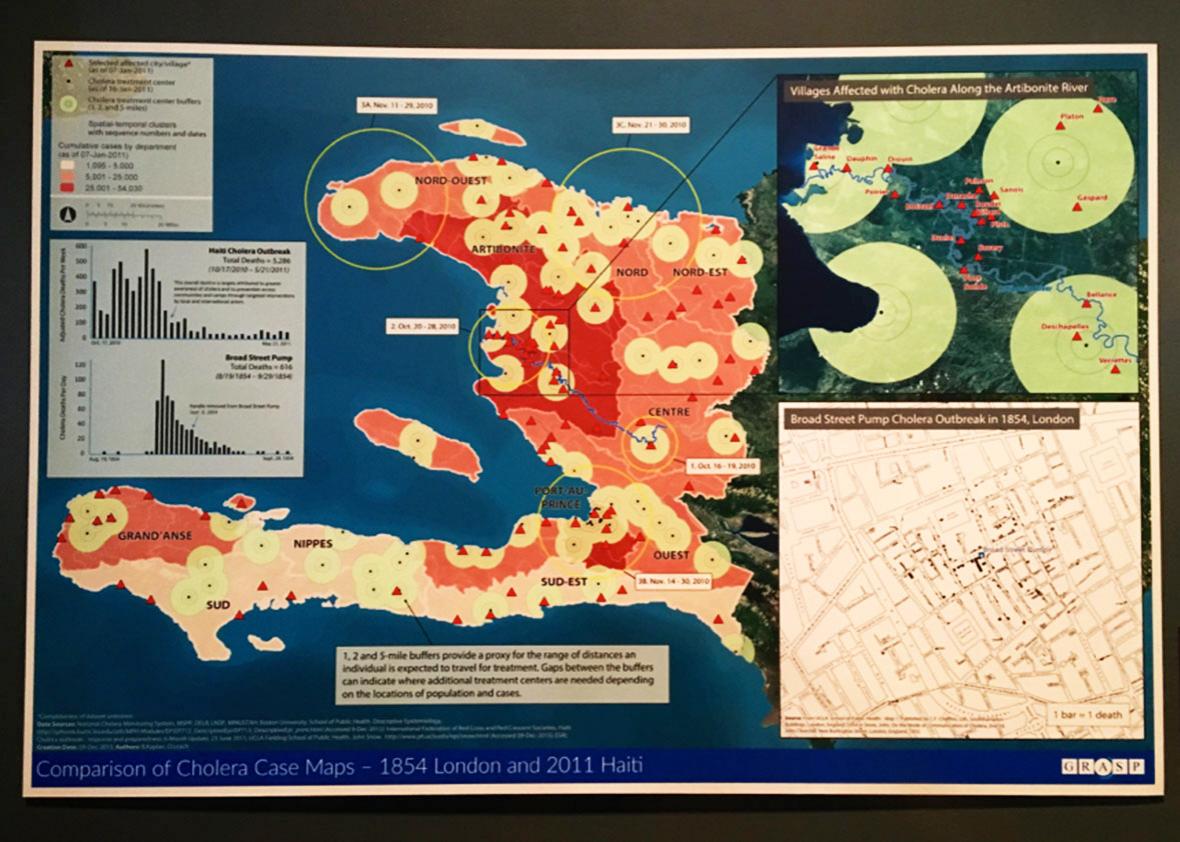
The main part of the map, that pink-and-red mass that looks like a crab claw, is Haiti. Specifically, it is Haiti at the height of the worst cholera epidemic in recent history, an incredible scourge that by official count has killed at least 9,265 people and sickened 775,000 people in that country alone—figures that many experts believe are wild underestimates. Even though this map is just a snapshot from early January 2011, less than three months into an epidemic that has now been raging nearly six years, you’ll note that already not a single part of the country has been left untouched. (The red areas are home to 25,000 cases or more; the pale pink areas, at least 1,000.) By then, the disease had already spread into the neighboring Dominican Republic and would soon be in Cuba, Venezuela, Mexico, and other parts of the region.
One of the several key facts this map fails to note is that three months earlier there had been zero diagnosed cases of cholera in Haiti. In fact, there had never been a diagnosed case of the disease in that country before. More on that in a bit.
Now let’s go to the second map, the inset at the bottom right—the little beige street grid:
This is the most famous map in the history of public health and one of the most important in the history of science. It was drawn in 1854 by John Snow, a Victorian anesthesiologist and polymath who, faced with one of the many catastrophic cholera outbreaks that plagued London in the 19th century, decided to figure out what caused it, scientifically. (At the time, most people thought cholera—a bacterial disease—was a product of either bad odors, moral and physical weakness, or the wrath of God.)
To do so, Snow went to Golden Square in the working-class Soho neighborhood and took a census of how many people had died in each house from cholera. Then he put them on the street map: one bar for each death. He found a pattern: The bars (deaths) were all clustered in one area, and as you got closer to the center of that area, the bars got longer. Most of the longest bars were next to a water pump on Broad Street, marked here:
Snow surmised this must have had something to do with the outbreak.
Shortly after, a local Church of England minister named Henry Whitehead set out to disprove Snow’s theory. (The reverend was fond of the bad-smells and wrath-of-God hypotheses.) Instead, he wound up proving it when he learned that a local woman whose baby had died from cholera had thrown its soiled diapers into an ancient waste pit that seeped into the adjacent pump’s well. A little later, everyone else in the neighborhood had started getting sick.
Armed with the map and the information, Snow theorized, correctly and for the first time, that cholera was a disease caused by microscopic organisms transmitted through dirty water, simultaneously creating the germ theory of disease, epidemiology, and modern public health. You know, no big deal.
(A popular legend says the pump’s handle was then removed, ending the outbreak immediately. In reality, it had already peaked and was burning itself out. It took another decade and the invention and construction of a sewer and water treatment system to eradicate cholera from London. You can read about this in Steven Johnson’s excellent book, The Ghost Map.)
Now, this display is hanging in a traveling exhibition called “Places & Spaces: Mapping Science”—which, according to the brochure, “demonstrates the power of maps to address vital questions about the contours and content of human knowledge.” The “Places & Spaces” creators at Indiana University told me the installation also includes “data visualizations created by the CDC that relate to the theme of using data visualization to better understand data.” This particular map was “one of the CDC’s pieces.”
So whoever put it together must have known that this little map from London and the big map of Haiti had something important to do with each other—namely, that they both pointed to the source of a cholera outbreak.
You can see it if you look closely. It’s the spot with the earliest date next to it, right next to the blue river that has all the other early cases clustered downstream.
Right here:
Yet the map on display makes no particular mention of that spot. There’s no highlight around it, no explanatory blurb, no special color, no icon akin to the one on Snow’s map. The inset in the top right, which purports to show “villages affected with cholera along the Artibonite River,” doesn’t even include it.
However it happened, from that very spot, that cholera strain—the same strain found in Nepal, which had never been seen before in Haiti, ever—spread throughout the country. By January 2011, the date given for the map, it had been well-established—mainly through my reporting and the work of French epidemiologist Renaud Piarroux—that this was the case.
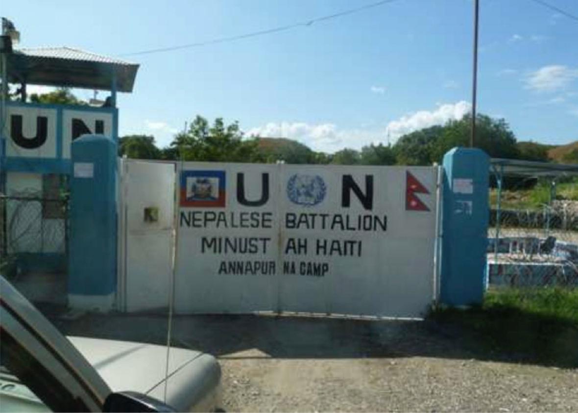
Since the first days of the epidemic, the U.N. has tried to cover up what it did. Everyone from the soldiers on the base to Secretary-General Ban Ki-moon has been implicated. The Obama administration and the U.S. government did not want the U.N. to be held accountable, because doing so might persuade other people elsewhere to hold U.S. peacekeeping missions accountable—and because the U.S. foots about a quarter of the U.N. peacekeeping budget.
The CDC, a U.S. government agency, discouraged journalists from asking about the epidemic’s origin, telling them that pinpointing the source, Dr. Snow–style, was “not productive,” “not central,” and would likely never happen. Its epidemiologists did provide a key detail early on, when they identified the strain in Haiti as having a recent South Asian origin—meaning it could have come from Nepal and not from South America, Africa, or anywhere else cholera was circulating at the time. But after that, the CDC refused to take environmental samples from around the base or test the soldiers during the small window when doing either would have been worthwhile. All of this detailed in a damning new book by Ralph R. Frerichs called Deadly River: Cholera and Cover-Up in Post-Earthquake Haiti.
Jonathan M. Katz
CDC had ignored its own standard procedure by using the “first confirmed case” in its Haiti Cholera Outbreak map of mid-February 2011. It based the onset time on laboratory confirmation, which falsely implied that cholera had first appeared on October 21 in downriver Artibonite département, then two days later in Ouest département, and finally a day after that, October 24, in upriver Centre département—findings entirely different from Piarroux’s and the Haitian public health team’s.
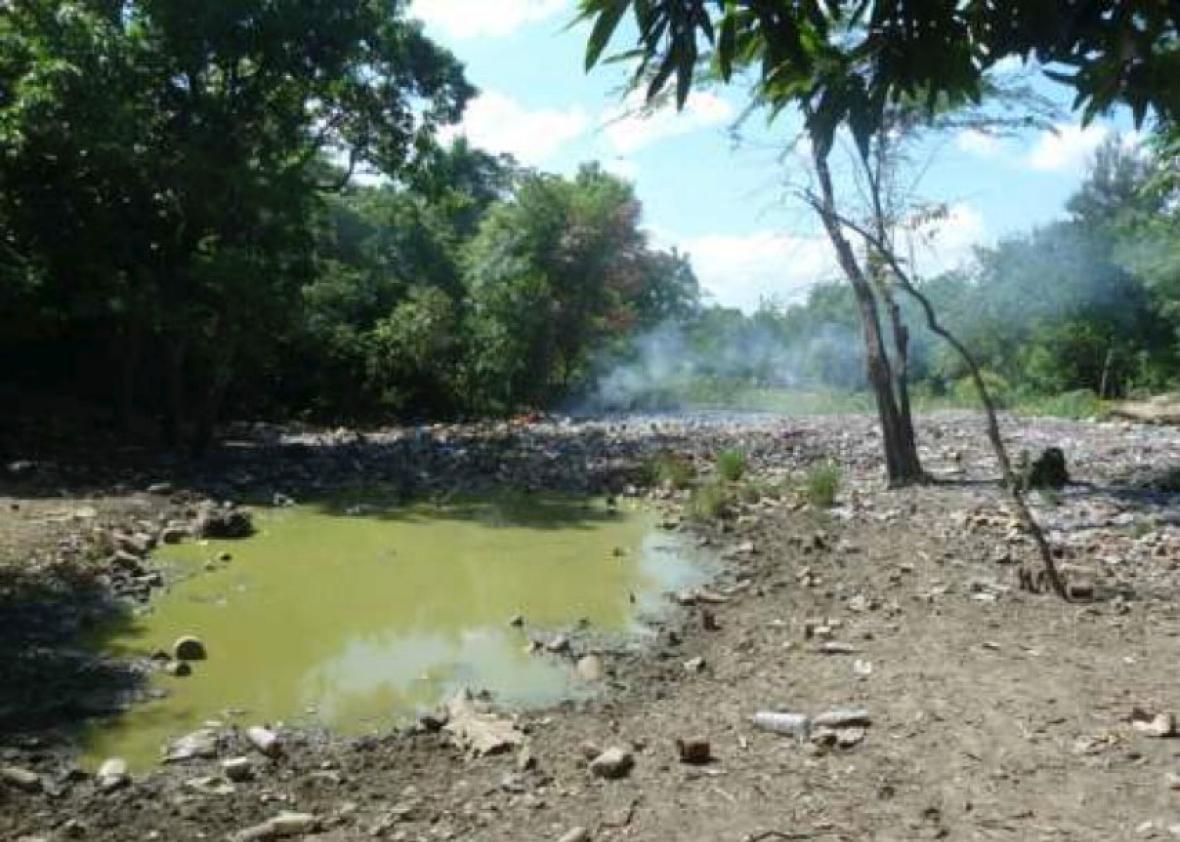
A pool of U.N. peacekeepers’ feces, across the street from the base and a few yards from Haiti’s most important river system.
Jonathan M. Katz
In the book, Frerichs also makes a good case that the agency used maps as tools of diversion. In one crucial map distributed in early 2011, he writes, the agency scrambled the order of dates for when cholera arrived in Haiti’s different regions, or départements—making it seem as if the disease had appeared on the coast before showing up near the U.N. base. Citing the CDC’s own manual, “How to Investigate an Outbreak,” which in his words emphasizes the “importance of correctly identifying infectious disease cases and then using a frequency distribution of the onset dates to estimate the outbreak’s start time,” Frerichs writes:
The timing of that map was crucial, because a panel of experts appointed, under pressure, by Ban was on its way to investigate the source of the outbreak:
Piarroux suspected that CDC had released the map in anticipation of the UN panel’s arrival in Haiti and was helping the UN shift attention away from the Nepalese peacekeeping base in Centre département. Implying that cholera had started elsewhere served that purpose.
It was the first in a series of online maps from CDC that used the poorest available measure to show when cholera had first appeared in Haiti’s ten départements. The CDC information remained widely circulated through updates in September 2011.
In a rare moment of clarity, as evidence mounted, Scott F. Dowell, then director of the CDC’s global disease and emergency response division, talked openly of political considerations in the agency’s response: “We’re going to be really cautious about the Nepal thing because it’s a politically sensitive issue for our partners in Haiti.”
Since then, the CDC has made a few more quiet admissions. In July 2011, its peer-reviewed journal, Emerging Infectious Diseases, published an independent paper by Piarroux’s team laying out evidence that the U.N. peacekeepers brought cholera to Haiti, with a standard note that it did “not necessarily reflect” the agency’s official position. CDC officials have occasionally cited that paper in technical writings, couched in conditionals. The agency’s public page on the epidemic does not make any mention of its cause.
If the CDC was trying to distract the U.N.-appointed panel with its maps, it didn’t work. The panel’s first official report, issued in May 2011, made it clear that the epidemic had started next to the U.N. base. A revised report, published by the same four scientists once they were no longer working for the U.N., was unequivocal “that personnel associated with the Mirebalais MINUSTAH facility were the most likely source of introduction of cholera into Haiti.”
The U.N. itself has never accepted any responsibility for the outbreak. The head of the U.N. peacekeeping mission in Haiti at the time, Edmond Mulet, has been continuously promoted, even as he dissembles publicly about the facts of the case. He is now Ban Ki-moon’s chief of staff. Responders prefer to highlight their role in fighting the epidemic their troops began—hence the absurd note on the graph in the top left-hand part of the chart, pairing a revisionist history of the Haiti outbreak with the mythical version of the Broad Street pump handle story:
In fact, the epidemic continues in Haiti. Neither the U.N. nor its donors are anywhere close to raising the $2.27 billion it says is required to build the clean water and sanitation infrastructure needed to end it. Meanwhile, a lawsuit against the U.N. itself, in which Ban and Mulet are named defendants, is wending through U.S. federal court. The U.S. Justice Department has appeared at each session to argue on behalf of the U.N., against the Haitian victims.
All of which probably explains why, at CDC headquarters today, five-and-a-half years into the epidemic, they are proudly displaying two historic maps that have everything to do with each other, but they are not telling you why.