
This post originally appeared on Inside Higher Ed.
In its brochures, a college is never just a college. A college is a gateway, or a launch pad, or a training ground.
Condensed into a few words, colleges’ missions are similar, and the concrete elements of college life become less so: “Attending SF State is more than an education—it’s an experience,” the university’s website reads. “Leadership isn’t just an elective. It’s a way of life,” reads the University of Virginia’s.
But it’s that brevity—a tagline, a logo, a mission statement—that sells. Colleges want to stand out, but they also want to be pithy. The effect is often grandiose, stylized, and crushingly clichéd.
Beyond tagline language, higher education marketing has its own aesthetic: students under trees, throwing Frisbees, wearing lab coats. So it makes sense when colleges on opposite sides of the world produce nearly identical marketing materials.
Take the University at Buffalo, which rolled out a new marketing campaign last month:
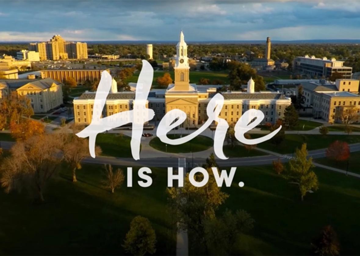
University of Buffalo
The campaign, the result of a $314,000 contract with the firms Ologie and Marshall Strategy, is centered around the phrase, “Here is how,” and it plays up the university’s location in Buffalo, New York. The goal of the campaign, the university writes on its website, is to “establish a distinctive, compelling and relevant position in the minds of our university stakeholders and key publics.”
But 9,000 miles away, the University of Sydney, in Australia, had similar ideas:
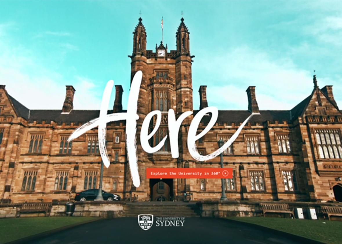
The University of Sydney
Sydney’s design isn’t a branding campaign; the white script “here” features prominently on a 360-degree video tour. The two designs were created by different firms.
Still, they are striking. How could two universities, on opposite ends of the world, come up with such similar designs?
“The presentation is very alarming,” said Peter Hahn, creative director at the public relations agency Finn Partners. “It really feels like they bought a campaign off a shelf.”
Yet Hahn can see why the theme works for both universities. Beyond the word here, the script lettering gives the design a more personal touch. Both universities knew what they were going for, and they ended up—innocently—at a similar place.
Ologie declined to comment on the apparent similarities.
Slogans, themes, and images go in and out of style all the time; for a while, Hahn says, he “felt like everyone and their mother used the ‘We are.’ ” We are Penn State. We are UMB. We are Mizzou.
Colleges want their brands to be stylish, catchy, and vibrant. But when style trumps substance, colleges start to look just like their competitors, said Bill Tyson, president of Morrison and Tyson Communications.
“Sometimes holding on to tradition and identity isn’t the most stylish—but it still conveys a message,” he said. “When I look at the Texas longhorn, it all fits. I don’t have to guess.”
Most branding experts will say that a degree is an emotional purchase. During the college search, prospective students are told to walk the campus, to stay overnight with a current student, to really get a feel for the place. They are asked: What does your gut say? Does it feel like this place really fits?
Savvy marketing is a big part of that feeling. But too often, colleges’ branding experts look to other colleges for inspiration, and similar ideas take hold across institutions, said Darryl Cilli, founding partner at the branding agency 160over90.
“When you’re a prospective college student, you’re looking for an education, and you’re looking for a lifestyle,” he said. “You want something that is completely customized to you.”
A few years ago, 160over90 published a book on the clichés that plague higher education marketing, called Three and a Tree. A college suffers from Three and a Tree, or TAAT, when its brochures feature pictures of “three students of varying ethnicities and gender, dressed head to toe in college-branded merchandise.” Then there are the worst cases, which suffer from TAATPTDPF: Three and a Tree Plus Two Dudes Playing Frisbee.
A college degree is the second most expensive purchase most people make in their lifetimes, Cilli said. Prospective students want to go somewhere they feel connected to, intellectually and emotionally. When a college’s marketing feels uninspired, those students won’t feel that connection.
“If you’re a student,” Hahn said, “the university is a huge portion of who you are.”
Brands reflect character—or at least they’re supposed to—and even after enrolling, students care about their colleges’ branding. They want it to accurately reflect their institutions, the institutions they’ve chosen to represent themselves.
Last month, Emerson College rolled out a new logo: a lowercase script e, with a long, horizontal swoosh. But students were less than impressed. They derided the logo on Twitter. They asked random passersby for their thoughts in a man-on-the-street YouTube video. They created a Change.org petition, writing: “This new logo does not represent the dedication, hard work and creativity of the students, alumni, teachers and faculty of Emerson College.”
“I always feel like brands are very much like people, very much like human relationships,” Hahn said. “The logo has to carry so much weight. It’s the very symbolic embodiment of everything.”
That’s why major rebranding efforts are often controversial from the start. But even the most ambitious, original campaigns can go too far, said Michael Stoner, president of the marketing agency mStoner.
“In buying a product like higher education, you have to establish trust in the consumer of that product,” he said. “I’m not necessarily sure that you do it by being radically different from every other college on the face of the earth.”