
We statisticians and social scientists are always trying to ensure that the data we collect or use are accurate, complete, and clean. We use data to estimate the effects of policies, and answering those questions requires data strong enough and clean enough to survive scrutiny. But data can also be used to ask questions, to look for interesting patterns, and one interesting thing about this type of endeavor is that it may not require the data to be quite as pristine.
This may explain part of why we were captivated by Alec Wilkinson’s recent New Yorker story on Thomas Hargrove, a retired reporter and current “homicide archivist” who “has the largest catalogue of killings in the country” that he analyses using an algorithm, “which he sometimes calls a serial-killer detector.” In his piece, Wilkinson recounts a story from 2010, when Hargrove uncovered a pattern of murders in Indiana that led to the discovery of a serial killer. Hargrove’s Murder Accountability Project is a fascinating example of citizen science that can help to motivate police departments to improve their work, and we applaud Hargrove’s efforts.
The story also inspired us to check out his data. Hargrove collected as much homicide data as was available online by downloading the FBI’s Supplementary Homicide Report data from 1976–2015. He then went the extra mile to obtain additional and (until then) generally unavailable data from Alabama, Florida, Illinois, and D.C. He used unknown offender sex as a proxy for unsolved case and grouped these cases by geographic area (county or metro area), weapon, and sex. Such cases are unfortunately not uncommon, especially if the victims are women. (There are also cases of multiple homicides of young men and unknown offenders, but data suggests that women are more likely to be targeted by serial killers.) Studying these individual groups, he found that he was able to find cases of suspected serial homicides, with young women as victims and unknown offenders, and this is what led to the discovery of the serial killer.
MAP makes its data and some computer code available to others who might be interested in examining it in their own communities. After checking it out, we have a few words of caution for those who might want to examine the data and use it themselves.
One problem is that the data MAP uses isn’t as clean as it could be. Their analysis implicitly assumes that if the SHR has no information on the offender’s sex, the offender is unknown. But this is incorrect: If a homicide is cleared after the SHR is filed, there is no way of updating that record, and it remains in the SHR file as uncleared. Moreover, some agencies do not provide information about offenders as a matter of policy; they may have been burned by defense attorneys who noted that their original description of the offender (including but not limited to offender sex) was incorrect. These and other problems with this data set are described in a report, “Bridging Gaps in Police Crime Data,” which one of us (Maltz) prepared for the Bureau of Justice Statistics in 1999.
Other anomalies became apparent in our first examinations of the MAP data. When looking at data, it helps to start with the area you’re most familiar with, so for us that meant examining the homicide data from Manhattan. In looking at this, we noticed that the New York Police Department does not separate out the crime data among the five counties that comprise New York City—all murders, regardless of where they happened, were logged in Manhattan. That’s certainly a problem if you’re trying to track murders by location.
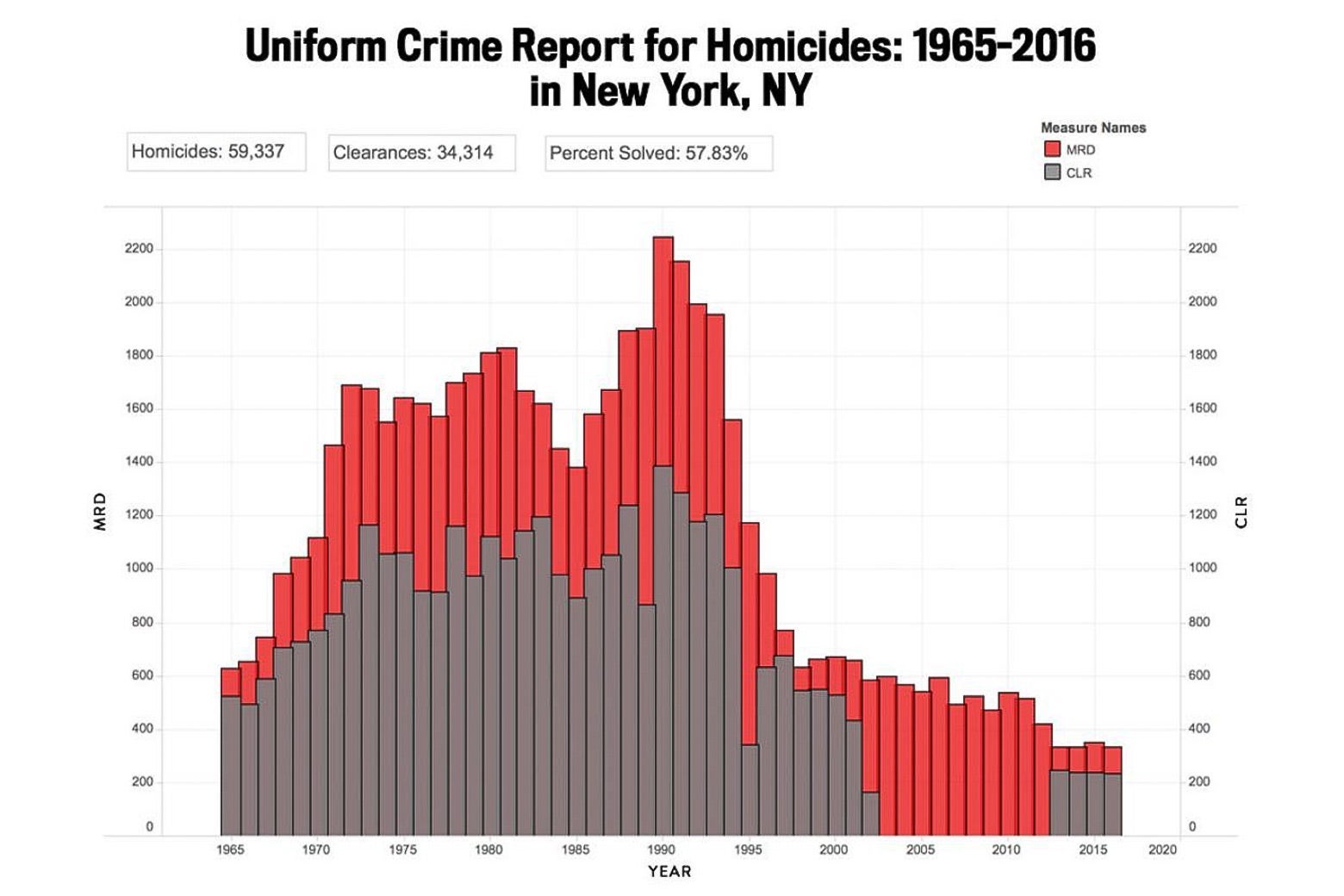
But also, we noticed some other problems with their data. Here’s a figure that we obtained from the MAP website.
But here’s a figure that you get for New York County using SHR data (note: The SHR began in 1976, so it doesn’t go back as far as the earlier graph, which used UCR data):
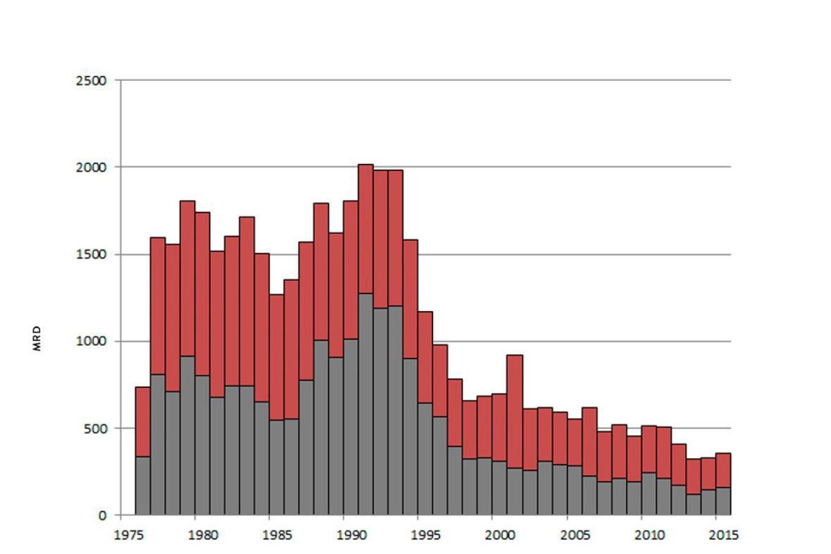
The gray bars on the charts represent cases cleared—a crime is considered cleared if an arrest results or if the homicide is assumed successfully dealt with for other reasons. On the MAP version, from 2003–2012, it appears that there were zero homicide clearances in Manhattan. This seems unrealistic, and indeed, the second chart shows that this was not the case. What appears to have happened is that the NYPD simply did not report its clearance data to the FBI’s UCR program (but did to its SHR program) for that 10-year period; this is just one of the many reasons that clearance data can be unreliable.
So when the MAP website makes judgments about which states and regions are better or worse in clearing homicides, those judgments are based on similar possibly unreliable data.
This is not to detract from the accomplishments of the Murder Accountability Project. They were able to find a nugget when sifting through a stream of messy data, which we, who deal professionally with such data on a daily basis, applaud. But if you’re automatically sifting through data, you have to be concerned with data quality, with the relation between the numbers in your computer and the underlying reality they are supposed to represent. In this case, we’re concerned, given that we did not trawl through the visualizations looking for mistakes; rather, we found a problem in the very first place we looked.
Not all cases of incomplete reporting of clearances are going to be as easily discoverable as the one we found in New York City. If you’re planning to use this data set, be on the lookout for anomalies in reporting.