On Monday, scientists announced they had detected gravitational waves emitted by the violent collision of an ultra-dense pair of neutron stars 130 million light-years away, complemented by observations of the light emissions ejected by the incendiary event. While the first four gravitational wave detections made since February 2016 have all resulted from black holes slamming into one another, this new one, first observed on Aug. 17, is the first time scientists have observed such signals created by a kilonova: a supernova formed by the cosmic crash of two neutron stars.
There are a lot of fascinating things about this arguably quite technical discovery. For one thing, this type of collision is responsible for forging the very same gold, platinum, and other precious metals we wear and use every day. The stars that collided, neutron stars, are 10 to 29 times the mass of the sun, but size out to a measly six miles in diameter—technically speaking, they’re actually the dead collapsed aftermaths of once-living stars that have undergone a supernova explosion.
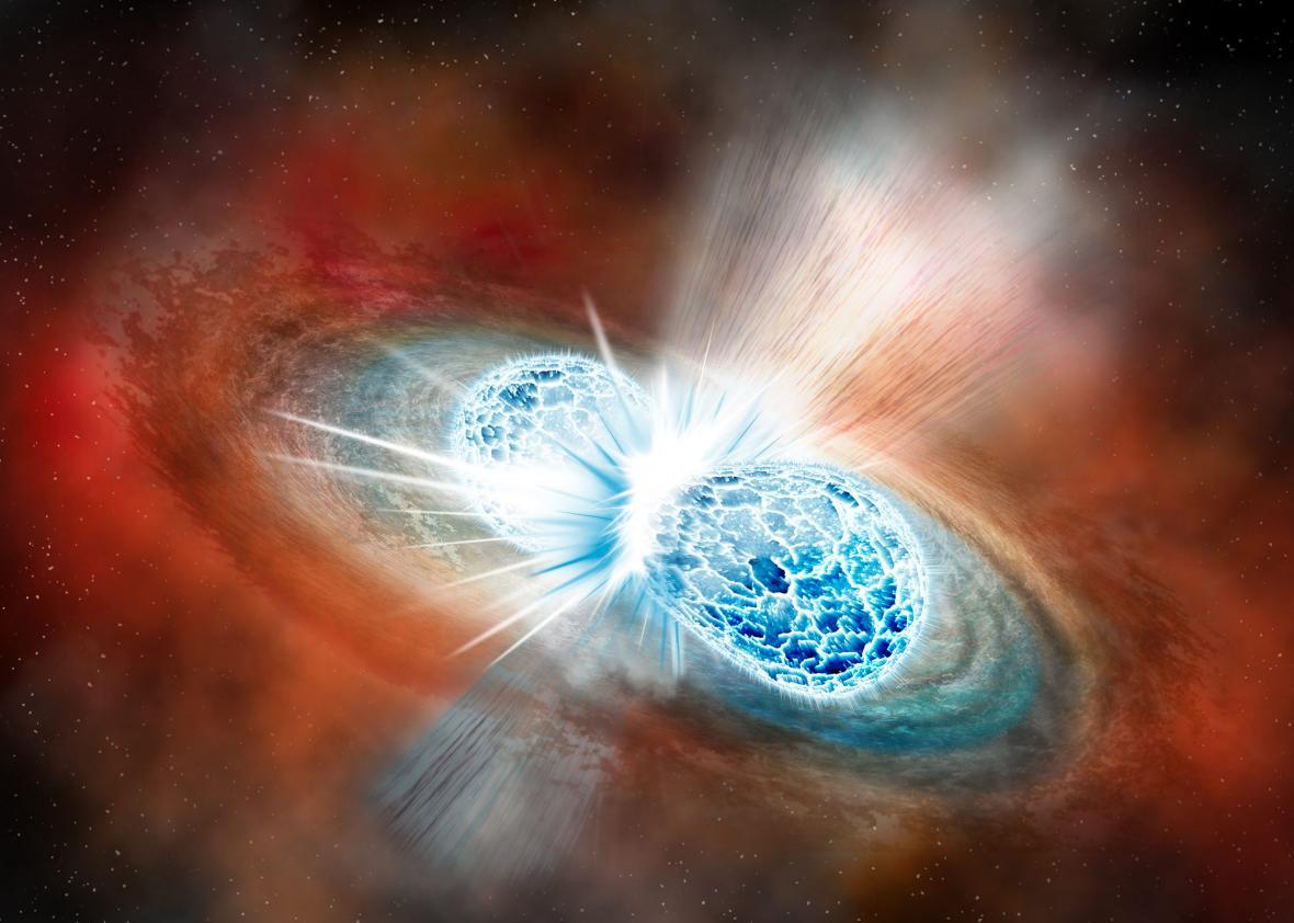
Illustration by Robin Dienel courtesy of the Carnegie Institution for Science
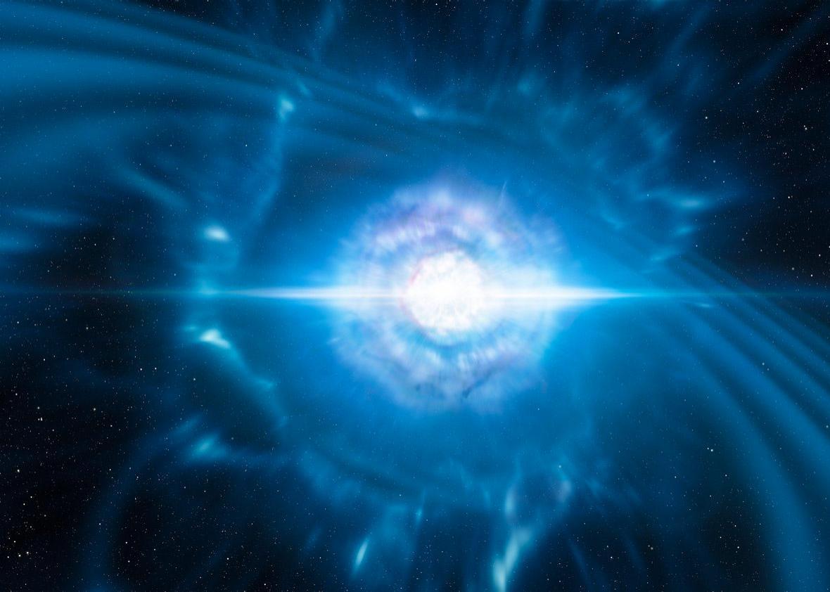
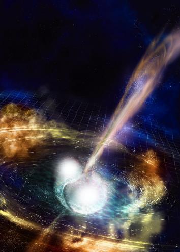
All of these things make this discovery easy to marvel at and somewhat impossible to picture. Luckily, artists have taken up the task of imagining it for us, which you’ve likely seen if you’ve already stumbled on coverage of the discovery. Two bright, furious spheres of light and gas spiraling quickly into one another, resulting in a massive swell of lit-up matter along with light and gravitational waves rippling off speedily in all directions, towards parts unknown. These illustrations aren’t just alluring interpretations of a rare phenomenon; they are, to some extent, the translation of raw data and numbers into a tangible visual that gives scientists and nonscientists alike some way of grasping what just happened. But are these visualizations realistic? Is this what it actually looked like? No one has any idea. Which is what makes the scientific illustrators’ work all the more fascinating.
“My goal is to represent what the scientists found,” says Aurore Simmonet, a scientific illustrator based at Sonoma State University in Rohnert Park, California. Even though she said she doesn’t have a rigorous science background (she certainly didn’t know what a kilonova was before being tasked to illustrate one), she also doesn’t believe that type of experience is an absolute necessity. More critical, she says, is for the artist to have an interest in the subject matter and in learning new things, as well as a capacity to speak directly to scientists about their work.
NSF/LIGO/Sonoma State University/A. Simonnet
Illustrators like Simmonet usually start off work on an illustration by asking the scientist what’s the biggest takeaway a viewer should grasp when looking at a visual. Unfortunately, this latest discovery yielded a multitude of papers emphasizing different conclusions and highlights. With so many scientific angles, there’s a stark challenge in trying to cram every important thing into a single drawing.
Clearly, however, the illustrations needed to center around the kilonova. Simmonet loves colors, so she began by discussing with the researchers what kind of color scheme would work best. The smash of two neutron stars lends itself well to deep, vibrant hues. Simmonet and Robin Dienel at the Carnegie Institution for Science elected to use a wide array of colors and drew bright cracking to show pressure forming at the merging. Others, like Luis Calcada at the European Southern Observatory, limited the color scheme in favor of emphasizing the bright moment of collision and the signal waves created by the kilonova.
Animators have even more freedom to show the event, since they have much more than a single frame to play with. The Conceptual Image Lab at NASA’s Goddard Space Flight Center created a short video about the new findings, and lead animator Brian Monroe says the video he and his colleagues designed shows off the evolution of the entire process: the rising action, climax, and resolution of the kilonova event.
The illustrators try to adhere to what the likely physics of the event entailed, soliciting feedback from the scientists to make sure they’re getting it right. The swirling of gas, the direction of ejected matter upon impact, the reflection of light, the proportions of the objects—all of these things are deliberately framed such that they make scientific sense. Although the kilonova is the focal point for the artwork, a closer look shows off all the softer details that take precision and care to finesse.
Nevertheless, the incredible artwork that stems from these discoveries are still just an amalgamation of numbers and hypotheses injected with imagination. There is no optical telescope powerful enough to watch and record kilonovas occurring 130 million light-years away. Nobody, not even the smartest scientists in the world, know exactly what these things look like. Perhaps that’s not necessarily a bad thing: If space is infinite, it makes sense our dreamy wonderings about what it looks like would be infinite as well.