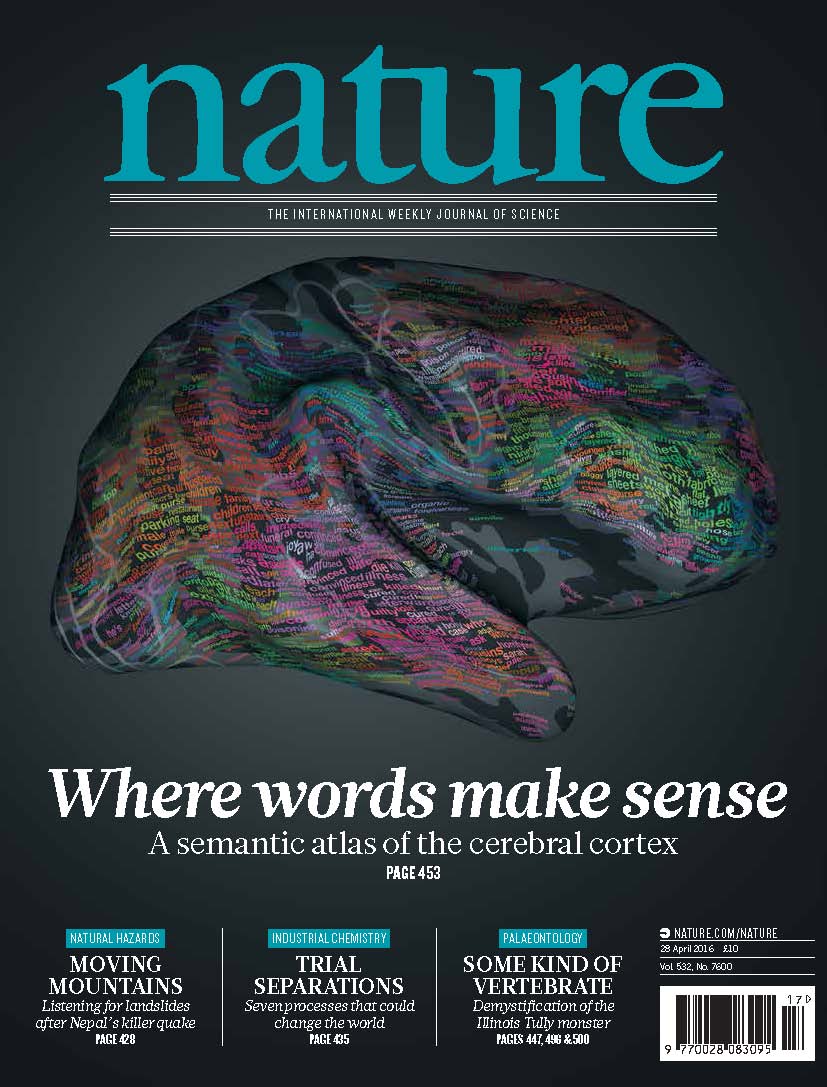
Last week, Nature, the world’s most prestigious science journal, published a beautiful picture of a brain on its cover. The computer-generated image, taken from a paper in the issue, showed the organ’s outer layer almost completely covered with sprinkles of colorful words. The paper presents a “semantic map” revealing which parts of the brain’s cortex—meaning its outer layer, the one responsible for higher thought—respond to various spoken words. The study has generated widespread interest, receiving coverage from newspapers and websites around the world. The paper was also accompanied by an online interactive model that allowed users to explore exactly how words are mapped in our brains. The combination yielded a popular frenzy, one prompting the question: Why are millions of people suddenly so interested in the neuroanatomical distribution of linguistic representations? Have they run out of cat videos?
The answer, I think, is largely the same as the answer to why “This Is Your Brain on X” (where X = food, politics, sex, podcasts, whatever) is a staple of news headlines, often residing above an fMRI image of a brain lit up in fascinating, mysterious patterns: People have a fundamental misunderstanding of the field of neuroscience and what it can tell us.
But before explaining why people shouldn’t be excited about this research, let’s look at what the research tells us and why we should be excited.
Royal Society Publishing
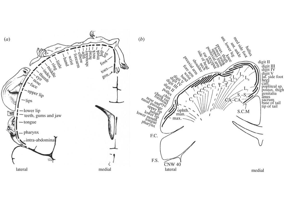
Different parts of the brain process different elements of thought, and some regions of the cortex are organized into “maps” such that the distance between different locations corresponds to the physical and/or conceptual distance between what it represents. An obvious example is the somatosensory map above: You can literally draw a (distorted) human body on the postcentral gyrus, such that stimulating the brain where you’ve drawn an elbow produces tingling in the elbow, and stimulating the spot where you’ve drawn an ass produces tingling in the ass.
A number of studies have also identified parts of the brain involved in representing concepts, such as the notion of actions or tools. But for the new Nature paper, Alexander Huth, a postdoctoral researcher in the lab of Jack Gallant at the University of California–Berkeley, took a much more comprehensive approach, testing thousands of words, embedded in lengthy narratives, to see what kinds of activation patterns turned up.
Huth, Gallant, and collaborators placed seven participants (including Huth) in an fMRI scanner and played them more than two hours of storytelling from the Moth Radio Hour, which included about 3,000 different words. They then looked to see which parts of the brain were most highly activated by each word. (For complex statistical reasons, they did this in a somewhat indirect way. Strap in. First they made a list of about 10,000 words, including the Moth words plus 7,000 other common words. Then, using a collection of millions of books, Wikipedia pages, and Reddit comments, they calculated how frequently each of their 10,000 words occurred in the vicinity of 985 common words. This allowed them to place the 10,000 words in a 985-dimensional space, with each of the word’s 985 coordinates specifying how closely it’s associated with each common word. [While this mathematical space is impossible to visualize, conceptually it’s no different from a three-dimensional space; each location just has 985 coordinates instead of the three of x, y, and z.] This legwork allowed them to link not only the 3,000 Moth words to the areas of brain they activated [areas divided into pea-sized regions called voxels], but also to link each of the words’ 985 coordinates to those areas. Then they added up these coordinate-voxel pairings for all the 3,000 words and found average dimension-voxel correlations. That way, they could take any of the 10,000 words, even those they hadn’t presented to the participants, and based on where it was in that 985-dimensional space, they could predict where it would activate the brain. They tested the results by having people listen to another 10-minute story while scanning their brains and determined that their predictions were basically correct.)
Once they were able to predict where a given word would activate the brain, they wanted to go the other way, from brain to word: In other words, they wanted to point at a region of the cortex and see which words or concepts it represented. So they ran a statistical analysis of their 985 dimensions to group them into fewer dimensions based on similar brain activation. For instance, if the frequency with which words were found in the vicinity of the word fork on Wikipedia and elsewhere were strongly associated with their coordinates in the spoon dimension, then those two dimensions could be collapsed into one, representing utensils.
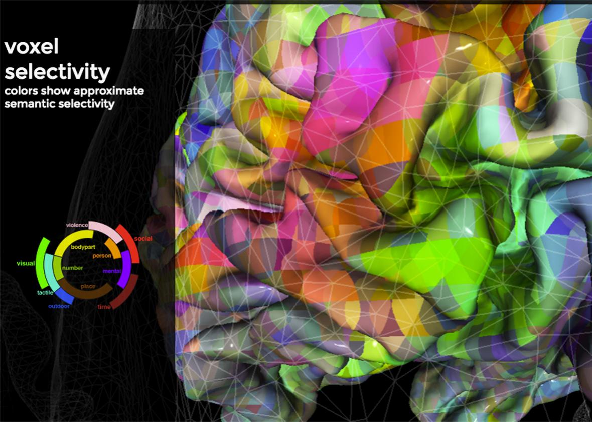
Using this method, the researchers collapsed 985 dimensions to four. The first dimension roughly describes whether a word’s meaning is more closely related to humans and social interaction (words at this end include social, emotional, and communal) or more closely related to perceptual descriptions, quantitative descriptions, and setting (words at this end include tactile, locational, numeric, and visual). The second dimension, Huth says, roughly describes whether a word’s meaning is both social and perceptual (hand, violence) or neither (going, time). (The dimensions are a bit hard to interpret, and in the paper the researchers didn’t even attempt to label the third and fourth.)
The researchers took the first three dimensions and assigned them the colors red, green, and blue (the three additive primary colors—TVs also use RGB signals instead of red, yellow, and blue). The higher a word was in each of the three dimensions, the more of that dimension’s assigned color it was assigned. Highly social words, for instance, have a lot of red in them. Then the researchers colored the surface of the brain, such that cortical areas matched the colors of the words they represented. The result is a rainbow-colored brain displaying every color combination. This candy coating helps the nifty online tool displaying the study’s results feel accessible. You can rotate and zoom a rendering of a subject’s rainbow brain, click on each hue, and see the cloud of words most likely to activate that part of the cortex.
(The researchers did all of the above calculations seven times, once for each subject. As a final step, they used an algorithm they developed called PrAGMATiC, for “probabilistic and generative model of areas tiling the cortex,” to combine all seven people’s brain data into one generic semantic atlas. I’ll spare you the details, but they have another paper describing the method.)
All of this work yielded two main surprising results. First, each person’s semantic map was relatively symmetrical from left to right, countering previous research suggesting that language comprehension is handled mostly by the left hemisphere. Second, everyone’s map was nearly identical.
One critique of the study was that the researchers scanned only seven people. A typical fMRI study might have twice as many subjects, and a behavioral experiment might have 10 times as many. But this study was different, in that it collected enormous quantities of data on each subject—reactions to thousands of words each—so it didn’t need as many subjects. As Huth told me, “We go deep instead of broad in our data set.”
Another critique is that the subjects were all right-handed native English speakers associated with Berkeley. Huth sees that homogeny as a strength, noting that he wanted to control as many subject variables as possible. (Let’s say two of the subjects were left-handed or were not native English speakers, and their brain maps were different from the others. That variation would just be noise, because two isn’t a big enough sample to know if their differences were caused by language or handedness or if it was just random variation.)
With one brain atlas established, they’re now revving up to study speakers of other languages and those who speak English as a second language. Huth guesses that the semantic maps won’t change much. “I feel like the commonalties in our existence are so much greater than differences in the surface form of language,” he told me. And he’s excited about the tool they’ve built for asking other questions about how the brain uses language. It could even have clinical applications, for instance in diagnosing the deficits caused by brain injury or disease. And it could someday prove a useful tool for interacting with computers through a form of mind reading.
* * *
So there’s plenty to be exited about. But the two most interesting scientific advances—the fact that the semantic maps are symmetrical across hemispheres and that they’re uniform across individuals—while maybe fascinating for neuroscientists, don’t seem like Facebook fodder for your average Joe. So why is the public drawn to this paper?
Two reasons. First, its pretty pictures. Those rainbow brains are truly gorgeous. As Huth told me, the study is “esoteric and not easily digestible,” but “the graphics are pretty cool.” The researchers also posted a cool video, and the online interactive brain feels like a game—it even puts you in control. As one person emailed me, “I spent a long time yesterday playing with it and being sort of fascinated/addicted by it, before I realized that I had almost no understanding of why it actually mattered that these words showed up in these places. It was simply fun.” She called it “insanely mesmerizing.” Go try it yourself! Finally, something to rival cat videos.
Second, and this one applies to most of the “your brain on X” stories, I think people expect neuroimaging studies to tell us more about psychology than they actually do or even can. Consider the widely covered PNAS paper published last month on LSD and brain activity (CNN headline: “This Is Your Brain on LSD, Literally”). One finding was that LSD strongly activated the visual cortex and its interactions with other parts of the brain. Well, as anyone who’s taken LSD will tell you: Duh. Just describing what everyone already knows about trippy visuals doesn’t generate press—but stating that we’ve actually seen it in the brain seems to. It’s as though people, in general, don’t believe or value psychological reports until they’re reified by neuroscience (a phenomenon that’s been called neurorealism).
In general, seeing that a stimulus activates a part of the brain only tells us something about how that stimulus affects one’s actual experience by virtue of other studies linking that brain area to experience. We could just study the connection between the stimulus and the experience directly and more easily: A study showing that cake activates the ventral striatum, an area associated with reward, doesn’t tell us anything we wouldn’t learn by watching a child and a cake. You can leave your expensive brain scanner at home.
With the interactive semantic map, if you click on an area in the right angular gyrus that represents social words, you see it responds to both husband and father. We already knew those two concepts were related, so nothing new there. The same area also responds to other words, including months. That’s a less obvious connection, but does it reveal anything about humanity? Probably not. I don’t suddenly have new insight into husbands or months, now that I know nearby areas of the brain respond to the words for both. The research has not attempted to divine what the map means—these words’ proximity could be incidental, or based on a linkage that’s superficial, or on one that’s much too deep for our puny minds.
So in a sense the map might not be as meaningful as people might think. One story I read about the paper said, “Their results suggest language is much more complex than previously thought.” I’m not sure the results actually say anything about language—at least not on a level relevant to a typical user of language or even a linguist. We see again that neuroscience tells us a lot about biology but not much about psychology.
Huth doesn’t disagree about neuroscience’s application to psychology, helpfully quipping, “God knows it’s a mess.” He says it’s possible neuroscience may eventually be able to teach us about behavior, but we’re a long way off, and in the meantime the best way to study behavior is to, you know, study behavior.
But still, a plethora of research shows that people find explanations for behavior more satisfying when accompanied by a superfluous mention or picture of the brain. Why do these mere mentions give psychological findings the patina of significance?
According to Diego Fernandez-Duque, a psychologist at Villanova who has studied the allure of neuroscience, it’s because we’ve accepted the idea of “brain as engine of mind.” We like it when branches of science build on one another, and neuroscience is one step more fundamental than psychology. Deena Weisberg, a psychologist at the University of Pennsylvania, has recently submitted a paper supporting this view. She found that not only did people see explanations from the field of psychology as more convincing when accompanied by meaningless references to neuroscience, but the same went for neuroscience explanations populated with terms from basic biology, biology flavored with chemistry, and chemistry with a nutrient-free zest of physics.
So neuroscience provides satisfyingly reductionistic (though often empty) explanations for psychology. And of all the reductionistic scientific explanation to give, those for psychological phenomena are surely the most enticing. After all, psychology relates most personally to our everyday lives, our drives and fears and very identities.
A third possible explanation for the attraction of Huth’s paper, besides pretty pictures and neurorealism, is intuitive Cartesian dualism, an automatic tendency to see the mind and brain as separate, even separable, types of substances. Lite-Brite phrenology reminds us that all of our abstract thought and consciousness is implemented by a hunk of matter, and we see that ideas can literally be mapped to physical space. This notion is of course hundreds of years old, but it feels surprising every time. Even solid science writers can write things like: “Not only were [they] learning, but so were their brains.” Yet the little bit of evidence on this hypothesis shows that self-professed dualism doesn’t correlate with ratings of how interesting or surprising neuroscience studies are. So this hypothesis needs more research. As Weisberg told me, “The fact that this [reductionistic appeal] happens across multiple sciences suggests that it’s not just dualism. However, I think we don’t yet have a foolproof way of measuring people’s dualist beliefs, so there may still be a place for dualism to play a role.”
* * *
Not long ago, I attended a professional conference on “neuroleadership.” Most of the seminars actually discussed psychology. Sometimes speakers would throw in a mention of the brain, but I couldn’t see how any of the suits in attendance would benefit by knowing which part of the brain was active when they were feeling in control, or being persuaded, or working creatively. But in talking with them, I could see their excitement in mastering a new vocabulary. “Cortex” is like a magic password for getting people to listen to you, “amygdala” the new “open sesame.” If your lessons are solid, and many of those at this conference were, sprucing them up with some buzzy neurorealism may be a justifiable way to attract people’s attention. Sure, it might seem silly—like jangling a key chain in front of a toddler—but it’s mostly harmless.
So hey, if you see a picture of a brain, go ahead and click. Whether or not the article is actually as deep as you feel it to be, you might just learn something about biology or even psychology. In any case, you’ll definitely learn a lot more than you would by watching a cat video.