
In a much-discussed recent paper, economists Anne Case and Angus Deaton reported “a marked increase in the all-cause mortality of middle-aged white non-Hispanic men and women in the United States between 1999 and 2013. This change reversed decades of progress in mortality and was unique to the United States; no other rich country saw a similar turnaround.” During this period, the death rate among non-Hispanic white Americans between the ages of 45 and 54 increased by about 10 percent, from 380 to 415 per 100,000. To put it another way, of 1,000 people in this group, about 4 would be expected to die in the next year. Meanwhile, the death rates in several other rich countries continued their historic pattern of decline, falling by about 20 percent during this period. The mortality rate among this age group in Britain, for example, is 270 per 100,000. In the United States, Hispanics and blacks also had sharply declining death rates. It was only middle-aged whites who saw the increase.
This finding was stunning, and it resonated with both left and right. Paul Krugman hears that “mortality among middle-aged white Americans has been rising since 1999,” and focuses on this being “a uniquely American phenomenon—yet America has both a much weaker welfare state and a much stronger role for traditional religion and values than any other advanced country,” and sees “a link between the despair reflected in those mortality numbers and the volatility of right-wing politics.” Elsewhere on the New York Times op-ed page, Ross Douthat attributes the problems to a loss of “the sense of meaning and purpose that blue-collar white Americans derived from the nexus of work, faith, and family until very recently.”
(An amusing aside here: Case and Deaton looked at mortality rates for 45-to-54-year-olds, a group Krugman refers to as “middle-aged” but that the much younger Douthat calls “late-middle-aged.”)
There are lots of competing explanations, but first we’d better make sure we know what we are trying to explain! It was brought to my attention that the observed increase in mortality among a group of Americans aged 45–54 could be a statistical artifact resulting from the coarseness of the age category. The culprit is the postwar baby boom, that notorious period from 1946 through 1964 when Americans were producing children like rabbits. The number of births in this country increased from 2.9 million in 1945 to 3.6 million in 1950 and peaked at nearly 4.3 million in 1959, before declining to below 4 million in 1965. In 1999, the peak of the baby boom was just entering the 45-to-54-year-old age bin: That is, there were lots more 45-year-olds than 55-year-olds in 1999. By 2013, the baby boom had mostly passed through the 45–54 group, and the average age in this bin was a bit older.
The census data have numbers for the population by age, and I ran the numbers and estimated that the average age of non-Hispanic white Americans increased from 49.3 in 1999 to 49.7 in 2013. An increase of 0.4 years might not sound like much, but mortality rate increases a lot by age—more than doubling between the ages of 45 and 54—so even a small shift in average age can cause a big shift in the observed trends.
To track down whether this can explain the reported increased death rate, we have to go to the data on deaths per year, which fortunately are easily downloadable on the website of the Centers for Disease Control and Prevention. We just click on deaths per single year of age among non-Hispanic whites from 1999 through 2013. (Unfortunately, data before 1999 and after 2013 are not so easy to grab.)
First let’s pull down the numbers and check that we get the pattern of rising death rate that Case and Deaton reported and that everybody’s been talking about:
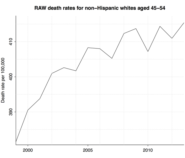
Chart by Andrew Gelman
Check. But those are the unadjusted numbers. What we really want are the death rates that we’d see with a fixed age distribution. For simplicity we’ll adjust to an equal distribution; that is, we’ll assume there are equal numbers of people of each year of age of the 10 years of age in the bin. And here’s what we get:
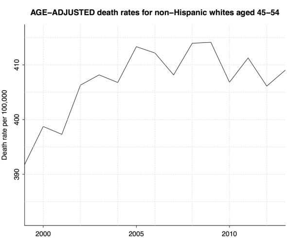
Chart by Andrew Gelman
So, no, mortality among middle-aged white Americans has not been steadily rising. It went up from 1999 to 2005 and has been stable since then.
Op-ed writers: Go back to your notebooks! Time to come up with new explanations.
And there’s more. But before going on, let me emphasize that the main finding of the Case and Deaton paper stands up just fine. I take their main finding to be that middle-aged U.S. whites have not been seeing the rapid declines in death rates that have occurred in other groups and in other countries. Statistical bias corrections on the order of 5 percent—that’s what we’ve just seen—are enough to derail the story of a steadily increasing death rate among middle-aged white Americans, but in no way could they explain away the drops of 20 percent in other groups and other countries. (Some other countries had postwar baby booms, but they generally did not quite coincide with America’s.)
Now let’s return to the U.S. data. Once I found how the story was changed after a simple statistical adjustment, I got curious: What was happening inside the data? Maybe more explanations could be found just by taking a look. Now that we have the data by single year of age and can query the CDC database, let’s look at the age-adjusted patterns separately for women and men in this demographic group:
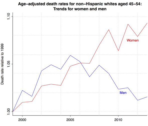
Chart by Andrew Gelman
Wow. Look at that. From 1999 to 2013, the death rate for middle-aged white women steadily increased. The death rate for middle-aged white men increased through 2005, then decreased. Add these and you get the increasing, then flat pattern that we saw for the two sexes together.
In New York magazine, Jesse Singal quotes researcher Kathryn Paez: “I had thought it would impact more men than women, because women weren’t affected by the downturn, I believe, as much as men were.” Now that we see that the men’s death rate was actually declining since 2008, maybe we need a different story.
The point is that something as obscure as a statistical adjustment, driven by a seemingly trivial shift of 5 months in average age in a 10-year window, is enough to completely change our story.
Let me emphasize that this is all in no way a “debunking” of the Case and Deaton paper. Their main result is the comparison to other countries, and that holds up just fine. The place where everyone is confused is about the shape of the trend among middle-aged non-Hispanic white Americans.
The story being told is that there was something special going on, with an increase in mortality in the 45–54 age group. Actually what we see is an increasing mortality among white women aged 52 and younger—with nothing special about the 45–54 group—and nothing much consistently going on among men. Now that we have the facts down, the explanations can follow. And there is much more work to be done, in particular in integrating these data with what we know about “cohort effects”—behaviors that different generations carry through their lives.
Just for example, on my blog I’ve posted some graphs showing trends in death rate since 1999 among men and women of three ethnic groups—non-Hispanic whites, Hispanic whites, and blacks—for each year of age from 35 to 64. Just to see what was going on, I took that 45–54 group that everyone’s been talking about and bracketed it with the decades before and after.
What do we find? For blacks and Hispanics, there’s been a steady decline in death rates for almost all ages, with the pattern especially clear at older ages. Among whites, the pattern discussed for 45-to-54-year-olds also appears in the group one decade younger: an increase in mortality and a slight decline for men:
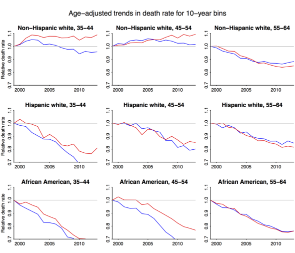
Chart by Andrew Gelman
Actually, the pattern among the younger group is even stronger—it just doesn’t show up if you pool the sexes.
And there’s even more to see when you look at the individual ages. At this point I would defer to demographers and actuaries who understand these data far better than I do.
As a statistician, what lessons can I draw from this episode?
First, post-publication review is a wonderful thing. A blog commenter alerted me to the possibility of age-aggregation bias, Angus Deaton pointed me to the relevant CDC website, and I was able to dive into the data, perform some calculations, and make some graphs. The classical peer-review system is painfully inefficient: Once an article appears in a journal, I could submit a letter of correction, that letter would have to go through a review process and would be severely limited in length, then the original authors could reply, and so on. All at the speed of the U.S. mail circa 1775. Real-time feedback gets us there much faster.
Second, when studying a time series, graph the whole thing, don’t just compare the beginning to the end. A simple comparison of 1999 to 2013 shows an increase in death rates at most ages. But the time series shows an increase since 2005 and then stasis—a much different picture.
Third, break up the data. That post-2005 stasis turned out to mask an increase for women and a simultaneous decrease in death rates for men.
Fourth, spot a potential bias, then estimate its size. The “pig in a python” image of the baby boom moving through the age distribution suggested that raw death rates in 10-year age bins might be biased. But by how much? To see, I first made an order-of-magnitude calculation and then followed Deaton’s suggestion and went to the raw data.
Finally, science progresses by continual revision. Case and Deaton made a mistake by not adjusting their numbers for changes in age distribution—but had their paper never been published, we never would’ve been having this discussion. Meanwhile, their main finding holds up and is clearly worth further exploration, and researchers can also look into the diverging patterns since 2005 for men and women. While this is happening, I’m pretty sure some people will find major problems in my analysis. That’s how it goes, two steps forward and, if we’re lucky, only one step back.