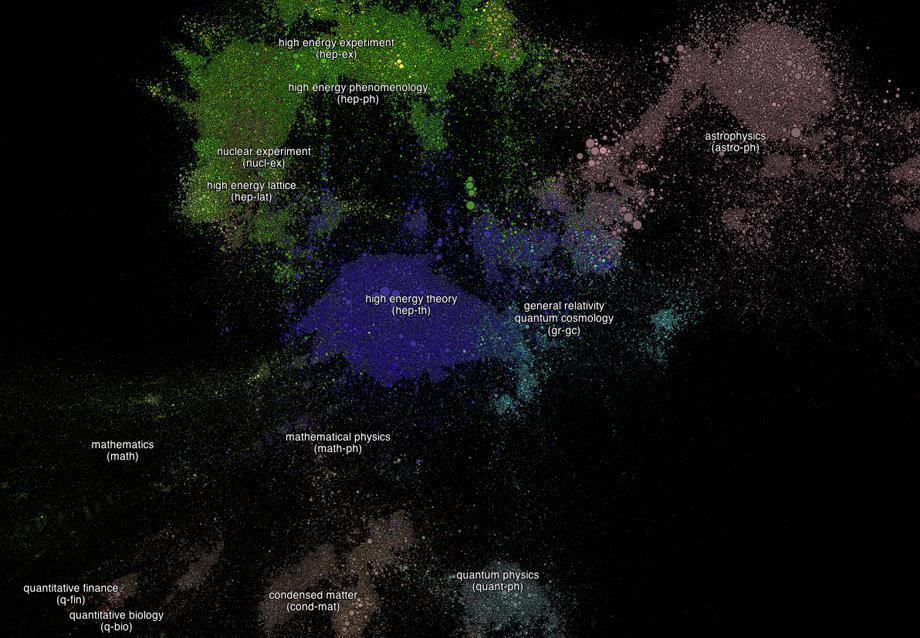
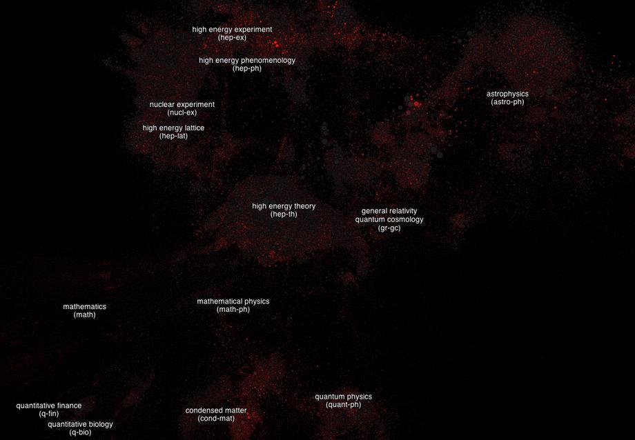
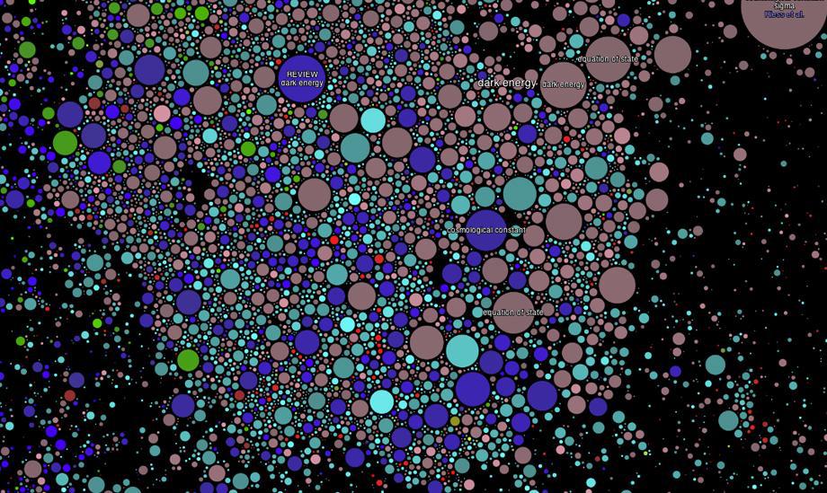
The study of the universe is a universe itself. An infographic designed by two physicists maps the hundreds of thousands of studies in arXiv, an open repository for physics, mathematics, computer science, quantitative biology, finance, and statistics papers that is maintained by Cornell University. The category of a paper’s research determines the color of its circle, and the more cited the paper is, the bigger its circle. Each marker is placed according to the number of references it takes to get from it to each other paper. Accordingly, papers are clustered around topics, such as extrasolar planets, dwarf stars, and superconductivity. Some multicolored clusters show where disciplines intersect around topics like neutrinos, dark matter, dark energy, and networks. Toggle the heat map to color each study according to its age to see which topics are getting the most attention. To learn more about how the infographic works, see its blog.
Courtesy of Paperscape
Courtesy of Paperscape