When I went to Burning Man, the visual aspect of the event that most delighted me—besides the flamethrowing robots and the nude aerialists—was the utter lack of logos. Burners work hard to create a “non-commodified” society in that desert. Any reminders of the mass-market culture that dominates the world outside are frowned upon. Or, as one (slightly dickish) Burner pointed out to me upon glimpsing the Nalgene and Goldman Sachs logos on the sides of my water bottle: “You got a lotta brands, man.”
Yet when Burners discuss their favorite festival online, they often include the little text shibboleth )*( in their chats—an ASCII representation of the Man himself, standing up with outstretched arms. The very first Google Doodle was a kindred line drawing, slyly announcing that Larry and Sergey were off attending the event. Burning Man’s official holding entity has even trademarked a symbol of similar design. It seems that shorthand visual signifiers—crassly commercial or not—come in mighty handy sometimes. (See, somewhat relatedly: the hackers of Anonymous, who have forever linked the foment of digital anarchy with an image federally registered to Time Warner.)
Turns out we were using logos long before anyone decided they weren’t cool. In Marks of Excellence: The History and Taxonomy of Trademarks—now newly revised and expanded in a second edition, 15 years after its original release—author Per Mollerup surmises that the first trademarks “probably marked ownership” and were “a simple sign to show that a weapon belonged to a particular man.” Makes sense. The same jealous impulse is visible today wherever you see a herd of branded cattle, a stack of painted shipping containers, a watermark on a movie screener, or a monogram Sharpied into a kid’s summer-camp undies.
At some point logos graduated from merely proclaiming this is mine (so don’t steal it) to announcing I made this (so rest assured it will exhibit the same craftsmanship as the other things I’ve made). Mollerup attributes the initial appearance of this latter sort of logo to artisans’ “urge to take credit, to show pride and to claim responsibility.” It’s easy to imagine the progression here. People admire my weapon, so I make a bunch of identical weapons and sell them off. My S mark serves 1) as an advertisement that drums up business when fellow warriors held at swordpoint ask my customers, “Where’d you get that fabulous weapon with the big S on it?”; 2) as a symbol of quality, so if my customers want to resell their weapons they can note, “It’s got that big S on it, so you know it’s the jam”; and 3) as a personal guarantee, suggesting, “This weapon has my S on it, so should it flimsily disintegrate mid-skirmish, you know where you (or your heirs) can complain.”
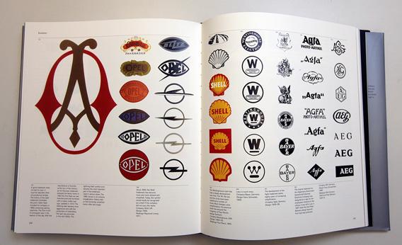
Today’s logos find their forebears in coats of arms and royal monograms. Marks of Excellence wonderfully contextualizes these building blocks of graphic identity. You’ll learn the rules of heraldry, and will soon be sorting invected lines of partition from embattled or dovetailed ones. You’ll spot the difference between chevrons, gyrons, inescutcheons, and double quatrefoils. (The sumptuous heraldic vocabulary alone makes this section worth it.) You’ll learn the original meaning of “hallmark.” (Spoiler: It refers to a hall in London where metalsmiths’ goods were stamped, verifying their purity.) There’s even an entire page devoted solely to sketches of earmarks—the patterned mutilations some ranchers slice into the ears of their livestock.

Courtesy of the author
It’s all rather pragmatic at first. These symbols are rooted in basic functions of identity and authentication. But as logos evolved, more nuance emerged. We enter the brave new world of “branding”—the metaphorical kind, not the kind with sizzling cow flesh. Suddenly, through careful design and well-chosen imagery, logos begin to connote all sorts of subtle things about a company and its products. Exclusivity, elegance, aggression, wit, simplicity, tradition, modernity.
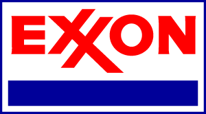
After muddling through some dense semiotic discourse about “the transport of meaning” and “interpretants” and “the triadic relationship set up by a sign,” Mollerup gets down to brass tacks, walking us through the vital qualities shared by effective trademarks. For instance, they must be easily distinguished from the marks of direct competitors (which explains why rival colas and car rental companies pick boldly differentiated color schemes). They must be instantly recognizable. (Mollerup singles out Exxon’s interlocking red X logo, designed by the famed Raymond Loewy, for the way it sears itself onto your retinas and into your memory.) When appropriate to the brand’s vibe, the mark may be discreet (as in the single white dot on a Dunhill pipe). But above all, it must be repeated, over and over, anywhere and everywhere, until its effect is “dramatically increased.”
This last rule is the sort of thing that drives people to establish an experimental desert community, packed with naked aerialists, just so they can hide from corporate logos for a week. And in this spirit, here’s where I’ll address the third—and most psychologically fecund—evolutionary stage of the trademark. First, it meant: “This belongs to me.” Then it meant: “I created this.” Then, at a certain point, it came to mean: “I have no formal connection to this, yet it somehow represents a spiritual kernel of who I am.” So now we’re talking about the teen who shaves a Nike swoosh in his hair. The prep who won’t be seen without a Lacoste alligator chomping its way across her torso. The urban boho who plasters Apple stickers on his bike helmet.
Hey, we all have our brand weaknesses. I’m ashamed sometimes at how glimpsing certain logos can still conjure a jolt of excitement or envy within me. At the same time, I’m reminded of the protagonist of William Gibson’s Pattern Recognition, Cayce Pollard, a marketing consultant who is preternaturally attuned to corporate logos, who removes the tags from her T-shirts and files the trademarks off the buttons on her Levis. She becomes physically ill at the mere sight of Bibendum—that puffy fellow also known as the Michelin Man (and to whom Mollerup coincidentally dedicates a two-page spread). Having spent a lot of time looking at and thinking about marketing, I identify with Cayce. And I find I get mildly nauseated when I try to watch Logorama, the 2010 Academy Award winner for Best Animated Short, an adventure composed entirely of brand symbols, corporate mascots, and lettermarks.
Flipping through Marks of Excellence gives me the same kind of willies. Mollerup taxonomizes hundreds upon hundreds of trademarks—each one lovingly reproduced, in full color, so as to pop off the page just like it was designed to do. To be sure, Mollerup’s a fascinating tour guide, with sharp things to say about familiar logos. His book will be a treasured reference for any designer tasked with forging a new visual identity for a new enterprise. But the saturation of corporate symbols here could serve, in the wrong hands, as a kind of torture device. This collection of smiling animals, abstract geometric shapes, and drop-shadow lettering would be enough to stir brand hate in a shopaholic. It’s strangely maddening to be inundated with so many trademarks in one place—and to know that every single tarted-up one of them badly wants to sell you something. On a few occasions, I felt an urge to slam the book shut and push it away from me, whispering: “You got a lotta brands, man.”
—
Marks of Excellence: The History and Taxonomy of Trademarks by Per Mollerup. Phaidon.
See all the pieces in this month’s Slate Book Review.
Sign up for the Slate Book Review monthly newsletter.