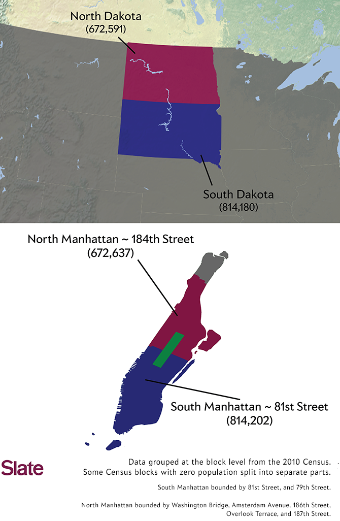
Every state has one governor and two senators, but, in almost every other way, each state’s human geography is different, often wildly so. New Jersey has 15 times more people than Wyoming, despite being one-tenth its size. You can divide the island of Manhattan in two and the top half would be more populous than North Dakota, the bottom half more populous than South Dakota. (Click on the images below to see larger versions of the maps.)
Most state borders were drawn centuries ago, long before the country was fully settled, and often the lines were drawn somewhat arbitrarily, to coincide with topography or latitude and longitude lines that today have little to do with population numbers. I wanted to know what the country might look like if we threw out all of the East’s ancient squiggles and the West’s rigid squares, and reconstituted the country as a union of states of equal population. Maybe it’s because I grew up in New Hampshire, one of the nation’s smallest states geographically and population-wise, but I’ve always been intrigued by the idea that we might find a way to even things out.
This is easier said than done. I started with a relatively straightforward approach to evening up the numbers: splitting America into just two states of equal population. Using the 2010 decennial census as my data source, I drew the map below. Each region has approximately 154,374,000 residents and no existing census tract is split in two:
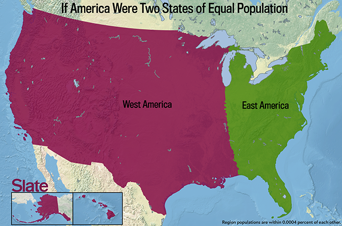
For the map above, and the majority of the maps in this article, I used a gerrymandering algorithm (similar to the one described here) that sought to optimize the compactness of each region. (To get technical: This means that the regions were drawn so the sum of the weighted average of distances from the center of every census tract to the center of the state was minimized.) Optimizing for compactness is often championed by those who oppose gerrymandering and would like to see more orderly, regular congressional districts, as opposed to the jigsaw puzzle pieces we have now, which have been drawn and redrawn by politicians eager to gain or hold on to power.
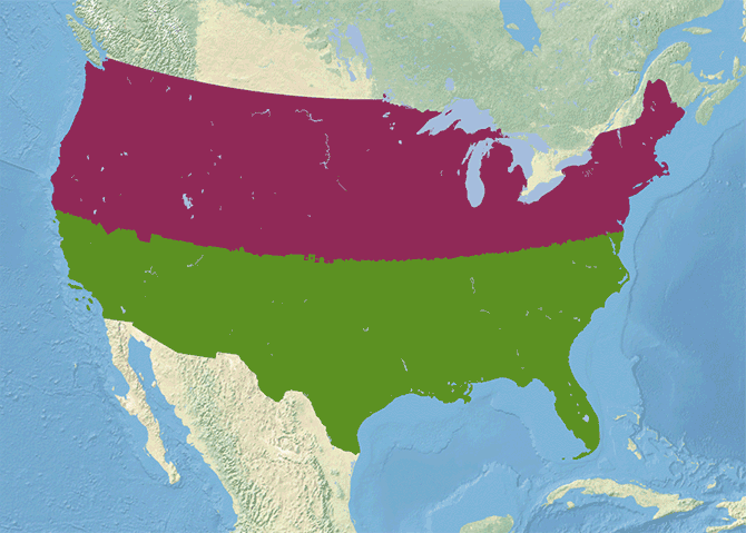
But consistency and compactness don’t guarantee more reasonable boundaries. Optimizing for compactness has the downside of ignoring topographical and cultural boundaries, and often results in metropolitan areas being carved up awkwardly. In the map above, just a small tip of the Upper Peninsula of Michigan is grouped with “East America,” though it hardly seems to make sense to divide such a small, geographically distinct area in two. To make my map conform to common sense, you’d need to do a lot of redrafting—and pretty soon, you might end up with a much more complicated picture.
If you don’t care about compactness, you can divide America into two halves of equal population in a bunch of different ways. Here are just a few of the options:
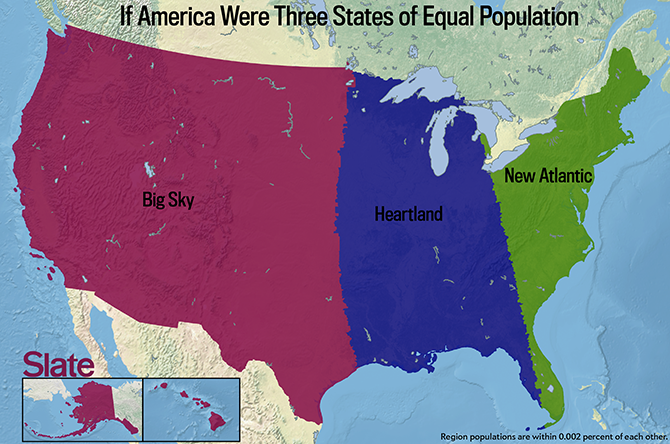
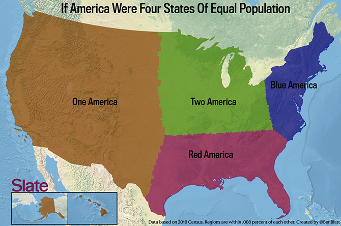
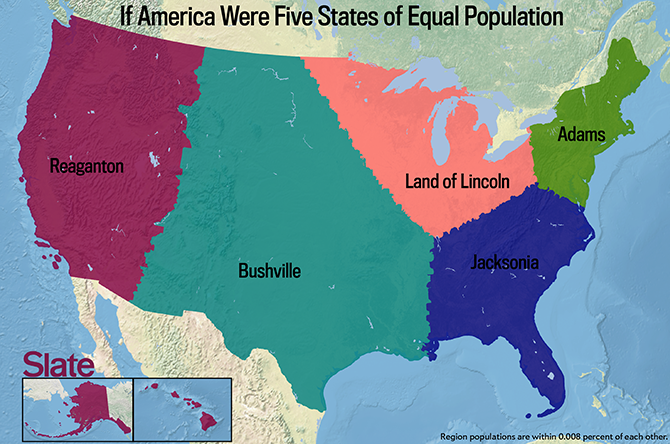
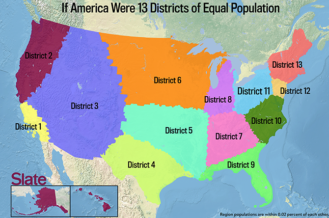
But let’s assume there is some benefit to compactness, and see what happens when we split the country up into larger groups of smaller states, all of equal population. Alternative Americas of three, four, five, and 13 states are below:
And what if you wanted to divide the U.S. into 50 states of equal population? If we turn the algorithm loose to create 50 states while seeking to optimize for total state compactness, we get the map below.
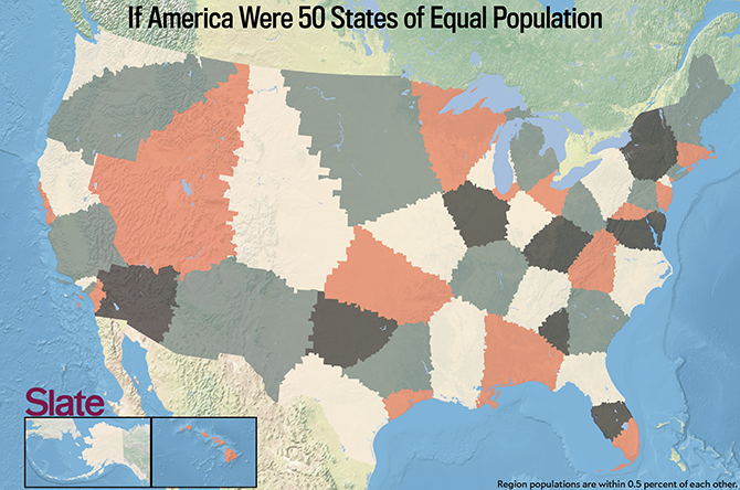
But that’s just one way to do it; there are many ways to split up America into 50 equal states, and depending on your methods, the results will look very different. If you wanted to, you could split the United States up by latitude or longitude. Below I divvied up the country by latitude. I created the first state by starting at the southern most point in the US, drawing a latitude line through it, and then moving upwards until that very long, skinny state contained 1/50th of the American population. I repeated that process until I had 50 new states. (Granted, some of these new “states” wouldn’t be very convenient to govern, like the northern-most one, which includes Alaska, a long stretch along the Canadian border from Washington to Michigan’s upper peninsula, and even a sliver of Maine.)
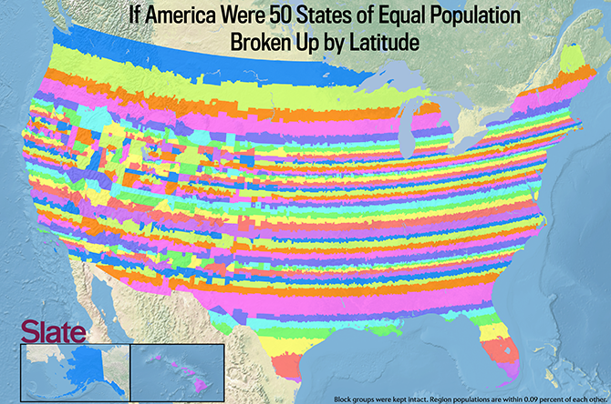
For this map, I kept each census block group (one of the smallest units of measure used by the Census) intact. Forcing smooth curved borders on the new states would have made the final map look less jagged, but it would have required inexact guesswork about where people actually live within each small unit of area.
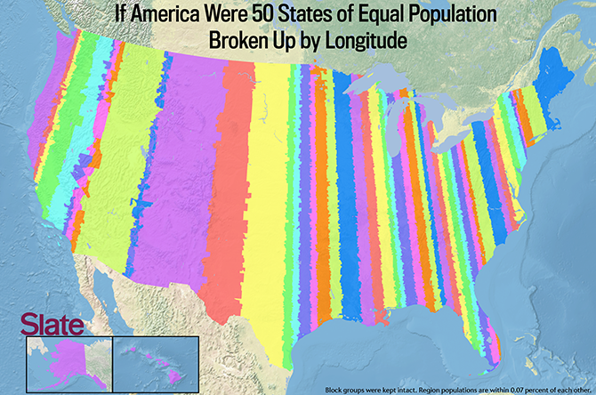
When I finished my latitude map, I took the same approach, but with longitude:
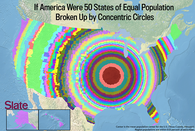
Here’s another way to skin this cat: split up the United States in concentric circles around the center of America. The US Census Department publishes a mean center of population after each of its decennial surveys. The mean center is the point on which an imaginary weightless map would balance if weights of identical value were placed on it to represent each resident: It’s essentially the middle of America if you ignored physical geography and only compared where people live. After the 2010 census, this point was determined to be in Texas County, Missouri. So I centered each state at this point and extended concentric circles around it (again, keeping block groups intact).
I’m far from the first person to have tried to carve up the U.S. into fictitious regions. It’s been done by many before me. Most cartographers rely more on known geographic or cultural boundaries instead of the automated results in my maps, so theirs are a bit more realistic. Perhaps the most popular version, which has been featured on sites ranging from Yahoo! to the website of the Paris Review, was created by urban planner Neil Freeman.
His version, certainly more aesthetically pleasing than mine, is below:
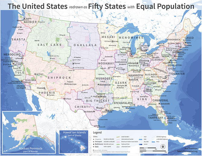
In making his map, Freeman took into account current metropolitan areas to create states that, in theory, could plausibly be states. My version—seeking optimal compactness—cut through cities like Chicago and New York. I asked Freeman, via email, what he thought this type of map does best and worst. He thought the reason his map was so popular was because it drew people in with a story that they could relate to, with alternate “states” as opposed to visualizations that merely illustrate population density. (The realistic names Freeman gave his new states probably helped too.) He also stressed that different maps are needed to emphasize different patterns, and not every type of data is best illustrated with the same mapping methods “Different projects require different tools,” Freeman concluded. “Let a thousand maps bloom.”
We won’t quite let a thousand maps bloom on Slate this week—but we’ll be illustrating what an alternative United States would look like divvied up by wealth, race, poverty, and, of course, Dunkin’ Donuts franchises. Tomorrow: Remapping America based on baseball player birthplaces.