In July 2011, the designer Andy Rutledge posted to his blog an unsolicited redesign of the New York Times’ website and blew up the Internet. Scores of heated rebuttals appeared on Twitter and media and tech websites; Rutledge’s design was said to reveal a “depressing view of humanity,” while Rutledge in turn accused critics of “libelous journalism.” Granted, Rutledge framed his slick mock-ups with ludicrously provocative claims like “News itself is broken.” But the furor that Rutledge sparked left me puzzled. I’d always seen the stakes of Web design to be … how a website looks. Rutledge-gate impressed on me that some people take Web design very personally, especially when it comes to the Times.
The redesign of a major website is an event akin to a new skyscraper going up on the Internet. Something painstakingly designed by a small team of professionals is subjected to the most democratic form of scrutiny: Anyone with eyes can see what’s wrong with the thing. But a Web design sparks debate at a level that a new, controversial building never does. Proposals and criticisms are charged with the urgency of the idea that they could actually be implemented. Web design is less permanent and more responsive than architecture or even print design. From the user’s point of view, a redesign seems like someone flipped a switch, and now a beloved website looks like unreadable trash. It shouldn’t be that hard, then, to flip another switch and fix it.
This is compounded by the fact that our relationship with a favorite website is more intimate than with any print magazine. There is so much content, and it changes so quickly, that learning how to use a website is much more central to the experience of reading online than parsing the layout of a magazine is to reading offline. In a way, becoming familiar with a website is the act of overcoming its design, resisting the tricks and temptations embedded by page-view-hungry owners in order to find your own way to the best stuff. Whenever Gawker, where I used to work, underwent another one of its frequent redesigns, we got emails from users so personally affronted you would have thought we killed their cats. A redesign scrambles hard-won strategies, violently reminding readers that even though the Internet offers them infinite possibilities, those options are always mediated by people whose interests and values might be different than their own.
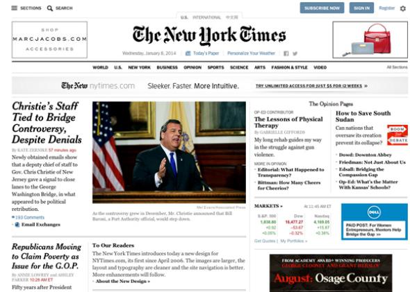
So this morning, as the New York Times unveiled its first real website redesign in eight years, I expected to find the Internet laid waste by rival factions of design nerds and media bloggers. In fact, scanning the few obligatory blog posts and tweets, it seems the Internet has already reached a consensus: “Yeah, looks pretty nice.”
No doubt a large reason for the collective shrug at the Times redesign is the fact that little has changed that affects our strategies of consumption. The Times’ editors still signal what they judge most important through the front page, which remains three columns of text with a big picture. Gone, finally, are the blue-hued headlines, which at this point were so outdated they’d nearly traveled past obsolete to retro-chic, a living monument to the Web of Yore, when primitive browsers would not click anything that wasn’t blue. Now, headlines look as they do in the Times’ print edition. I appreciate this symbolic gesture at the continuity between the Internet and real life, as the distinction has increasingly become meaningless, if it ever meant anything.
There is white space. There can never be enough white space. The most beautiful website, according to contemporary Web design, would be a completely blank page. To foster white space, the sidebar and toolbar for navigating among sections have been folded into a pull-down menu accessed by clicking one of those increasingly omnipresent triple-barred navigation icons in the corner. I have recently learned this icon is called, adorably, a “hamburger,” or, less adorably, a “basement”—as in “stuff all the shit in the basement.” Where the previous Times site replicated the blandly utilitarian file-and-folder structure of a desktop operating system, the new site operates according to the hide-and-seek logic of an iPhone app.
Individual article pages are the most noticeably revamped. Page breaks are gone, thank God. This would be a welcome development for any website. Page breaks are a great example of Web design that users are forced to overcome. But it’s particularly welcome for the Times, whose pagination I always found guided by inexplicable logic. The first page would be eight paragraphs long, the second 12, and the third 28. It was the Zeno’s paradox of Web publishing: You felt like you were making progress without ever getting closer to the end. Goodbye page breaks, forever. May you someday be seen as quaint as the CyberTimes Navigator.
Everything else about individual articles is pared down as well: Text is centered in a clean white space, making the font seem larger and giving the articles more heft. This new gravitas can sometimes backfire. With “Snowfall” and its ilk, the Times trained readers that white space plus centered text equals A Very Important Article. Now, even when you click on a 250-word briefing, it floats, lonely, in a sea of white space, seeming weirdly both more and less important than before.
Overall, the Times redesign doesn’t seems much more than a refresh, so it’s apparent why users aren’t angry about it: It allows you to read the Times the way you have for years. It’s just a little prettier. There is one new jarring aspect, though: the distracting “dynamic” navigation bar that now peeks out from the top of articles. These “related article” panes are probably the single most grating development in Web design since the pop-up ad. It is now impossible to finish an article online without one sidling out from the margin like a flasher from a darkened alley. I’ve heard a rumor that someone once clicked a related article toolbar on purpose, but I have no proof. In a redesign that refreshingly opens up space for a reader, these toolbars are little pokes in the eye to remind you of who’s really in control.