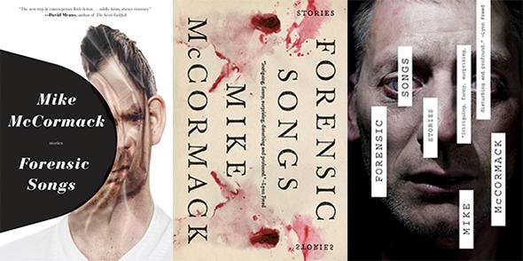
The stories in Forensic Songs, Irish author Mike McCormack’s second short-story collection, are all marked by a sense of being lost in time, as characters struggle to shield themselves from forgotten pasts and the encroachment of a technologically advanced future. The cover of Soho Press’ first American printing of Forensic Songs obliquely but arrestingly captures the impact of time on both the book’s central figures and the reader. The Slate Book Review recently talked with designer Jason Booher about the development of the cover and the ideas underpinning its powerful imagery.
Slate Book Review: Having read Forensic Songs, one of the first things that strikes me about the cover now is that it reflects the idea of one being blindsided, as characters are in nearly every story—by death and by unexpected returns and introductions. Was that the main theme you were trying to convey?
Jason Booher: So you really nailed the idea there. There was a consistency of the characters having an experience that, as you say, blindsides them. Even the subtler versions of this are violent psychologically. Pretty early on I had sketched a head being smashed by a black circular form.
Were there other ways that you tried to get that across?
None of my other sketches had anything like the power of this indescribable force represented by the stylized blackness pushing in. This was really the best formal move I came up with to get to the soul of the book.
Why did these two draft designs not make the cut?
One was too bloody even though the reflective mark suggested a physiological violence and the classical type reflected the literary quality turned on itself. But it read too “serial murderer.” The other captured the strangeness or otherworldliness that McCormack brings to the realities of these everyday Irishmen. But it was a little too freaky. The man in the photo wasn’t as everyday as I would want, but a more ordinary face didn’t have enough to it even with the white rectangles covering it up.
Both of the draft covers seem more directly influenced by the book’s title—the “forensic” part—than the one that was ultimately chosen. How did you decide how much you wanted to reference the title in the final design? And what kinds of issues do cover designers face more generally when trying to work with—or around—particularly suggestive titles?
You are always relating to the title. As to whether you want to do it more directly, it just depends. Sometimes a title begs for some kind of clear, direct interaction. Sometimes a title is really weak or obtuse and might carry less weight in the package. It’s just tied in as a big part of the design problem. Forensic Songs is a spectacular title and one that has very few limitations since it’s a little vague but still evocative and powerful. I probably felt the first word would relate to anything I made that suggested violence or darkness and the second would elevate any visual to a metaphor. The bloody Rorschach test design was definitely in response to the title, trying to capture that beautiful relationship between those two words. The splatter feeling violent but also intensely beautiful and stylized—because of the symmetry.
In the final design, the character depicted is sort of crumpling upon impact, like he’s made out of paper. What was that meant to convey?
The trick in executing the sketch was finding a balance between a suggestion of movement and pressure without completely giving in to a physical dimensional reality. The paper crumpling came to me as a solution to this problem. The paper crumpling does a few different things. In relation to the black shape, it suggests a force or physical pressure has been applied to the face as well as a surface. So it allows for the violence to the head, but makes it abstract, not literally the head being smashed.
That serifed font looks aged and evocative of the past, while many of the stories consider the present and future impacts of technology, among other things. Was that contrast intentional?
The most importation thing about the type in this case—and in most cases—for me is making the book feel unique and contemporary, while still connecting to the writing. As you felt, I think it is a little unexpected to have that fat italic. It can speak to the past—just like the stories—but it’s odd. It wasn’t really a conflict with the stories themselves I was going for—more of a conflict with the hardness of the smashing of the shape into the image, as well as the expectation of the kind of type for current packages for fiction of this kind.
What expectations did you have about the extent to which viewers would be able to process the conceptual underpinnings of the image?
Most of what needs to happen when a viewer sees a book cover happens in a few seconds. You either hold the eye or you don’t. And then if you hold the eye, you either have something interesting to give either in relation to the title, or a feeling, or some glimpse into the world of the book. Book covers can certainly have deep connections to the work and subtler conceptual relations to the book, but those are not the thing a potential reader will be engaging with initially.
So in the case of Forensic Songs, I expect a human to immediately see a smashed face but at the same time have a feeling of it being strange. I doubt there would be any clear mental acknowledgement of how the elements in the design work together, just an uneasiness or a feeling of the kind of story that’s in the book. Connecting that with the poetic strangeness of the title, I would hope the right kind of reader would then think: Yes, this book’s for me. I think the goal of being visually interesting is more a signifier that the book itself is unique or interesting. Creating a unique package for a book is really about making potential readers see the book as a singular thing in a sea of sameness. Something that has a soul.
—
Forensic Songs by Mike McCormack. Soho Press.
See all the pieces in this month’s Slate Book Review.
Sign up for the Slate Book Review monthly newsletter.